
42 Feather Tattoo Ideas: Meaning, Style, and Placement
A gallery of feather tattoo designs—from collarbone realism to color plumes and birds-from-tips—covering symbolism, style choices, placement, and healing tips.
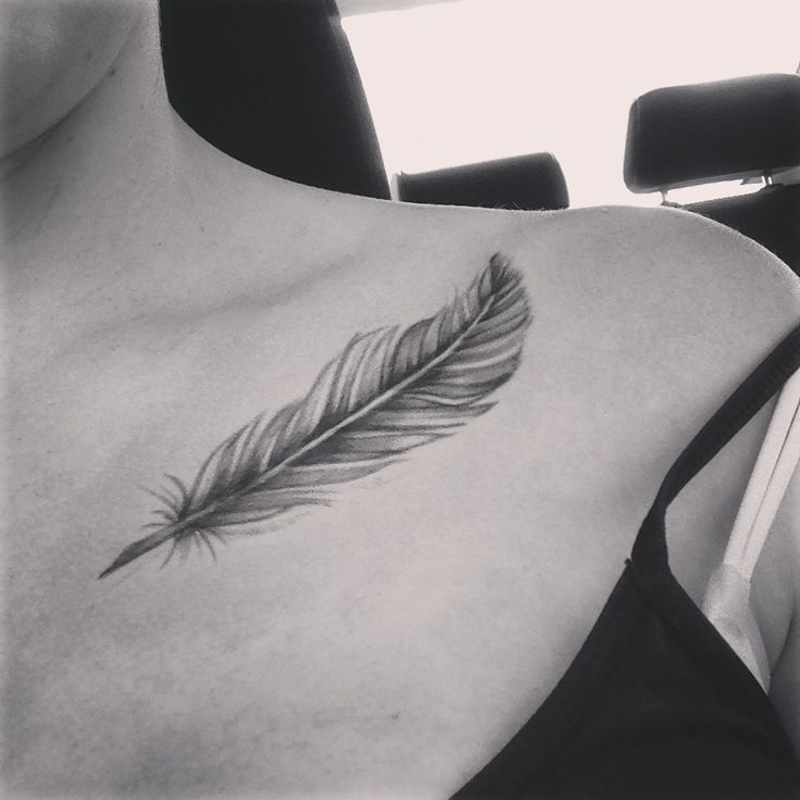
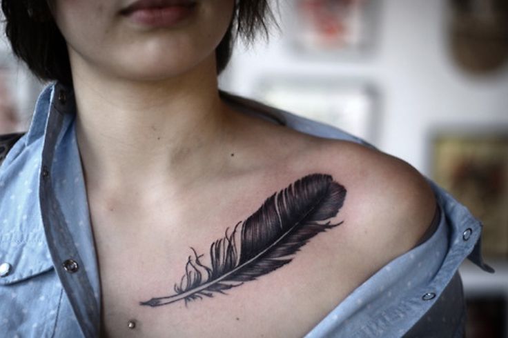
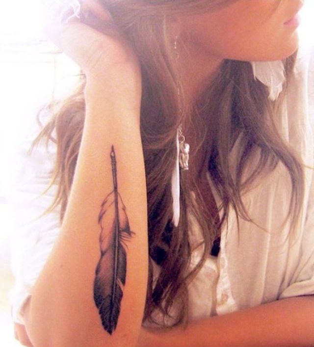
Feather tattoos earn their popularity twice: once for how they look, and again for how many meanings they can carry without a caption. Depending on the bird and the culture you draw from, a feather can suggest protection, honor, bravery, freedom of movement, or the sense of rising over an obstacle instead of colliding with it. On skin, the form is forgiving—horizontal under a collarbone, vertical down a forearm, wrapping a rib, scattering into birds mid-flight—and it takes black-and-grey realism or saturated color with equal ease.
This gallery gathers about forty-two design approaches so you can compare quill direction, barb detail, color, and placement before you commit. Treat the photos as a vocabulary of shapes, not a mandate to copy someone else’s exact piece. The best feather on your body will be the one that fits your bone line and your artist’s hand, not the one that won the most likes in a feed.
Meaning without locking yourself in
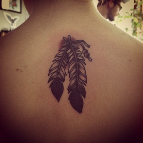
People often choose feathers for lightness and motion. A single plume can stand for a person, a journey, or a vow to stay mobile in mind as much as in travel. Species references deepen the story when they matter to you—eagle for strength, peacock for pride and display, swallow-associated feathers for return—but a generic, well-drawn feather can remain open-ended on purpose. If you are borrowing from Indigenous or other culturally specific feather symbolism, do that with respect, research, and preferably an artist who understands the difference between inspiration and costume.
Freedom and floating over trouble are common modern readings. So are memorial tattoos: a feather for someone who “flew,” sometimes with a date tucked into the barbs or a small bird leaving the tip. Decide whether you want that specificity visible to strangers or private to anyone who already knows the story. Ambiguity is not a flaw; over-explaining a feather in decorative banners often is.
Realism, watercolor, and graphic lines
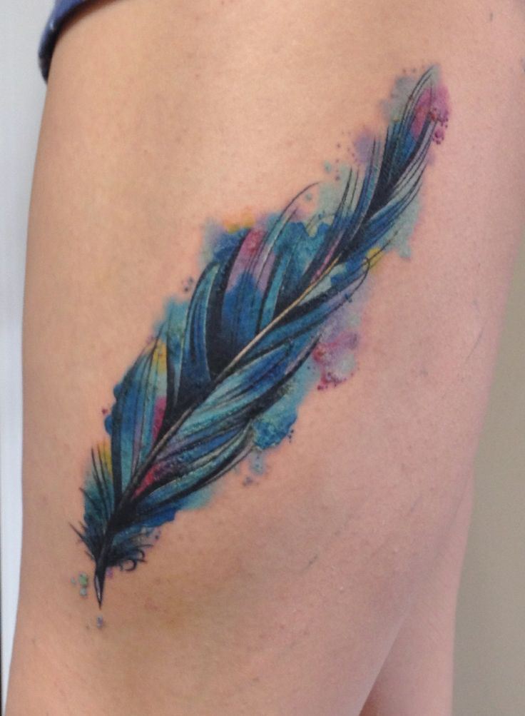
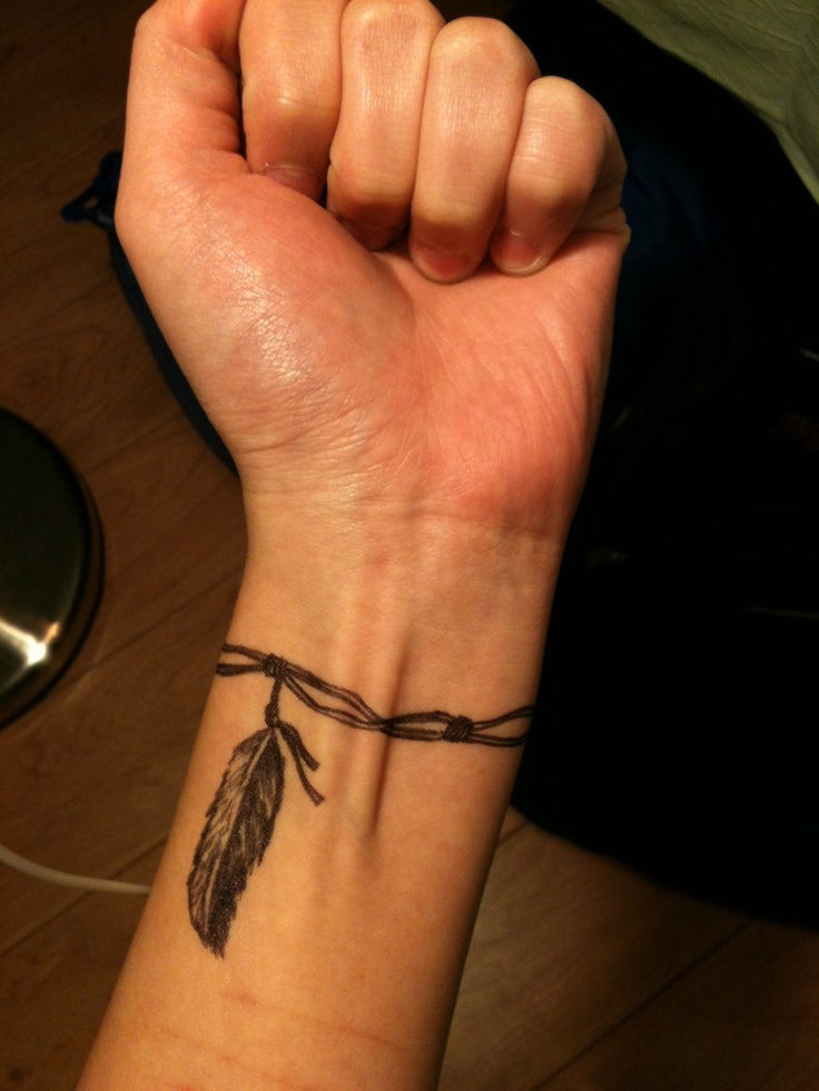
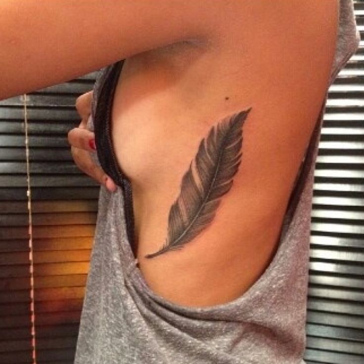
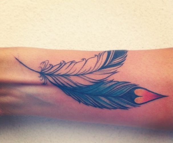
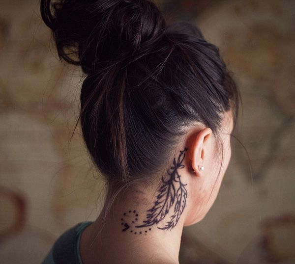
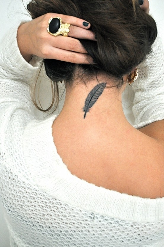
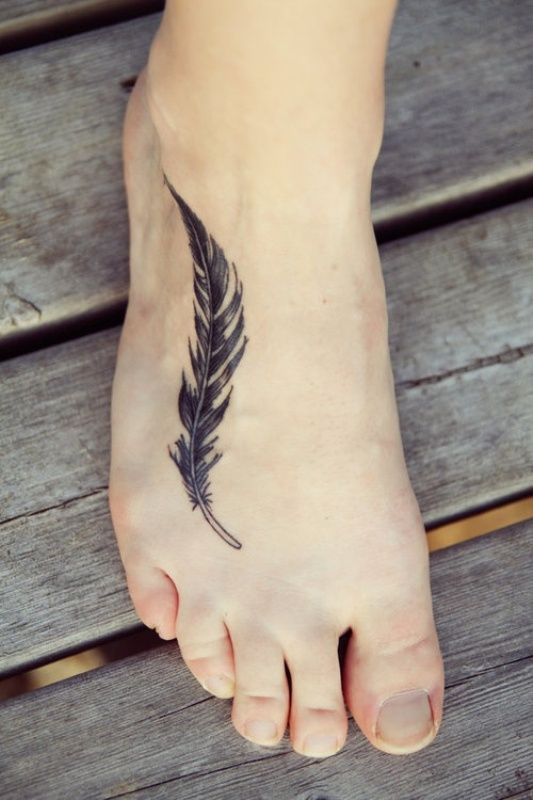
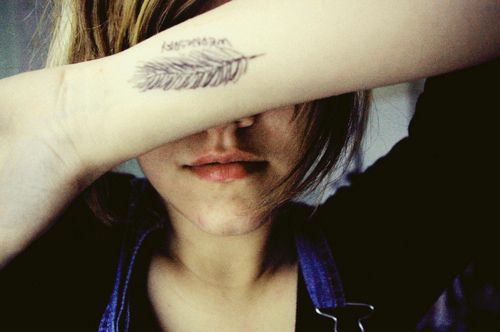
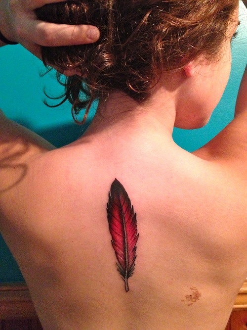
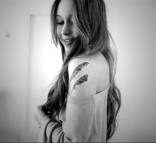
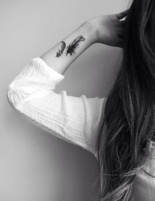
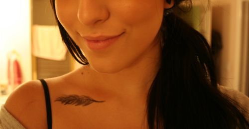
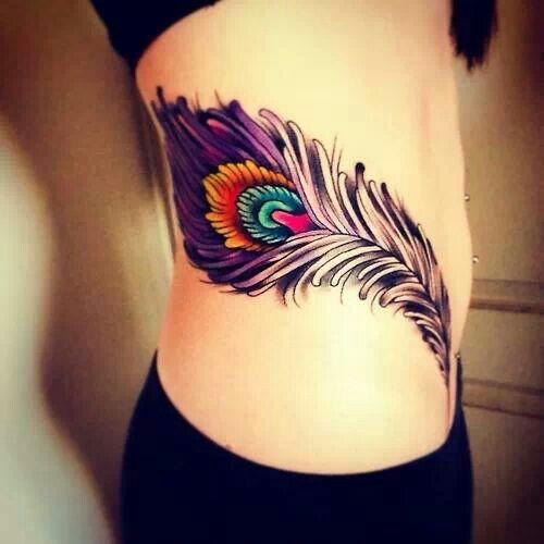
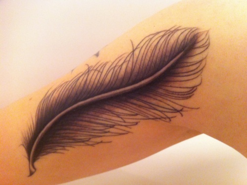
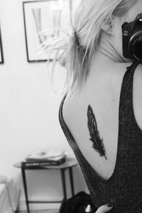
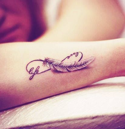
Realistic black-and-grey feathers rely on soft gradients and broken barb edges so the plume looks like it could lift in a draft. They suit collarbone and shoulder placements where the body already curves. Watercolor feathers drop hard outlines for pigment blooms—beautiful when saturated correctly, muddy when rushed. Illustrative and neo-traditional feathers keep clearer outlines and can hold turquoise, gold, crimson, and deep blue without pretending to be a photograph. Fine-line single-needle work thrives on forearms and ribs if the artist leaves enough spacing for healing.
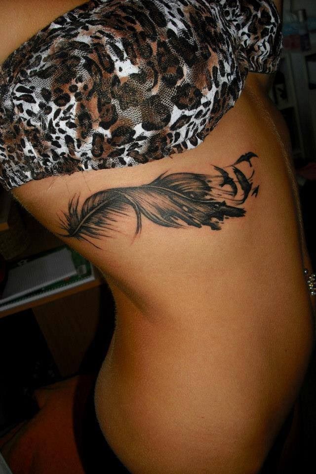
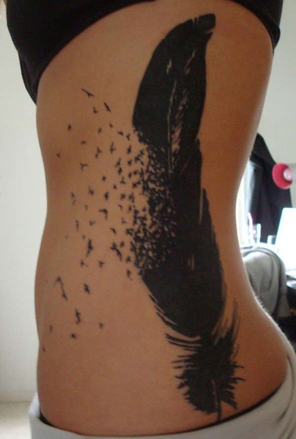
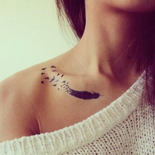
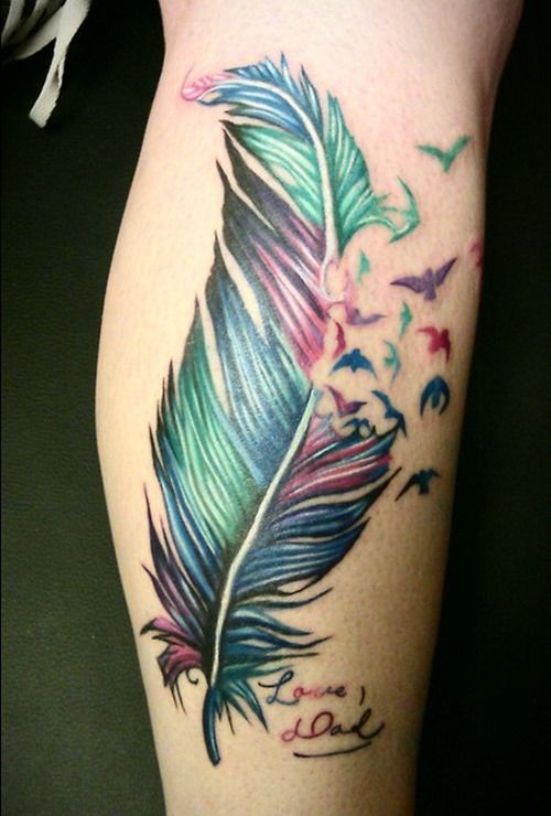
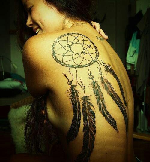
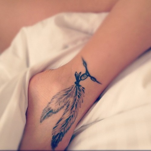
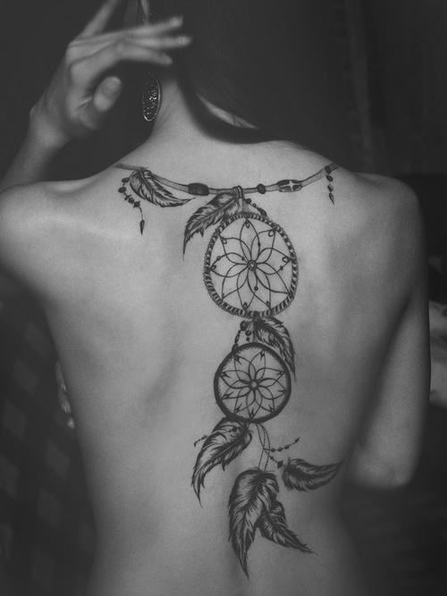
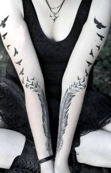
Arrow-and-feather combinations, dreamcatcher-adjacent designs, and feathers turning into birds mid-shaft are popular hybrids. Keep the silhouette readable at arm’s length. If every barb is microscopic, the healed tattoo may read as a grey smudge instead of a plume. Ask to see healed close-ups: fresh white highlights and razor edges flatter work that may soften in a year.
Style matching matters if this is not your first ink. A hyper-realistic feather beside bold American traditional roses can look accidental unless you bridge line weights or place the feather as a deliberate accent. Consistency of hand across a sleeve keeps the collection from feeling like stickers from different decades.
Placement that follows the quill
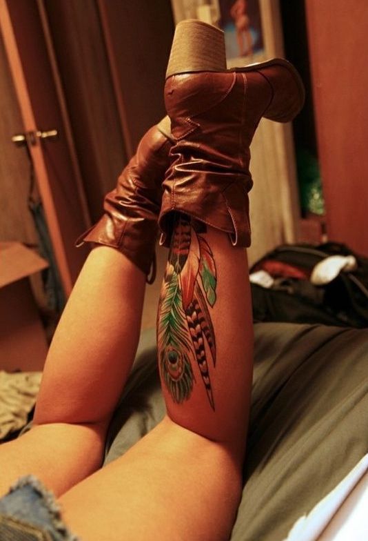
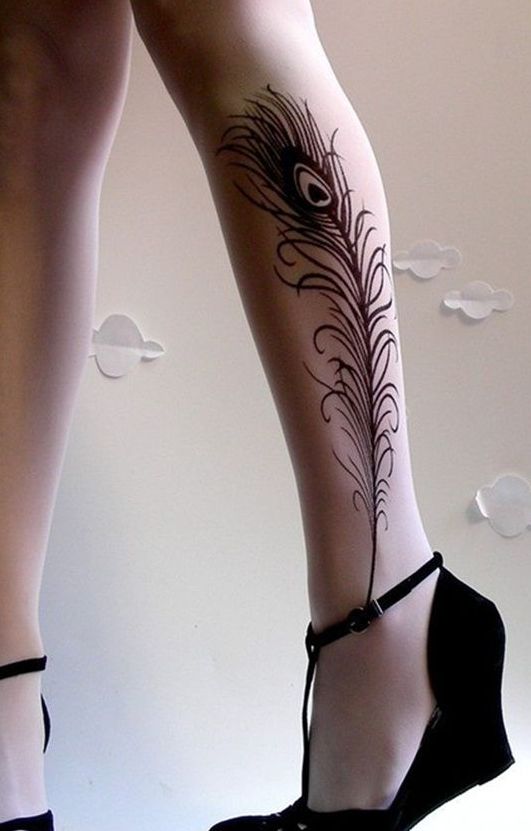
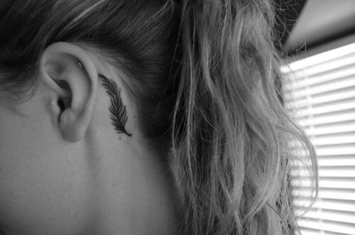
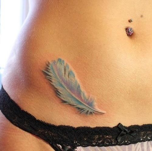
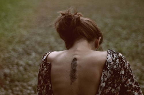
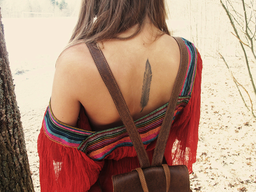
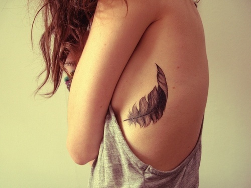
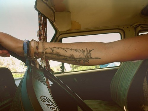
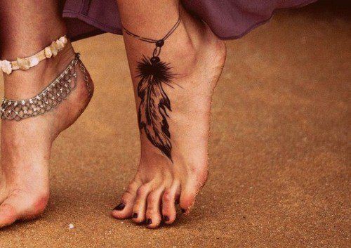
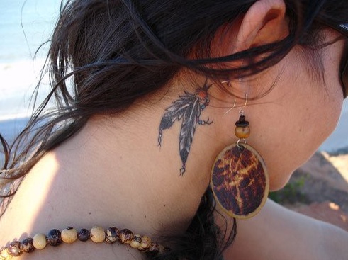
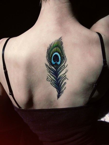
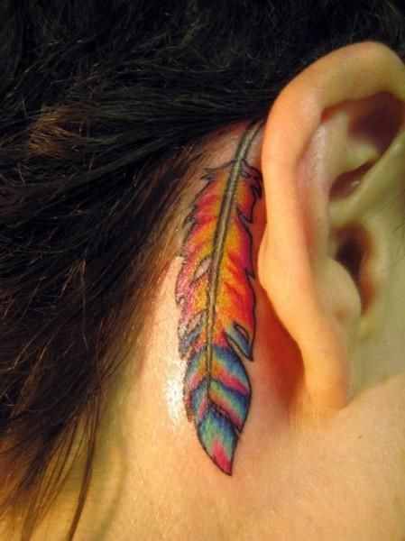
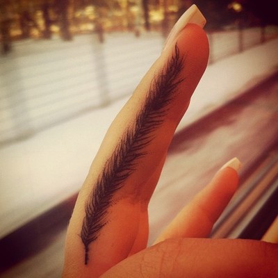
Horizontal feathers love clavicles and hip lines. Vertical feathers love inner arms, calves, and spines. Diagonal placements across the shoulder blade or rib cage create motion when you breathe or reach. Tiny feathers behind the ear or on the side of a finger work as accents; large peacock-style plumes need real estate and a plan for how clothing will crop them day to day.
Think about how the quill points. Toward the heart can feel intimate; toward the hand can feel like reach or release; downward trails can suggest shedding or gravity. None of those readings are mandatory—but orientation is a design choice, not an afterthought, so discuss it in the stencil stage while you can still rotate the sheet. Sit, twist, and raise your arm before the needle starts so you see how the feather rides muscle.
Ribs and sternum deliver drama and sharper sessions. Outer arms and calves are usually easier sits and easier to show or cover. Neck and hand feathers look striking and age under more friction and sun—budget for maintenance if you go that route.
Color, birds, and dissolving tips
Black-and-grey ages predictably and pairs with almost any existing sleeve. Color feathers pop in portfolios and need sun discipline afterward; saturated blues and greens can shift if neglected. Some designs dissolve the tip into birds, stars, or script—effective when the transition is gradual and the birds still read as birds from a short distance. Others bind feathers to arrows, compasses, clocks, or floral stems. Edit ruthlessly: one strong secondary element beats three competing stories stacked on a single shaft.
Peacock and tropical color stories ask for confident color workers. Soft grey memorial plumes ask for patience with negative space. Neither is “more meaningful”; they simply solve different visual problems. Bring wardrobe reality into the consult—straps, collars, and watch lines will frame or bisect the design whether you plan for them or not.

Choosing and healing well
Bring references that show the barb density and tip behavior you like, plus clear photos of your placement area in ordinary light. Ask for healed examples of similar feathers. On ribs and sternum, plan shorter sessions if you are new to pain; on outer arms, you may finish larger work in one sitting. Aftercare is ordinary and non-negotiable: clean, moisturize as directed, avoid pools and heavy sun while healing, then protect grey washes and color for years, not weeks.
Feathers look simple and expose weak technique quickly—crooked quills, muddy midtones, barbs that merge into a blot. Choose a licensed artist whose feathers still look like feathers years later. The design’s job is to suggest air and motion on a surface that does not move like air. When the drawing and the placement agree, you get that floating quality the motif is famous for—protection, honor, bravery, freedom, or simply the pleasure of a well-made plume on skin that will carry it through ordinary days.
Scan the set for the feather that still interests you after the tenth scroll—not necessarily the loudest color, but the silhouette that fits your bone line. Take a shortlist to a consultation, leave room for the artist’s adjustments, and you will walk out with a design that feels like motion even when you are standing still.

Comments
Continue reading
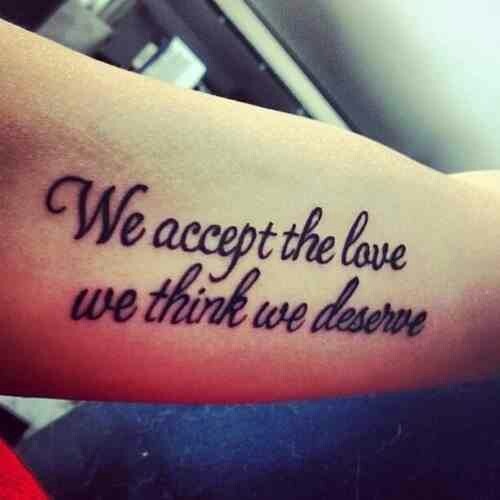
Meaningful Love Quotes for Inspiration (and Ink)
Meaningful love quotes that still feel true — short lines for tattoos, gifts, and everyday reminders, with placement and wording tips.
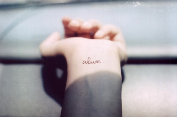
40 One-Word Tattoo Ideas: Placement, Type, and Meaning
A gallery of single-word tattoos—love, faith, strength, wanderlust, and more—with guidance on typography, body placement, and choosing a word that still fits years later.
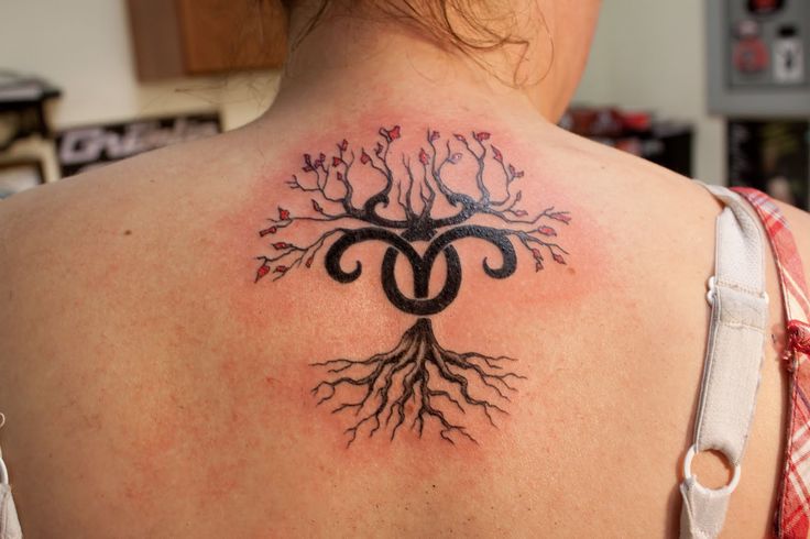
16 Taurus Tattoo Ideas: Bulls, Glyphs, and Venus-Inspired Ink
Sixteen Taurus tattoo directions—from minimal glyphs and constellation maps to floral bulls and bold blackwork—plus placement and artist tips for lasting earth-sign ink.