
Black and White Beauty Portraits, Part 2: Distance, Gesture, and Contrast
A second monochrome beauty gallery read like a contact sheet—framing distance, hand gesture, wardrobe tone, and contrast recipes for your next shoot.
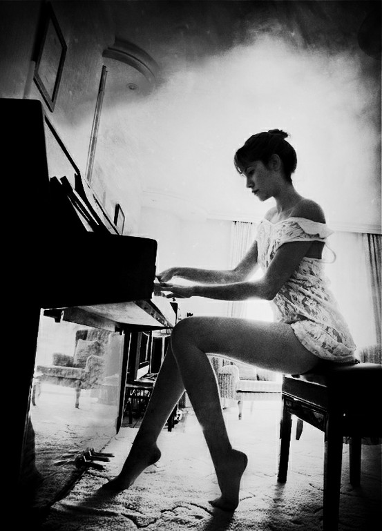
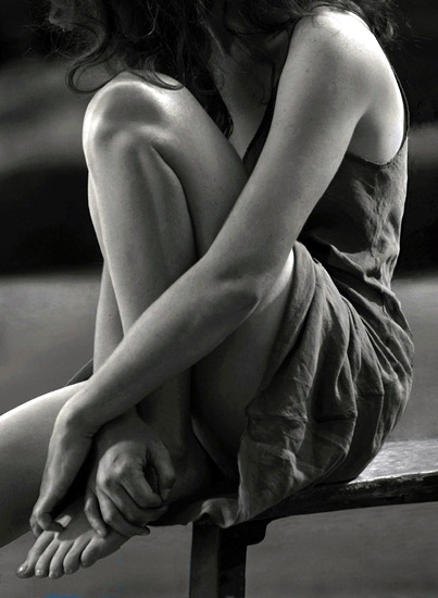
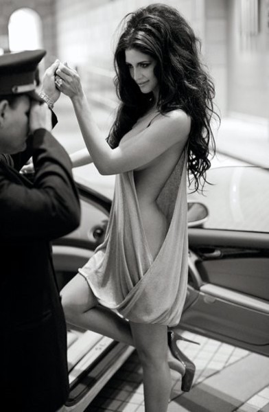
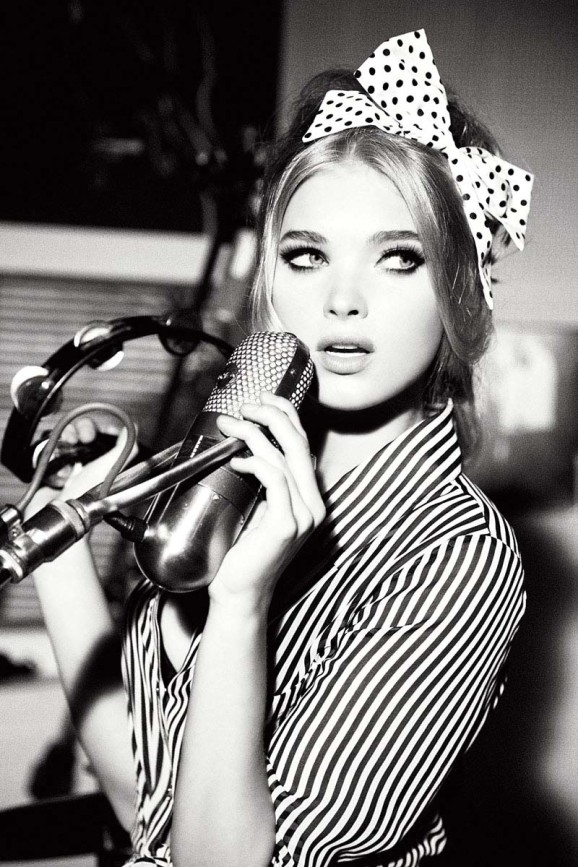
A second collection of black-and-white beauty portraits is not filler after a first gallery. It is another chance to study how monochrome treats faces when color cannot rescue weak light or vague posing. Different subjects, different distances from the lens, different appetites for shadow—each frame argues a slightly different version of beauty. Read this set the way a photographer reads a contact sheet: slowly, comparatively, with craft questions in mind.
What follows is organized as six practical lenses for looking. The images stay central; the commentary is there so the gallery teaches something beyond “pretty in gray.” If you shoot beauty, edit portraits, or collect references before a session, use the sections as a checklist you can steal for your own work.
1. Distance: intimacy versus elegance
Camera distance changes the contract with the subject. A tight headshot makes every freckle, lash, and catchlight part of the conversation. It favors careful focus on the nearer eye, makeup that holds up at close range, and lighting that does not carve unkind hollows under the eyes. Pull back to include shoulders and collarbones, and posture joins the story. Pull farther still, and wardrobe silhouette begins to compete with facial expression for attention.
In monochrome, distance also changes tonal drama. A close crop can live almost entirely on mid-tone skin. A wider frame often needs a darker or lighter field behind the subject so the figure does not float in undifferentiated gray. Several portraits here alternate near and mid distance; notice how emotional temperature shifts when the camera stops hovering at the cheekbones and starts showing the neck and garment edge.
Practical takeaway: decide your preferred working distance before the subject arrives. If you want variety, schedule it—three tight frames, three three-quarter frames—rather than hoping crop later invents intimacy you never shot.
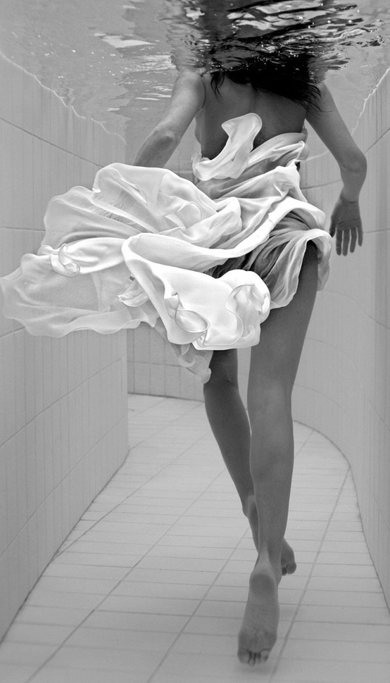
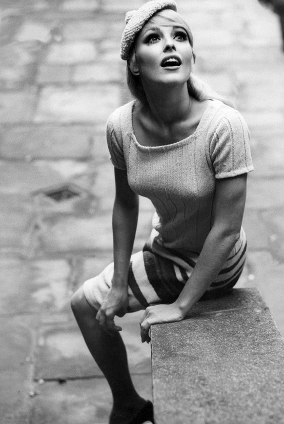
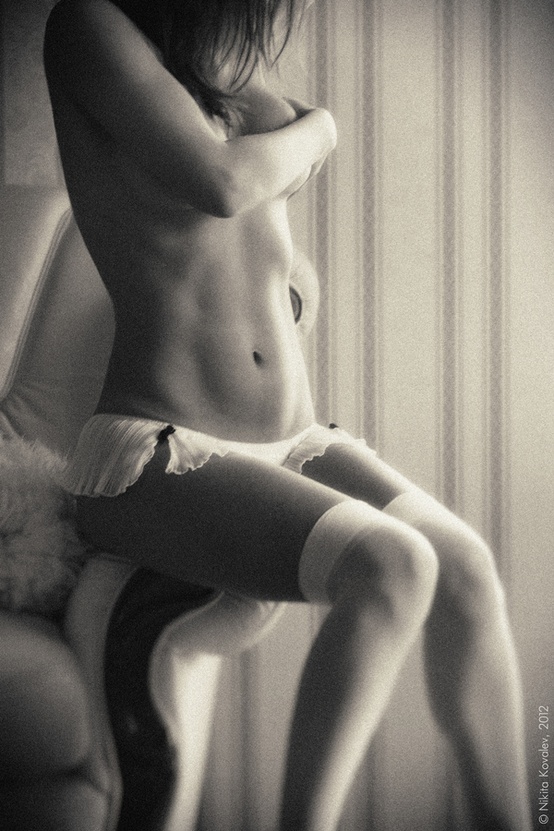
2. Gesture as punctuation
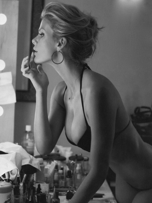
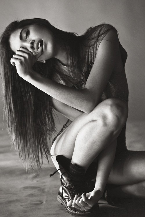
Hands near the face are a classic beauty device and a classic failure mode. Done well, fingers create leading lines toward the eyes or break a too-perfect symmetry. Done poorly, they look like the subject is hiding, adjusting hair mid-shot, or bracing against discomfort. Watch knuckles for tension. Watch nails and rings for specular highlights brighter than the eyes—those small bright spots steal attention ruthlessly in black and white.
Shoulder angle matters almost as much as hand placement. A squared stance can feel strong and contemporary; a slight diagonal softens the torso and lengthens the neck. Hair tucked behind one ear reveals jaw shape or a simple earring; hair left forward creates a dark frame that can deepen eye contrast. None of these moves are universal rules. They are levers you pull until the expression and the light agree.
If hands enter the frame, give them a job: resting lightly at the collarbone, supporting the jaw without pressing flesh into a fold, or disappearing into hair with intention. Limp wrists read unfinished; clawed fingers read anxious. Monochrome will not romanticize either mistake.
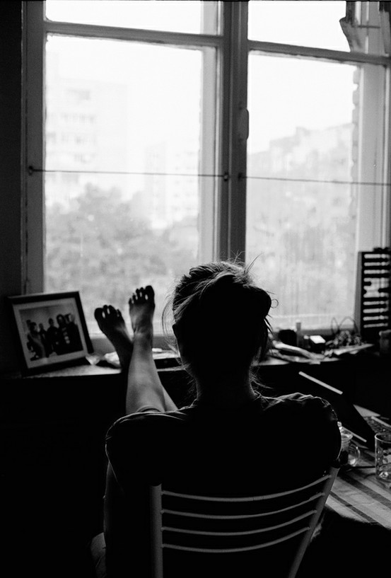
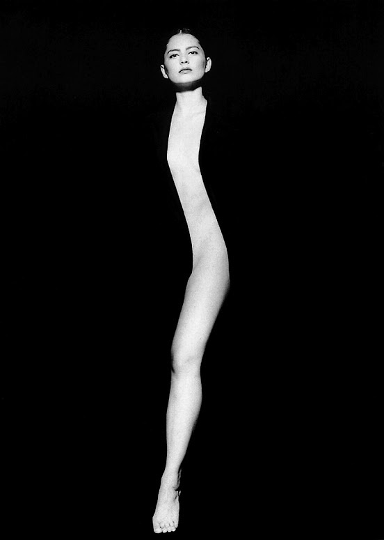
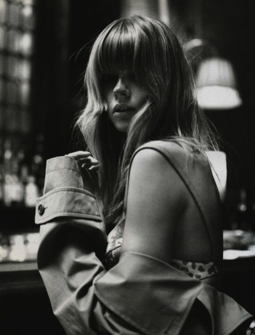
3. Eyes, mouth, and the half-expression
Full smiles are uncommon in serious beauty monochrome for a structural reason: teeth introduce a bright tonal island that can overpower the rest of the face if exposure is careless. Softer expressions—closed lips with a hint of ease, a look that is almost a smile—often print more elegantly. That does not ban joy. It asks for control of highlights on enamel and lip surface so brightness stays hierarchical: eyes first, then mouth, then jewelry.
Eyes carry narrative when hue is gone. Catchlights should feel intentional: one main reflection from the key, maybe a smaller fill sparkle, not a cluster of window panes and practical bulbs that turn the iris into a miniature city map. Heavy lower lashes or soft smoky lids can look graphic and deliberate in grayscale. Uneven liner or patchy shadow will look equally deliberate—and not in a flattering way.
Direct gaze can feel confrontational or intimate depending on aperture, distance, and how much torso is included. Looking away—past the lens, toward a window—often softens mood and lets the viewer study the profile without feeling stared at. Both approaches appear across this set. Match the gaze to the severity of the light; hard light with a soft glance can be beautiful, while soft light with a hard stare can feel unfinished.
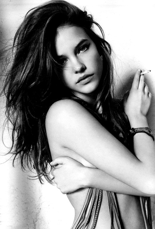
4. Wardrobe that supports tone
In black and white, fabric is value and texture first. A black top can merge with dark hair and create a floating-head problem unless a rim light or pale background intervenes. A white blouse can bounce light upward under the chin and lift shadows—useful for some face shapes, too much for others. Patterns must be bold enough to survive conversion or quiet enough not to vibrate against skin like visual static.
Jewelry behaves like small mirrors. Fine chains can disappear; larger metal pieces can become the brightest objects in the frame. If the portrait is about the person, keep metal under control. If adornment is part of the concept, expose so metal has shape, not only glare. Necklines matter too: a clean boat neck or soft V can lengthen the neck in grayscale; a busy collar can compete with the jawline for the same tonal band.
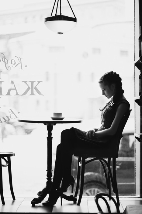
5. Contrast recipes across the set
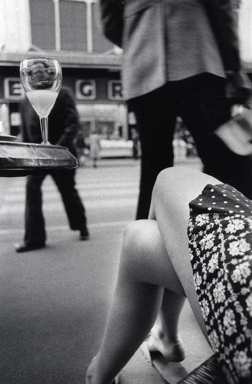
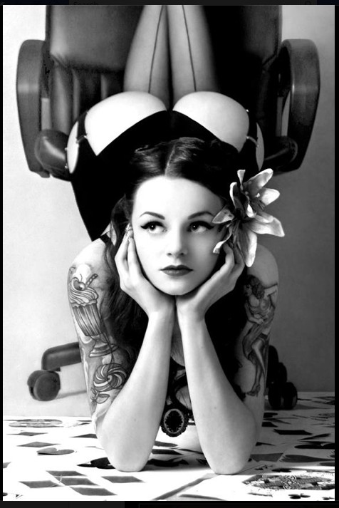
Some images here live in open mid-tones—gentle gradients, soft transitions from cheek to shadow. Others push toward higher contrast, with deeper blacks in hair and background and brighter speculars on skin. Both recipes are valid. Mixing them in one body of work asks for sequencing care: group similar contrast families, or place a transitional frame so the jump does not feel like a mistake in the edit.
Retouching philosophy should match the contrast recipe. High-contrast portraits can tolerate slightly more cleanup because texture is already graphic; low-contrast portraits often need texture preserved so the image does not turn into fog. Dodge the iris carefully. Burn frame edges lightly if you want the eye held center. Avoid the plastic forehead that looks fine on a phone and false in print.
When converting color RAW files, skip autopilot desaturate. Use luminance controls so red lips, warm skin, and cool backgrounds fall into the gray values you intend. Preserve micro-contrast in eyes and hair edges. Beauty that looks airbrushed into porcelain often fails when grain and paper reveal the lie.
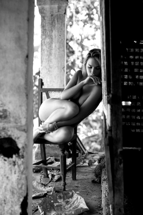
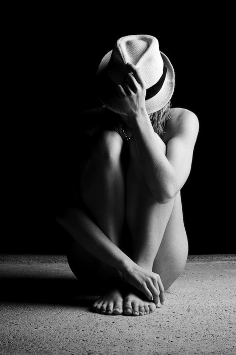
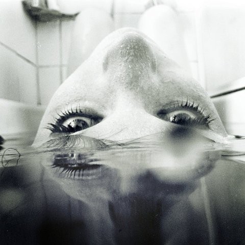
6. What to steal for your next shoot
If you are planning a monochrome beauty session after studying a set like this, leave with three decisions written down before you unpack lights: key direction, preferred camera distance, and how much gesture you want from the hands. Those three choices prevent the common failure mode of shooting thirty nearly identical centered headshots and hoping conversion invents variety.
Then shoot a short ladder of options on purpose: one frame with eyes to camera, one looking away; one with hands in, one with hands out; one softer fill, one deeper shadow. Compare them in grayscale on a calibrated screen, not on a phone in a sunny kitchen. Which frame still feels like a person rather than a mannequin?
Build the rest of the set around that answer. Beauty in black and white is not a filter preset. It is a sequence of choices about distance, gesture, wardrobe tone, and contrast—choices you can see, compare, and improve every time you open a new gallery like this one.

Comments
Continue reading
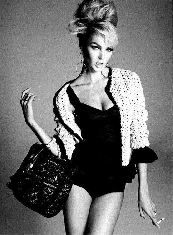
Black and White Beauty Portraits, Part 3: Mood, Shadow, and Editorial Distance
A smaller monochrome beauty set focused on atmosphere—shadow language, hair as graphic design, crop orientation, and which frames still hold when you squint.
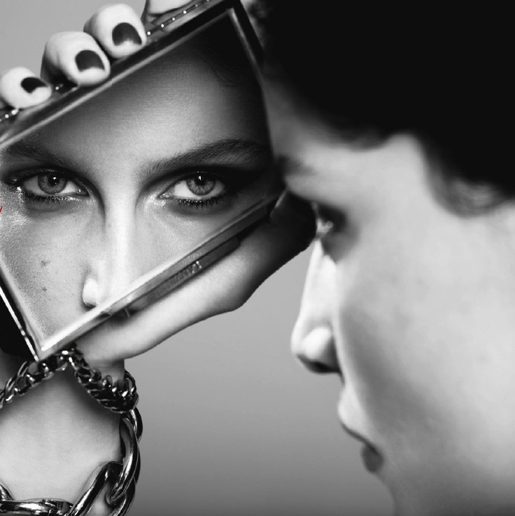
Depiction of Reflection: Women, Mirrors, and Doubled Selves
A photography gallery on women and mirrors—where reflected eyes, ornate frames, and surreal “back-side” glass images explore the gap between outer face and inner feeling.
Black and White Beauty Portraits: Light, Tone, and Expression
A gallery of monochrome beauty portraits with notes on lighting, pose, conversion, and how grayscale changes what flattery means.