
Burning Red Ideas for Fashion, Cars, and Rooms
How to use red with intent—shoes and wardrobe accents, lacquered cars, interior punctuation, and a small palette worth stealing.
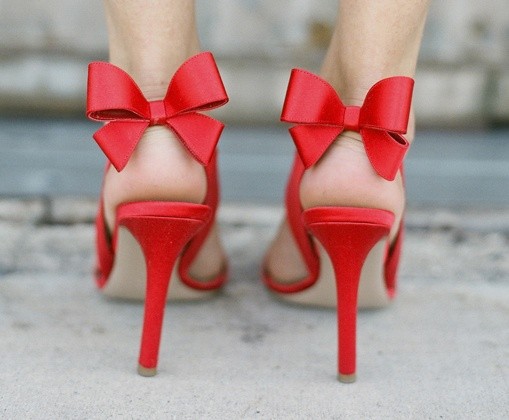
Red is not a neutral color. It arrives already loaded—with heat, warning, celebration, appetite, and a little bit of theater. A “burning red” idea is less about matching a paint chip and more about choosing a hue that refuses to sit quietly in the background. Fashion knows this. Car culture knows this. Interiors learn it the hard way when a single crimson chair starts running the room.
Remember the old line: life is too short not to wear red shoes. The joke works because red footwear is a decision you feel in your walk. This page is a field guide to that decision across clothes, objects, rooms, and machines—how red behaves, where it earns its keep, and when a smaller dose burns brighter than a full flood.
Why red still startles
Human vision is tuned to notice saturated reds quickly. Traffic signals, berries, blood, emergency gear: culture and biology both train the eye to pause. Designers borrow that pause. A red coat in a gray crowd becomes a plot point. A red door on a quiet street becomes an address you can describe to a stranger. A red taillight cluster on a dark road is language before it is decoration.
Not all reds carry the same temperature. Scarlet leans sharp and modern. Brick and oxblood lean historic and grounded. Cherry can feel playful or luxurious depending on finish—matte fabric versus lacquered metal. Coral drifts toward fashion seasons; true crimson holds its ground year-round. Naming the family matters because “just paint it red” is how rooms and wardrobes end up fighting themselves.
Light changes the story again. North light cools a wall; warm lamps push a velvet toward wine. Automotive clear coats shift under sun and streetlight. If you are testing a red idea, look at samples at morning and evening before you commit money. Red that thrills at noon can feel heavy at night.
Red in fashion: shoes, lips, and one brave piece
Red shoes earn their reputation because they move. Unlike a red handbag parked on a table, footwear flashes with every step. Patent pumps announce occasion. Suede loafers whisper confidence. Canvas sneakers make red feel like a weekend. The practical rule is simple: if the rest of the outfit is quiet—navy, black, camel, white—red shoes can carry the composition alone.
The same logic applies to a red lip, a coat, or a dress. One dominant red usually beats three competing reds unless you are deliberately building a monochrome look. Monochrome red is advanced: textures have to do the work that color contrast normally does. Think wool against silk, matte against shine, soft knit against structured leather.
Accessories are the low-risk laboratory. A belt, scarf, enamel pin, or watch strap lets you rehearse how much heat you want near your face and hands. If you like the rehearsal, graduate to a blazer or tailored trousers. If you do not, you have learned something cheaply. Red is forgiving when it is removable.
For men and anyone who avoids “occasion color,” try red through knitwear or outerwear rather than a full suit. A cardinal sweater under a charcoal overcoat reads intentional without costume energy. Socks and pocket squares are optional punch lines; they work best when the rest of the look is disciplined.
Red cars and the romance of lacquer
Car culture treats red as both cliché and classic for a reason. On curves and chrome, high-gloss red behaves like jewelry. Sports cars lean on it because motion and saturation reinforce each other; even a parked coupe looks faster in the right candy apple. Older touring cars and hot rods use deeper maroons and flames that feel hand-built rather than showroom-new.
Practical notes matter if you are choosing paint, wraps, or even a die-cast collection for a shelf. Bright reds show swirl marks and dust more readily than darker metallics. They also photograph beautifully, which is why red vehicles dominate moodboards and calendars. If your “burning red idea” is automotive, decide whether you want daily-driver forgiveness or weekend-show drama. Those are different finishes and different maintenance habits.
Scale changes meaning. A red city hatchback feels cheerful. A red truck feels bold. A red motorcycle can feel almost loud without making a sound. Match the saturation to the vehicle’s lines: delicate roadsters often prefer cleaner, brighter reds; heavier bodies can carry burgundy and oxblood without looking gloomy.
Rooms that can handle the heat
Interiors panic around red more than wardrobes do, mostly because walls are hard to undo. Start with objects: a lacquer tray, a lamp base, dining chairs, a single sofa, art with a decisive crimson mark. Object-level red lets you edit seasonally. Wall-level red asks for commitment and good trim work.
Dining rooms and powder rooms historically tolerate saturated color because people visit them in bursts. A lacquered red powder room can feel jewel-box glamorous. A living room painted the same shade may tire guests who stay for hours. Bedrooms are personal: some people sleep better surrounded by calm neutrals and prefer red only in a throw or headboard detail.
Pairing partners for red include warm wood, black metal, cream plaster, green plants, and brass that is allowed to age. Cool gray can work if the red is clean and modern; muddy gray can make brick red look tired. Pattern helps—stripes, ikat, botanical prints—so red is not a flat slab. Texture helps more: velvet absorbs light; gloss throws it back.
If you already own coastal or pale interiors, a controlled red accent can keep the scheme from drifting into blandness. Think of it as punctuation, not a new dialect. One strong object often does more than a scatter of small reddish trinkets that never quite agree with each other.
Graphic red: signs, type, and tabletop
Outside fashion and cars, red is the workhorse of graphic urgency. Posters, matchbooks, café menus, and wayfinding signs use it because legibility and emotion travel together. At home, that energy shows up in book spines, enamelware, kitchen canisters, and a bowl of tomatoes that accidentally becomes styling.
Typography in red should stay short. Long passages in red type fatigue the eye; headlines and labels thrive. The same is true of tabletop: a red runner or napkin set can celebrate a holiday or a dinner without requiring a themed overload of hearts and flames. Restraint keeps “burning” from becoming “busy.”
How to try a burning red idea this week
Pick one surface you can reverse. Shoes, a scarf, a vase, a temporary wall sample, a phone case, a bicycle bell, a candle. Live with it for several days in real light. Notice whether you feel sharper, louder, happier, or simply annoyed. Red is honest feedback.
If the experiment works, build a small family rather than a warehouse: two or three related reds that share undertone, plus plenty of neutrals that let them breathe. Photograph your combinations; the camera often reveals clashes the eye forgives in person—or the reverse.
If the experiment fails, you have still learned the difference between admiring red in a moodboard and wanting it in your daily loop. Plenty of beautiful red ideas belong on other people, other cars, other rooms. Borrowing the feeling through a museum visit, a film still, or a single borrowed accessory can be enough.
A short palette to steal
- Signal red — crisp, modern, great for shoes, logos, and clean sports paint.
- Cherry lacquer — glossy and festive; loves black, cream, and chrome.
- Brick — earthy; pairs with oak, linen, and olive.
- Oxblood — deep and tailored; strong in leather and winter wool.
- Coral-leaning red — warmer and softer; easier in summer linen and ceramics.
Choose one lane and stay there long enough to see whether the idea still burns after the novelty cools. The best red moves are the ones you still like when nobody is watching—and yes, that can be as simple as a pair of shoes that make an ordinary sidewalk feel like a stage.

Comments
Continue reading
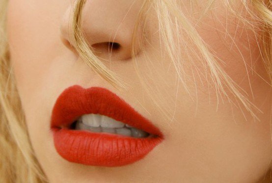
Red Lipstick Shades by Undertone and Finish
A practical guide to choosing red lipstick—cool, warm, and brick families, cream vs matte vs sheer, and how to test and wear a shade that fits your skin.
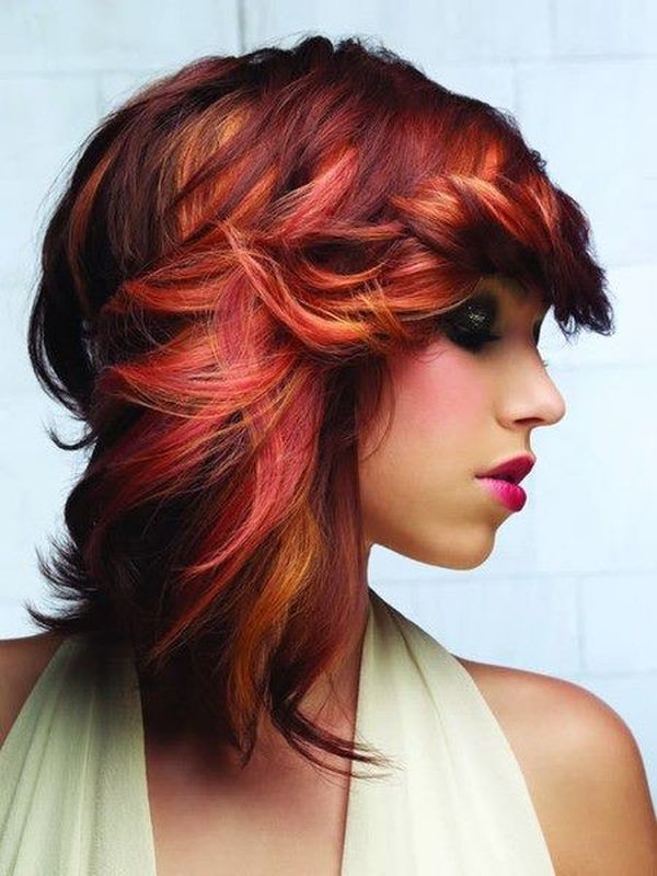
Flame-Red Hair Styles: Classic Copper and Auburn Looks
A part-one gallery of wearable flame red—copper, auburn, strawberry, and terracotta—with shade matching, styling, and first-time color tips.
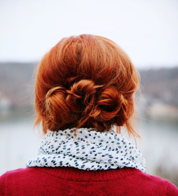
Bold Red Hair Styles: Cherry, Wine, and Shorter Cuts
Part two of the flame-red lookbook—vivid cherry and wine shades, bobs and braids, evening shapes, and how to keep saturated red from fading flat.