
Everyday Objects as Imaginative Illustrations by Javier Pérez
Guayaquil designer Javier Pérez (cintascotch) turns cookies, tools, and cutlery into spare hybrid drawings—how the Instagram Experiments method works and why it sticks.
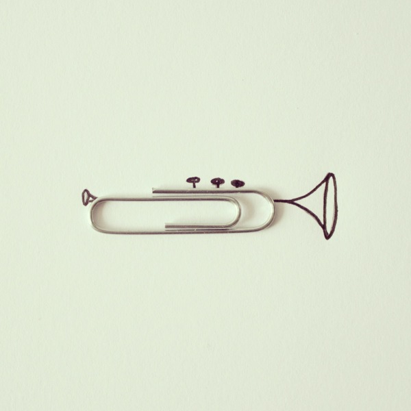
Some illustrations begin with a blank page. Javier Pérez Estrella—better known online as cintascotch—often begins with a paper clip, a cookie, a pair of pliers, or two ordinary forks already sitting on the table. Based in Guayaquil, Ecuador, the graphic designer and audiovisual producer builds small visual jokes in which a real object completes a drawn scene. The object is not decoration beside the drawing; it is a structural character inside it.
The series that made his work travel widely—often grouped under names like Instagram Experiments—treats the feed as a sketchbook with rules. Keep the frame clean. Keep the line economical. Let one familiar thing flip into something else. A half-eaten sandwich becomes geography. Hardware becomes a figure. Cutlery becomes architecture. The pleasure is immediate, then slightly delayed: first you smile, then you notice how little ink was needed to sell the transformation.
Guayaquil roots and a minimalist wager
Pérez has described his approach as deliberately simple—a push against visual oversaturation. In a culture of dense composites and hyper-polished product shots, his frames leave white space and trust the viewer’s eye to finish the gag. Influences he has cited in interviews and portfolio notes include the playful clarity of illustrators such as Marta Altés and the object-logic surprises of surrealists like Magritte and Dalí, filtered through a contemporary, kid-adjacent humor rather than heavy symbolism.
Training in graphic design and audiovisual production at ESPOL in Guayaquil shows in the work’s craft even when the premise looks casual. Composition is tight. Shadows are considered. The photograph of the object and the drawn line share one lighting logic so the hybrid does not feel pasted. That coherence is why the pieces survive as stills: they are not only clever captions, they are designed pictures.
The motto often attached to his practice—“Create every day. No matter your skills”—matters as context. The project is a discipline of looking as much as a portfolio of punchlines. Walking through a kitchen or desk drawer becomes research. Ordinary inventory turns into a casting call.
How the trick works without explaining the joke
Most successful pieces follow a quiet grammar. First, choose an object with a strong silhouette or an incomplete shape—an Oreo with a bite missing, open scissors, a banana curve, a coil of tape. Second, draw only what the object cannot supply: limbs, horizon, architecture, a face in profile. Third, stop. Overdrawing kills the illusion by competing with the object’s reality.
Scale is part of the wit. Tiny stationery becomes monumental when the drawing treats it as a tower or a rider. Food becomes planetary when a nibble reads as a crater or coastline. The viewer’s brain, trained on both product photography and cartoon shorthand, stitches the two languages faster than conscious analysis. That speed is the joke’s engine.
Color usually stays restrained. The object keeps its factory or edible palette; the drawing often stays monochrome or lightly tinted so the real item remains the chromatic star. Negative space around the hybrid keeps the feed from feeling like a scrapbook collage. You are meant to see one idea, not a pile of craft supplies.
Favorite moves in the everyday repertoire
Food transformations are perennial: cookies and fruits reimagined as globes, animals, or vehicles. The half-eaten form is especially fertile because absence becomes terrain. Tools and hardware offer another vein—pliers as a cowboy’s stance, clips as creatures, coins as planets or wheels—because metal edges photograph crisply and suggest mechanical characters.
Cutlery architecture is almost a subgenre of its own. Two forks leaning into an Eiffel-like lattice, spoons becoming boats, knives casting long drawn shadows that turn into roads: the humor sits in recognizing both the utensil and the landmark at once. Stationery—clips, erasers, rubber bands—tends toward creatures and tiny gymnasts, as if the desk drawer hosted a circus after hours.
None of these need encyclopedic cataloging to appreciate. The point is the method: inventory plus empathy for shape. Once you see a few, you start auditioning objects on your own table. That contagious looking is part of why the work spreads so easily beyond illustration circles.
Photography, not only drawing
It is easy to call these doodles and miss the camera’s role. Pérez typically photographs the object under controlled, even light, then integrates drawing—digitally or in hybrid workflows depending on the piece—so edges align and shadows agree. The final file behaves like a poster: centered subject, calm background, readable at phone scale.
That phone scale is not accidental. The project grew in the era when Instagram rewarded immediate clarity. A concept that reads in one second and rewards a second look fits the medium without becoming purely meme-thin. Later stop-motion and animation experiments in his broader practice extend the same object-play into time, but the still hybrids remain the clearest introduction to his eye.
Craft details matter at that size. A slightly crooked shadow or a line that ignores the object’s thickness breaks the spell. When the spell holds, the brain accepts an impossible cohabitation: steel and ink, snack and continent, sharing one coherent world.
Why the work feels generous rather than gimmicky
Object-illustration gags can tip into one-note novelty. Pérez’s better frames avoid that trap by staying affectionate toward the mundane. The cookie is still a cookie; the pliers are still pliers. The drawing does not humiliate the object or bury it in decoration. It proposes a temporary identity, then lets you keep both readings.
There is also an ethic of accessibility. You do not need rare materials or a studio full of props—only attention and a willingness to leave most of the page empty. For students and casual sketchers, that lowers the barrier: creativity as recombination of what is already near the coffee cup.
In design terms, the series teaches economy. Graphic designers spend careers removing surplus. Here, surplus removal is the entertainment. One object, few lines, one transformation. The constraint is the style.
Looking longer at a single frame
Take the kind of image that circulated widely from his early Instagram years: an edible round with a bite missing, redrawn as a globe, or tools posed as figures mid-action. Notice where the drawing begins and ends. Notice what is not drawn. The restraint is the sophistication. A lesser version would outline everything and smother the object; the stronger version trusts the object to carry half the narrative load.
Also notice humor without cruelty. Faces, when they appear, tend toward charm rather than grotesque exaggeration. Landmarks become friendly icons, not lectures. The tone matches a sketchbook shared with friends more than a manifesto, which is precisely why adults scroll, pause, and forward.
A small practice borrowed from the method
If the series sparks more than passive scrolling, try a ten-minute version at home. Pick one object with a clear outline. Photograph it on a plain surface in even light. Print the photo or import it into a simple drawing app. Add the minimum lines required to suggest a second identity—animal, building, vehicle, landscape. Stop when the second reading clicks. Do not decorate.
Repeat with three different objects from the same drawer. Compare which silhouettes transform easily and which fight you. You will start to see why certain props recur in imaginative illustration: curves imply motion, gaps imply geography, symmetry implies faces, asymmetry implies gesture.
Whether or not your results match a polished feed, the exercise sharpens the same muscle Pérez exercises publicly—finding latent characters in the overlooked. Everyday objects become imaginative illustrations not when they are rare, but when someone decides they are worth a second identity for the length of a single frame.

Comments
Continue reading
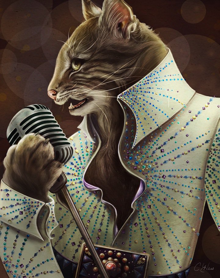
Christina Hess’s Animals From History: Costumed Pets as Playful Portraits
Illustrator Christina Hess reimagines historical icons as ornate animal portraits—Elvis Petme and friends—mixing puns, costume detail, and soft history lessons.
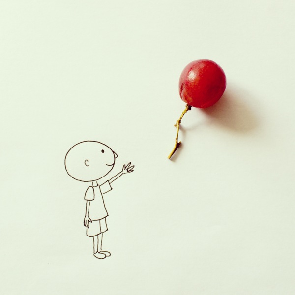
Everyday Objects Reimagined in Art by Javier Pérez
Ecuadorian illustrator Javier Pérez (cintascotch) turns grapes, condiments, and desk clutter into witty photo-doodles—minimal lines, maximum double takes.
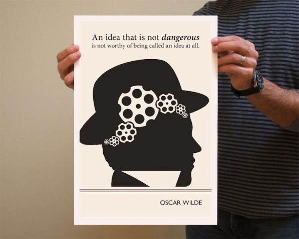
Evan Robertson’s Illustrations from Underlined Book Quotes
Through Obvious State, designer Evan Robertson turns underlined literary lines into black-and-white posters where text and drawing think together.