
Game of Thrones Characters Reimagined as 80s/90s Types by Mike Wrobel
Tokyo-based French illustrator Mike Wrobel drops Westeros into grunge, Miami Vice, and mall-era stereotypes—fan-art costume essays, not plot spoilers.
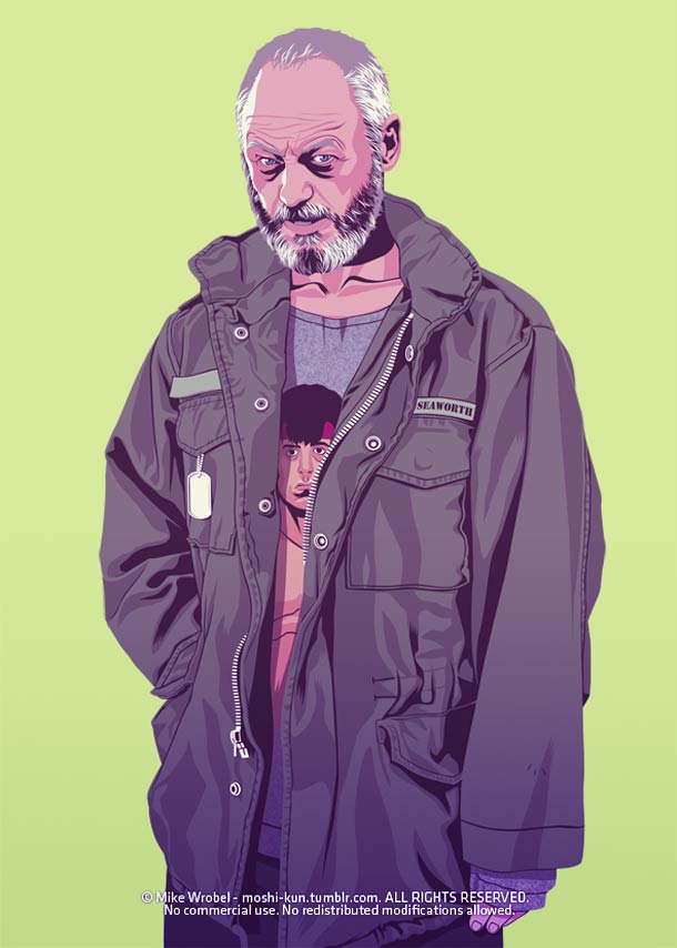
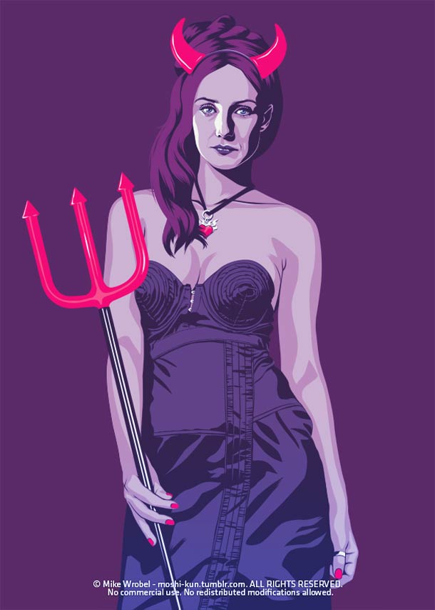
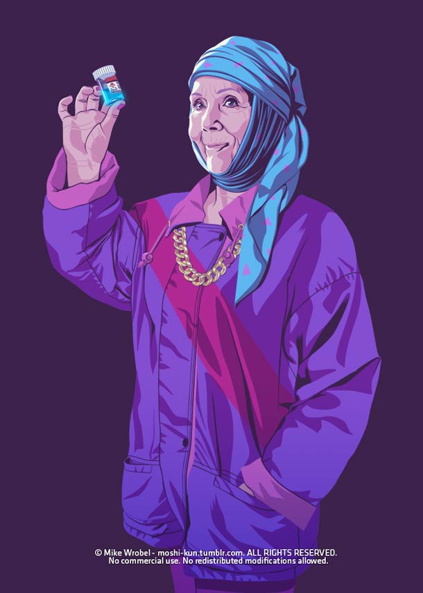
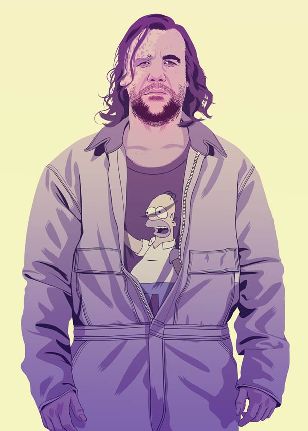
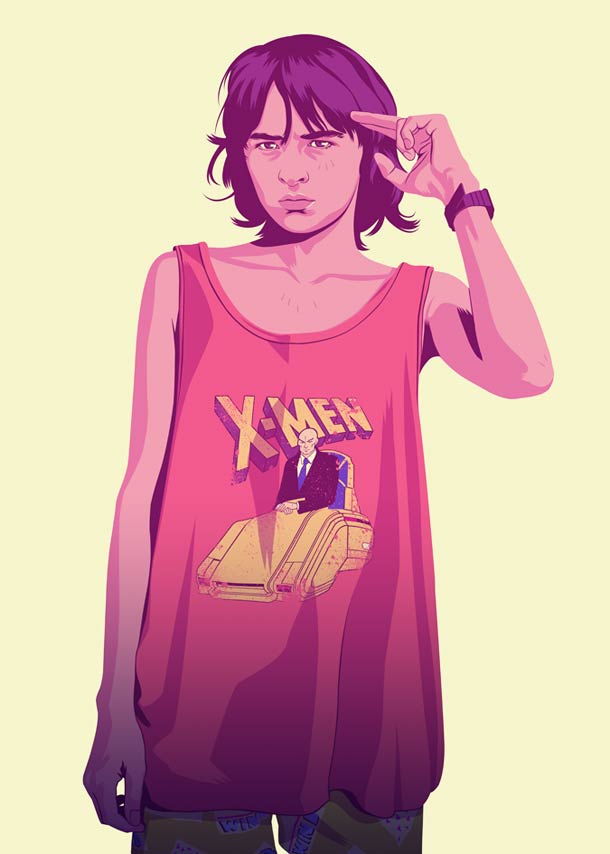
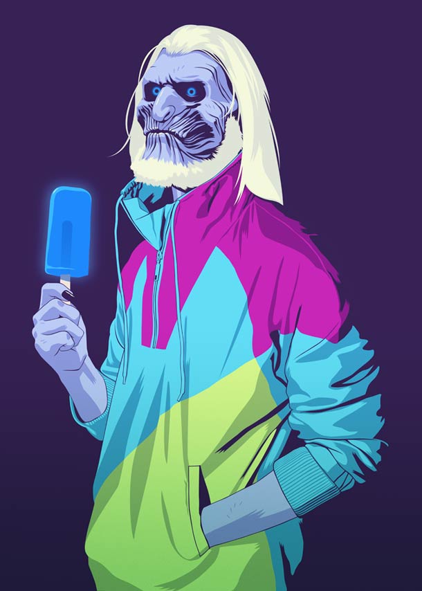
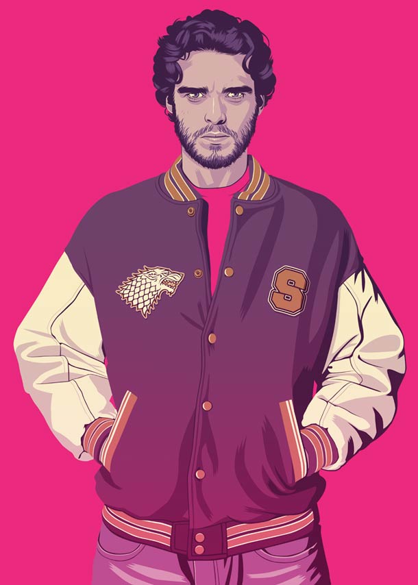
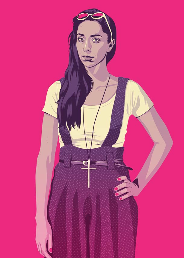
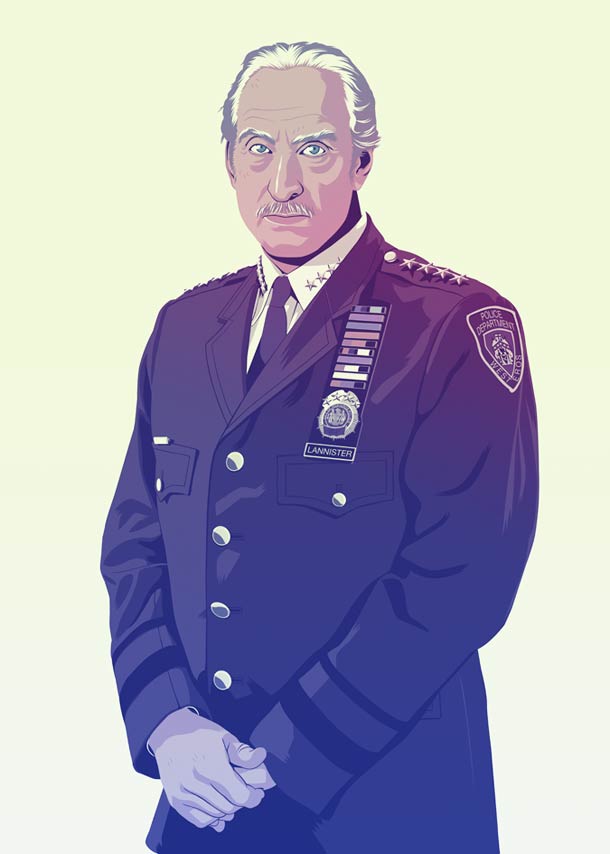
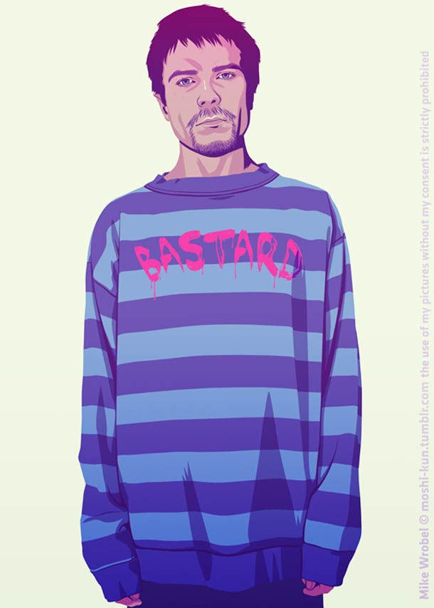
Fantasy armor looks inevitable until you drop it into a mall parking lot. French illustrator Mike Wrobel, based in Tokyo, tested that collision by redrawing Game of Thrones characters as late-twentieth-century stereotypes—grunge kids, mall royalty, Miami Vice slickness, sitcom tomboys—without asking the plot to advance a single scene. The series is fan art with a costume thesis: keep the personalities, change the decade, and see what still reads as true.
Wrobel has explained the premise in interviews as a natural outgrowth of his own media diet. He grew up with The Fresh Prince of Bel-Air, Saved by the Bell, The X-Files, Nirvana, Pearl Jam, Super NES boxes, and the loud commercial color of the 1980s and 1990s. Dark fantasy met neon nostalgia, and the contrast did the comedy. What started as two or three character experiments expanded into a full roster once blogs and entertainment sites began circulating the images.
How the casting rule works
Across the set, the method stays disciplined. Name the character’s social role and temperament. Translate armor, banners, and medieval status into clothes, hair, and props a video-store clerk would recognize. Keep enough facial structure and attitude that fans shout the name before they finish a caption. The wardrobe is the joke; the likeness is the respect.
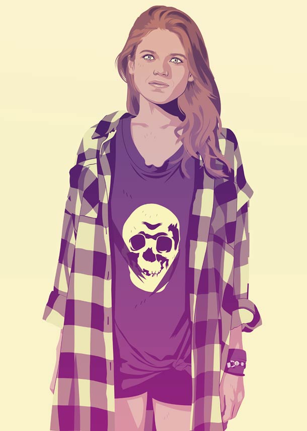
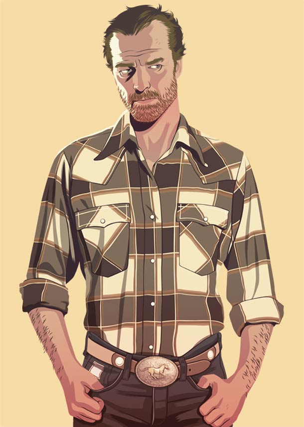
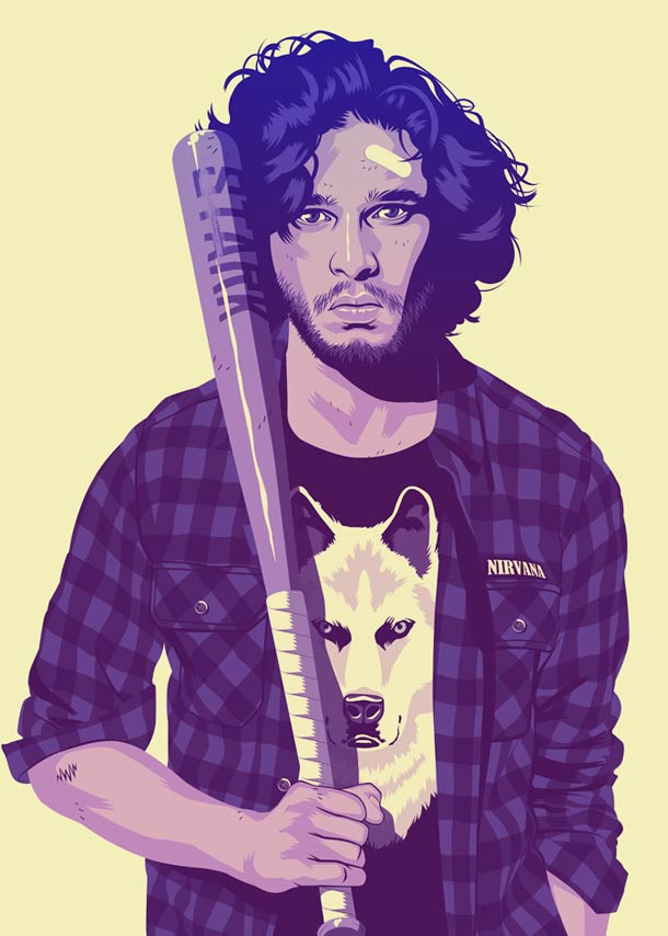
Jon Snow becomes an obvious grunge figure—flannel weather, reluctant cool, northern gloom without Night’s Watch blacks. The translation feels almost unfairly easy, which is why it works: the show already sold him as someone who never quite belongs in polished rooms. Joffrey stays punchably smug. Wrobel has noted how important it was to make him still look like a douchebag, because audiences already loved to hate him; suburbia does not redeem that energy, it only changes the brand of hair gel.
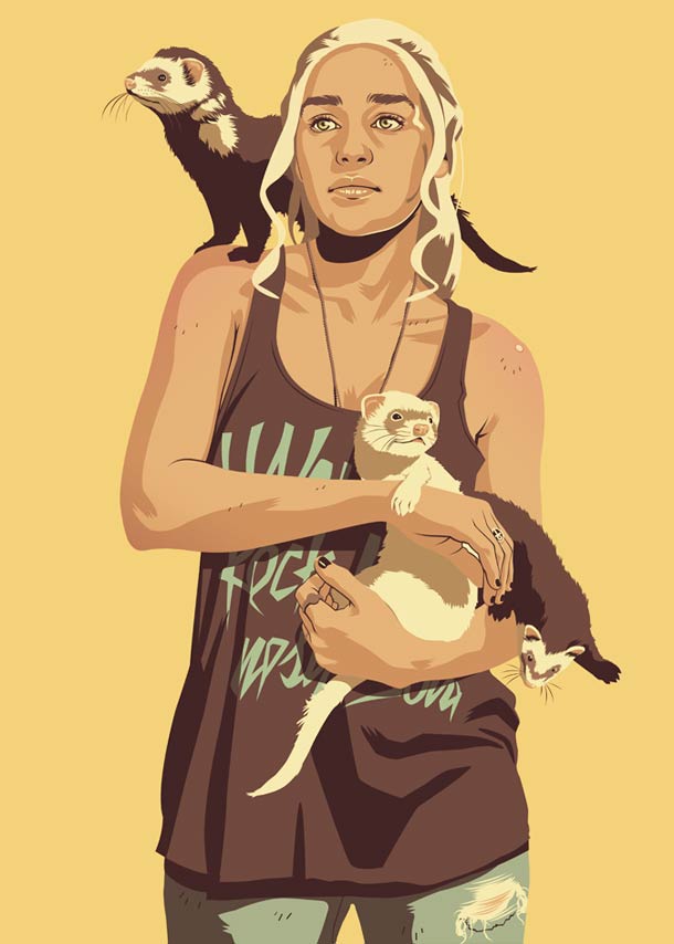
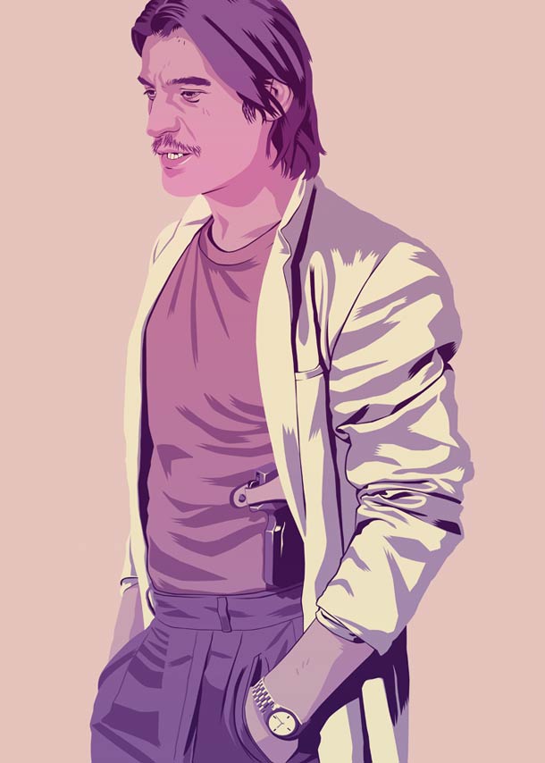
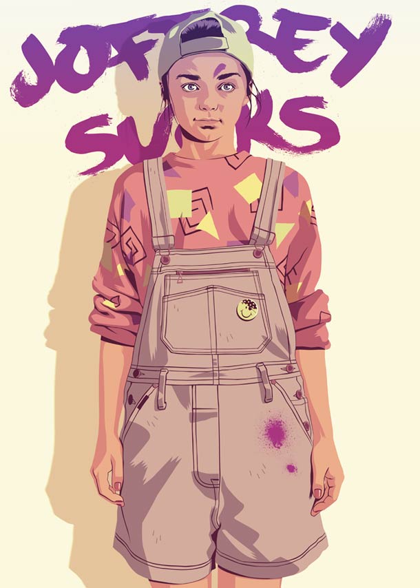
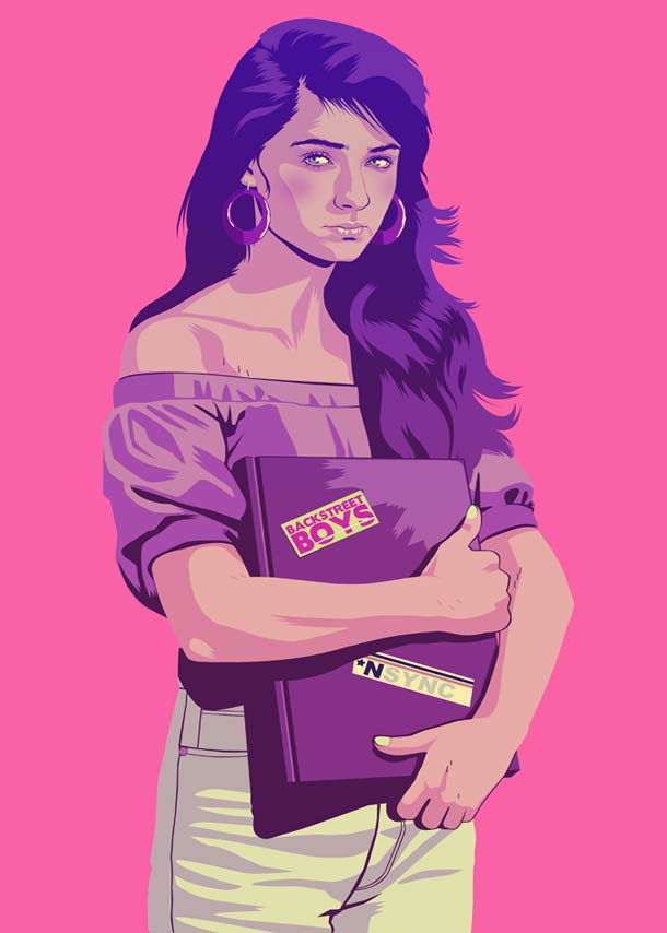
Jaime Lannister gets the Miami Vice treatment: arrogant playboy polish in a retro suit that telegraphs wealth and danger without needing a lion crest on the lapel. Arya reads as a Saved-by-the-Bell-adjacent tomboy—mobility and mischief over court manners. Sansa tips toward Beverly Hills teen gloss, boy-band culture implied by palette and posture even when no poster appears in frame. Daenerys keeps the platinum presence, but dragons become a practical joke of the era: exotic pets (ferrets in the widely discussed version) because baby dragons were scarce under apartment leases. Brienne’s armor logic becomes football pads—protection reframed as sport instead of knighthood.
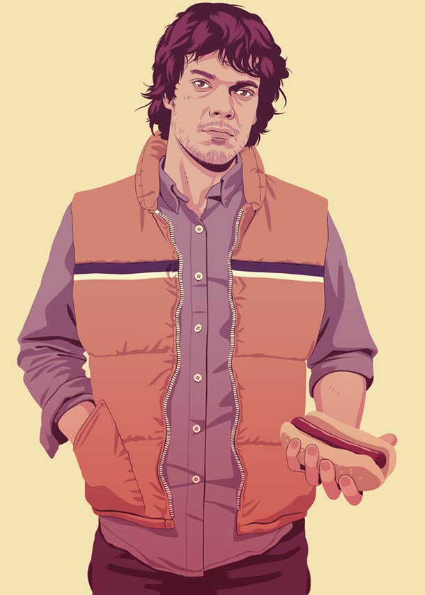
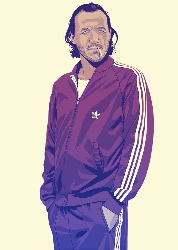
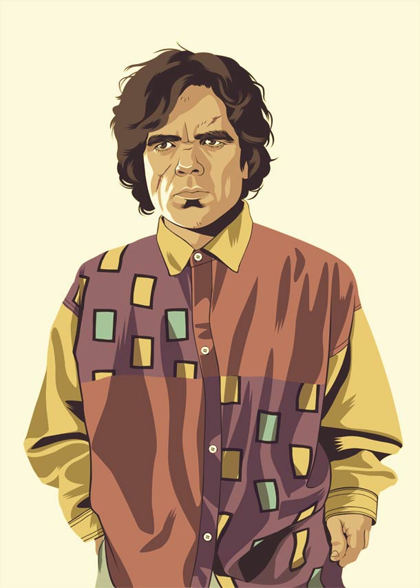
Tyrion, Theon, and the wider bench follow the same rule. Stereotype is shorthand, not erasure. The gag collapses if the original personality disappears under the costume.
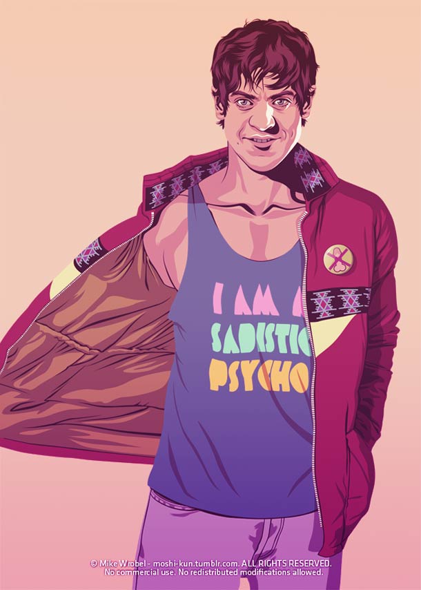
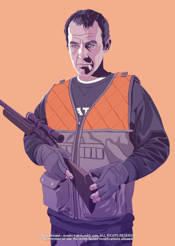
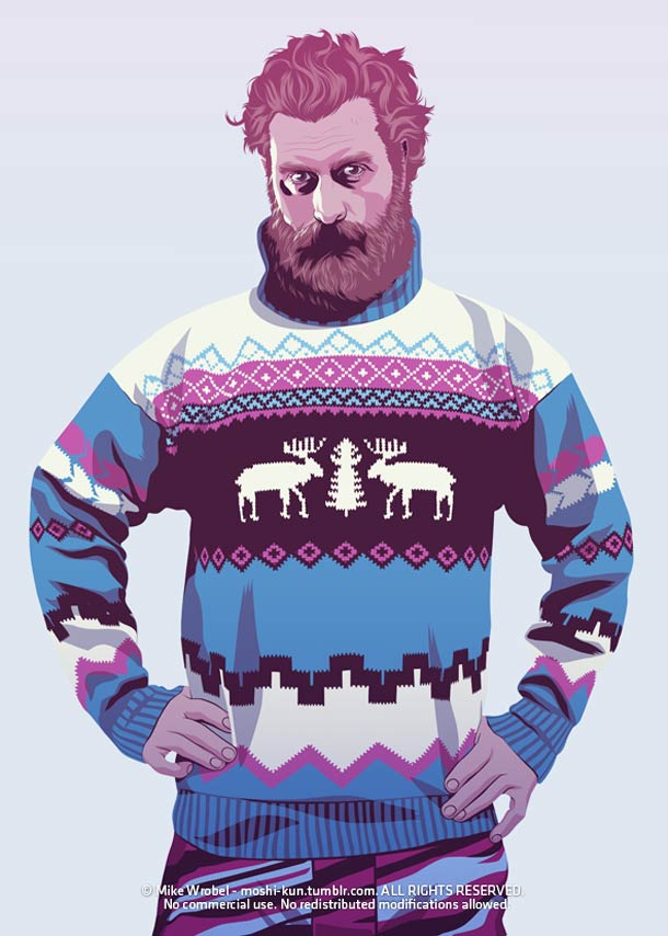
That consistency is what separates a one-off meme from a series. Once you understand the rule, you can predict the next outfit before you see it—and still enjoy the specific choices Wrobel makes inside the prediction. Prediction plus surprise is good comedy design.
Craft: loud color, careful shadows
Wrobel’s background includes animation study in France and a lasting fascination with Japanese character design—especially detailed shadow treatment that demands real knowledge of anatomy and light. That training shows. Jackets fold like cloth. Hair has weight. Faces catch light in planes rather than flat stickers. The pictures are not photoreal cosplay; they are graphic-design characters with enough modeling to feel physical.
The palette is loud on purpose: teal, magenta, sunset orange, denim blue—colors that scream VHS sleeve, mall directory, and cassette-era poster racks. Against the desaturated prestige look of the television show, that chromatics is the second joke. Fantasy drama usually whispers in iron and ash. Wrobel shouts in retail neon and still keeps the characters legible.
Full-body centering helps the set behave like a print collection. Each figure can hang alone on a dorm wall or sit in a grid. That poster logic mattered when the work spread: blogs needed images that cropped cleanly and still read at phone width.
Fan-art framing, not a spoiler desk
These illustrations circulated while the series was still on air, which tempts later readers to treat old fan posts like unfinished news. Resist that. Wrobel’s project is costume essay and personality study. It does not announce casting changes, leak episodes, or “break” plot. It asks a quieter question: how durable are these people when production design is swapped for thrift-store archetypes?
Durability is the secret praise inside the comedy. If Jon still feels like Jon in flannel, writing and performance left a strong silhouette. If Joffrey remains intolerable in suburban clothes, the character was never only the crown. If Brienne still reads as Brienne in athletic pads, honor was always a posture as much as a suit of steel. The jokes depend on that clarity.
The series also sits inside a larger fan-art ecology—Simpsonized casts, noir posters, Victorian redraws—where appropriation is the point. Wrobel’s angle was specifically chronological: not another planet, another decade. That narrow brief is why the set feels coherent instead of random cosplay roulette.
Inevitable hits and witty stretches
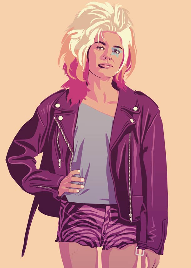
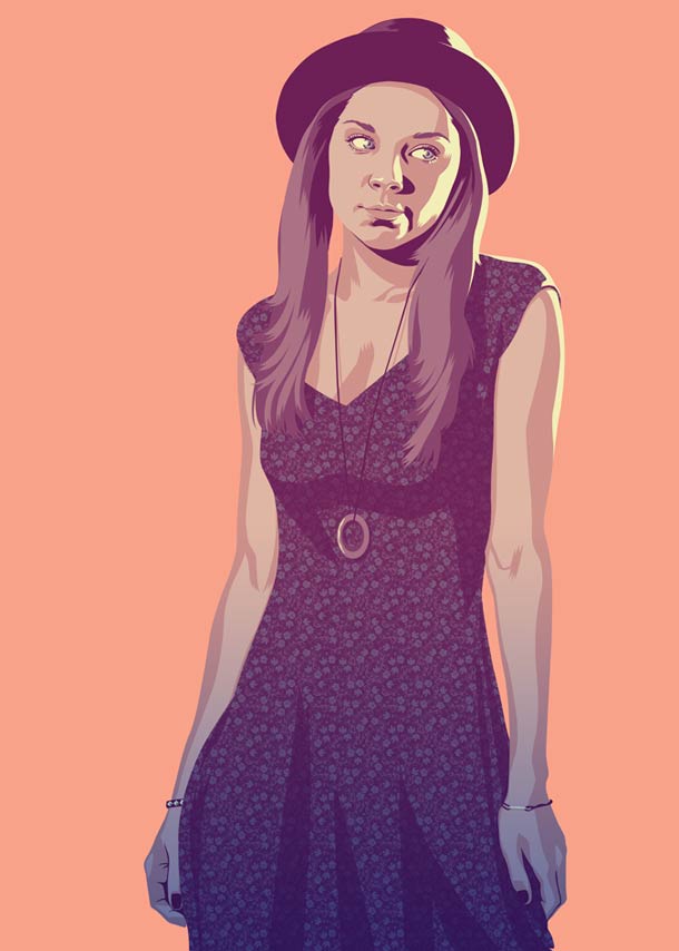
Some translations feel inevitable: grunge Jon, Vice Jaime, spoiled-teen readings of court kids who already behaved like court kids. Those hits prove the show’s archetypes were already half-modern. Other choices are witty stretches—pets standing in for dragons, football pads for plate armor—and those stretches are where the illustrator’s taste shows. A stretch has to remain emotionally accurate even when literally absurd.
Look for the hinge in each portrait: the one prop or garment that carries the metaphor. A jacket cut. A hair volume. A pet on a shoulder. A smug smile that survives any century. Good fan costume design often lives in that single swap—clear, then done—rather than in a pile of competing references.
A reverse game for fans
After browsing the gallery, try the reverse exercise. Pick a modern stereotype—skater, pageant parent, tech bro, mall security, aerobics instructor—and ask which Westerosi figure could wear it without losing the soul of the role. The ones that fit too easily tell you what the show already encoded. The ones that refuse to fit tell you which characters are bound to a specific world-building machine.
You can also sort the set by tone: affectionate, mocking, glamorous, pathetic. Wrobel’s better frames stay affectionate even when they mock. That warmth is why the work aged as fan illustration rather than as a pile of mean caption memes.
Mike Wrobel’s 80s/90s reimaginings remain a bright corner of Game of Thrones art because they refuse solemnity without refusing craft. They are loud, specific, and oddly respectful. The characters are still themselves—just late for class, overdressed for the club, or arguing in a food court instead of a throne room. If one portrait makes you laugh and still feel the old loyalty or irritation, the costume thesis worked.

Comments
Continue reading
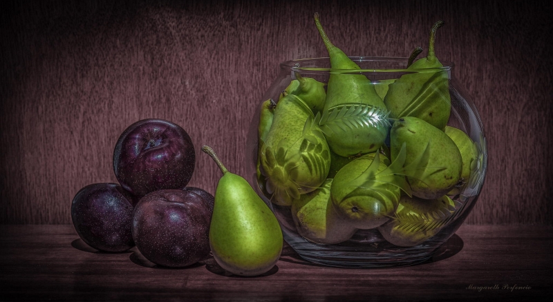
Still-Life Photography by Margareth Perfoncio
São Paulo photographer Margareth Perfoncio’s still lifes of food and flowers—Old Master light, dark wood, and tables that feel inevitable.
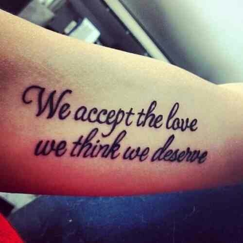
Meaningful Love Quotes for Inspiration (and Ink)
Meaningful love quotes that still feel true — short lines for tattoos, gifts, and everyday reminders, with placement and wording tips.
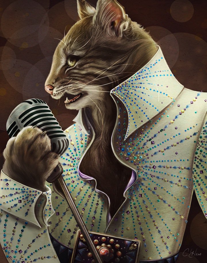
Christina Hess’s Animals From History: Costumed Pets as Playful Portraits
Illustrator Christina Hess reimagines historical icons as ornate animal portraits—Elvis Petme and friends—mixing puns, costume detail, and soft history lessons.