
Inspirational Food Photography: Light, Styling, and Appetite
How to shoot food that looks truly edible—sidelight, hero hierarchy, angles, props, and timing—so your plates inspire hunger instead of looking staged.
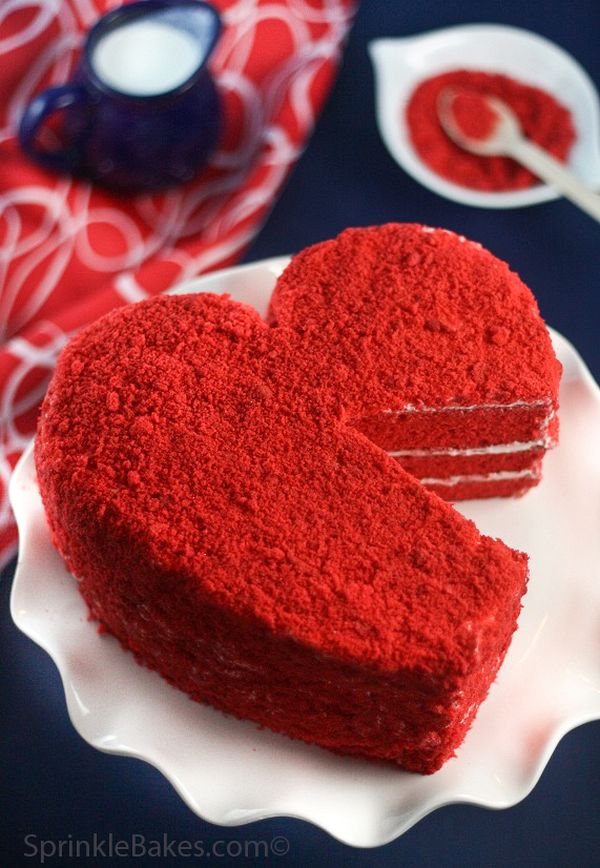
Food looks different when someone has taken the time to see it. A torn loaf, a glossy berry, steam lifting from a bowl—ordinary kitchen facts become appetite and atmosphere once light, angle, and styling agree. Inspirational food photography is less about perfect plating contests and more about noticing texture, color temperature, and the small human traces that make a dish feel edible rather than staged for a catalog.
Whether you shoot for a blog, a restaurant menu, a personal project, or weekend curiosity, the same craft questions return: What is the hero ingredient? Where does the light come from? What can leave the frame? This piece walks through those decisions and keeps one strong image as a reminder that delicious photographs start with looking, not with gadgets.
What “inspirational” means in a food frame
Inspiration in food photography is not a filter preset. It is the feeling that you could reach into the picture—that the crust would crack, the sauce would cling to a spoon, the citrus would smell sharp. Technical sharpness helps, but sensory suggestion matters more. Soft focus on a background herb, a slightly imperfect pour, crumbs on linen: these details signal life.
Study images that make you hungry and name why. Is it sidelight catching oil on greens? Is it a limited palette of browns and creams that feels bakery-warm? Is it height—looking down on a shared table versus meeting a layered cake at eye level? Collect those reasons as a personal brief. Random liking without language will not improve your next shoot.
Also notice what fails to inspire: flat overhead flash, plastic-looking color, overcrowded boards where every garnish screams, or food that has sat so long it looks tired. Inspiration includes knowing what to refuse.
Light before lenses
Most memorable food photos are lighting decisions first. Window light from the side or slight back angle sculpts volume on bread, pasta, and glazed surfaces. Front-facing hard light flattens. Direct noon sun through a bare window can bleach highlights on white plates; a sheer curtain or moving the setup a meter deeper into the room often restores gentle contrast.
Decide early whether you want bright and airy or moody and intimate. Bright scenes need careful whites—plates, napkins, marble—so they stay clean without blowing out. Moody scenes need a reason for shadow: a darker backdrop, a smaller light source, deeper bowls that hold darkness. Mixing both moods in one chaotic setup usually produces muddle.
Reflectors can be simple: a white card opposite the window to lift shadow sides of a cake; a black card to deepen contrast if the dish looks washed. You do not need a studio kit to learn these moves. You need patience to watch how steam, glaze, and cut surfaces change as clouds pass.
Choose one hero and protect it
Every strong food photograph has a hierarchy. The hero might be a single slice with visible layers, a skillet still sizzling, or a drink with condensation. Supporting players—cutlery, cloth, secondary plates—should guide the eye toward that hero, not compete for equal attention.
Ask: if I blur everything slightly in my mind, what shape still reads? That shape should be your subject. Crop tighter when the table story is noise. Pull back when context—morning newspaper, garden table, busy brunch—is part of the appetite. Context is a choice, not a default.
Color hierarchy works the same way. One saturated accent (a strawberry, a chili oil swirl, a bright citrus wedge) can animate a neutral plate. Three competing brights often cancel each other. When styling, remove one colorful item and see if the frame calms down. Restraint reads as confidence.
Angle: overhead, three-quarter, and eye-level
Overhead (flat lay) suits patterned spreads, pizza geometry, cookie grids, and anything whose interest lives in arrangement across a plane. It struggles with tall layer cakes and stacked burgers unless you accept a graphic, almost diagrammatic look.
A three-quarter angle—slightly above and to the side—is the workhorse for bowls, plated dinners, and anything with depth. It shows height and surface at once. Eye-level or near eye-level flatters towering subjects and drink layers; watch the background carefully so a busy kitchen does not steal the pour.
Try the same dish at two angles before you commit to styling complexity. Sometimes the food itself tells you which viewpoint wins. A soup may need the spoon break of a three-quarter view; a tart may sing from above where pastry pattern shows.
Styling that still looks edible
Food styling for photographs walks a line between care and honesty. Wipe plate rims. Choose the side of the cut that shows the best crumb or melt. Replace wilted herbs. But avoid building a sculpture nobody would serve. Viewers forgive imperfect edges; they distrust food that looks like polymer.
Texture is your ally. Torn bread beats perfectly sliced sameness. A cracked pepper finish, a drip of honey, a flake of salt catching light—these micro-moments sell taste. Matte ceramics often photograph more kindly than glossy white restaurant plates that bounce hotspots, though high-gloss can work when you control specular highlights deliberately.
Hands in frame—tearing, pouring, sprinkling—add scale and timing. Motion blur on a pour can feel alive if the dish itself stays sharp. If you include people, keep skin tones natural and avoid turning the shot into a lifestyle ad unless that is the assignment.
Surfaces, props, and negative space
Backdrops and surfaces set era and mood: worn wood for rustic baking, cool stone for seafood and citrus, dark metal for chocolate and coffee, pale linen for spring produce. Rotate a small set of surfaces rather than buying endless props. Familiarity with how each surface takes light will improve shots faster than novelty.
Props should earn their place. A fork that points toward the hero helps; five mismatched vintage spoons usually do not. Glassware needs clean edges and intentional condensation—not accidental fingerprints. Napkins introduce softness and color temperature; wrinkled linen often feels more human than hotel-sharp folds.
Negative space is not emptiness to fear. Breathing room around a bowl can feel luxurious. Crowding every corner is a common beginner reflex. If the composition feels anxious, remove an object before you add another.
Color, white balance, and appetite
Appetite responds to plausible color. Overcooked greens that go neon, bread that turns orange, or meat that shifts toward gray will unsettle viewers even if they cannot name the problem. Set white balance for your light source and check a neutral plate or napkin as a reference.
In editing, lift shadows gently if the dish disappears, but keep contrast where gloss and crust need bite. Oversaturation is a frequent spoiler—especially reds and oranges. Stop when the food still looks like something you would eat tonight, not like a candy commercial.
Black-and-white food photography can be striking for high-texture subjects (crusty bread, espresso crema, grilled marks), but most inspirational food work stays in color because hue carries flavor expectations. Choose mono when form and light are the story; stay in color when ingredient identity matters.
Working with steam, melt, and timing
Some dishes have a short photographic life. Ice cream, soufflés, seared steaks, and anything that weeps or wilts demand a shooting order. Style the set first with stand-ins if needed, set exposure, then bring the hero food at the last minute. Have backups of critical garnishes.
Steam reads as freshness but dissipates fast; a dark background and backlight help it show. Melted cheese and broken yolks look best in the first moments—plan the bite or pull before you shoot a dozen safety frames of a dead plate.
If you are photographing for yourself, cook for the camera in stages. Roast vegetables can be finished under a broiler for color just before the click. Sauces can be reheated. Bread can be refreshed briefly in a warm oven. The craft is partly culinary stage management.
Building a personal library of references
Save images that teach, not only images that impress. Note lighting direction, prop count, and whether the crop is tight or generous. Over time you will see your taste: maybe you love dark European bakery moods, or bright Mediterranean salads, or minimal Japanese plating. Lean into a lane long enough to get good, then expand.
When you study a favorite frame, recreate its lighting with a cheap stand-in meal. Matching light teaches faster than matching recipes. Once you can reproduce a mood on demand, your own dishes will start to look intentional.
Share work with people who cook or shoot, and ask specific questions: Does this look hot? Does the hero read? Is the color believable? Vague praise does not sharpen a craft.
A practical shoot sequence
- Pick one dish and one mood (bright or moody).
- Set surface and backdrop; remove extras.
- Find sidelight; fix white balance on a neutral object.
- Choose angle with a quick test shot of a stand-in.
- Plate the hero; add one accent garnish; wipe rims.
- Shoot a tight set, then one wider context frame.
- Edit lightly for appetite; stop before plastic color.
Inspirational food photography is a habit of attention: noticing when oil shines, when crumbs help, when the frame is already full. Keep the light honest, the hero clear, and the styling edible. The picture above is a reminder of that standard—food that still looks like supper, only seen with care.

Comments
Continue reading
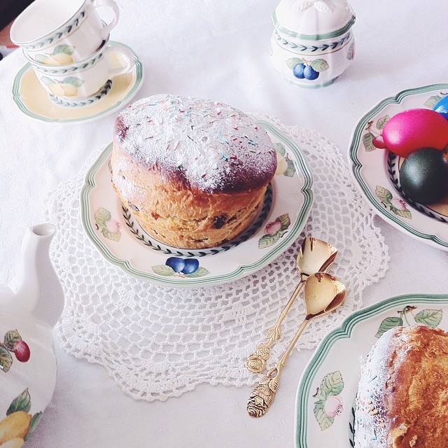
Svetlana Karner’s Food Photography: Appetite and Memory
Vienna-based photographer Svetlana Karner styles bright, nostalgic food images—plum cake included—where recipes feel like family stories.
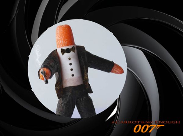
Food Photography by Vanessa Dualib: Playful Produce Characters from São Paulo
Vanessa Dualib’s humorous food photography turns groceries into characters—craft, casting, and light behind the São Paulo artist’s playful stills.
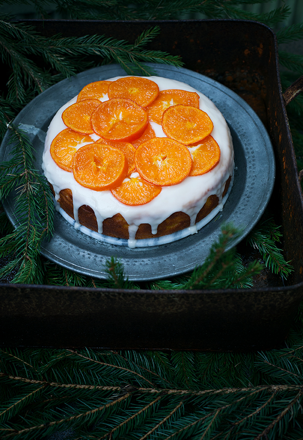
Call Me Cupcake: Linda Lomelino’s Food Photography and Sweet Still Lifes
Swedish baker-photographer Linda Lomelino’s Call Me Cupcake world—soft light, cupcakes and layer cakes, and still-life craft from blog to early cookbooks.