
Fabio Di Corleto’s Swapped Social Logos
Naples designer Fabio Di Corleto remixes social-app marks into uncanny hybrids—Swapped Logos that test how well you actually know the brands on your phone.
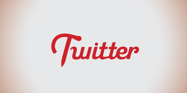
Brand marks live in muscle memory. You do not “read” the Facebook blue box or the Google letter colors so much as recognize them in a blink, the way you recognize a friend’s silhouette across a station. Italian designer Fabio Di Corleto built his late-2013 project Swapped Logos to interrupt that blink. Mixing names, type, and graphic systems from major social apps and platforms, he produced a set of hybrids that look almost right until the brain catches the fraud. The joke is sharp; the design lesson is sharper.
What the swap actually does
Published on Behance in November 2013, Di Corleto’s series was framed plainly: a review and mix of the main logos of social apps and platforms. The mechanic is consistent. Take the visual clothing of Brand A—color field, wordmark logic, icon habit—and dress Brand B inside it, or braid the two until neither owns the result cleanly. Because the source systems are already overlearned from phones and browsers, the hybrids trigger a double take. Recognition fires; literacy stumbles; you laugh, then you stare.
At the time, Di Corleto was a young designer studying new technologies at the Academy of Fine Arts in Naples, working across illustration, graphic design, and character design. Swapped Logos sits at the illustration-design overlap: not a corporate rebrand proposal, not pure cartooning, but a conceptual remix that uses polish as the delivery system for confusion. The cleaner the craft, the more convincing the impostor. That is why the set still works as a teaching object. Sloppy parody only proves you can be silly; precise hybrid work proves you understand the systems you are bending.


Why social logos were the perfect prey
By 2013, social and app marks had joined sneakers and soda in the pantheon of instant symbols. Unlike a local shop sign, they were global furniture for daily attention. That ubiquity is what makes the swap uncanny. When Di Corleto threads Google’s multicolor logic through another product’s name, or drops a familiar word into the wrong blue rectangle, the mismatch feels slightly illegal—as if someone edited culture while you were looking at your lock screen.
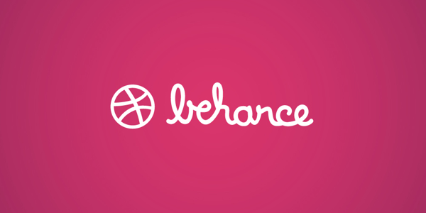
Pairs matter. Some swaps work because the brands already share a category—two video platforms, two messaging habits—so the hybrid feels like a sibling wearing the wrong jacket. Others work because the systems clash: a playful wordmark forced into a corporate slab, or a minimal icon language asked to carry a louder name. Coverage of the project noted how combinations such as long-form and short-form video marks, or search-and-social color systems, force a double reading. You think you know the logo until the letters refuse to match the costume. That refusal is the artwork’s real medium.


Design literacy as a prank
Good logo swaps are not random mashups. They require the designer to understand which parts of a mark carry identity: exclusive colors, distinctive letter shapes, icon silhouettes, corner radii, the ratio of word to symbol. Di Corleto’s pieces succeed when those DNA strands remain recognizable while the organism becomes new. That is adbusting energy without needing a protest caption. The critique is perceptual. If identity is this easy to unseat, how much of “brand” is careful design—and how much is mere repetition burned into users?
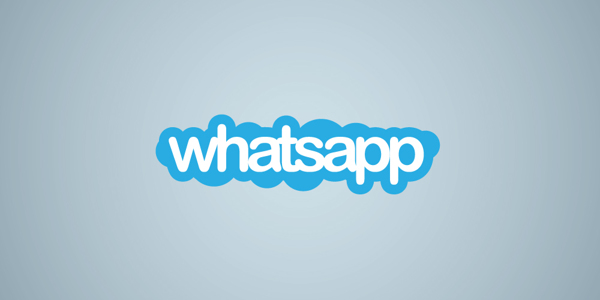
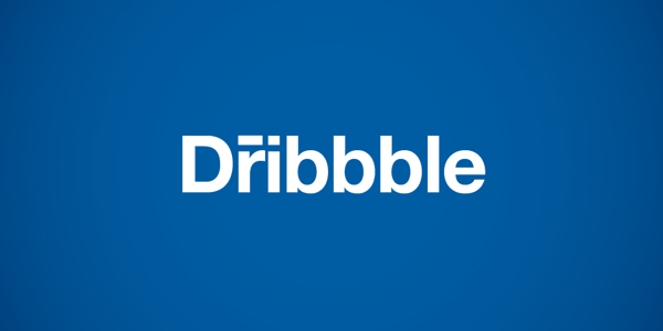
There is also a quiet tutorial for students. To swap convincingly, you must redraw with respect. Lazy pastiche looks like a meme template; careful hybrid work looks like an alternate timeline in which a product meeting chose differently. Illustrator craft—clean vectors, balanced spacing, color fidelity—turns the joke into an object worth saving. The gallery below rewards zooming in, not only skimming for the gag. Look at kerning. Look at how a borrowed blue behaves when the wrong letters inhabit it. Those details separate a clever concept from a finished series.

How to look without spoiling the fun
For each image, try a three-step read. First, name the costume: which brand’s visual system seems to be hosting? Second, name the guest: which product’s words or symbols have moved in? Third, notice the seam—the place where the hybrid almost fails and therefore becomes interesting. That seam is where design education hides. Spacing that feels slightly wrong, a color that belongs to the wrong sibling, an icon that no longer means what the letters claim—these frictions are the point.
Compare two swaps that share a parent brand. Does one feel friendlier because the host system is rounder and brighter? Does another feel more corporate because the host is a rigid blue slab? You will start to see identity as a kit of parts rather than a sacred monogram. That is useful even if you never design a logo. It makes you a harder person to hypnotize with interface chrome. Brand fluency becomes conscious instead of automatic—and automatic fluency is exactly what most apps rely on.



Context: remix culture meets brand pantheon
Swapped Logos landed in a decade already fluent in remix—memes, bootleg merch aesthetics, parody accounts, and student projects that treated famous marks as public playground equipment. Di Corleto’s contribution was execution plus focus. By limiting the field to social apps and platforms, he mapped a single ecosystem of attention rather than scattering across every famous trademark on earth. The set becomes a portrait of early-2010s digital life: the icons that mediated friendship, search, video, and chat, suddenly wearing each other’s clothes.
The project also ages in a useful way. Some of the platforms in the mix have since changed marks, faded, or been absorbed. Looking back, the swaps document a moment when those shapes felt permanent. Permanence was always a user illusion. Designers knew marks iterate; Di Corleto made the instability visible by forcing iteration sideways instead of forward. Sideways change is more revealing than a scheduled rebrand. It shows which traits were sticky enough to survive transplantation.

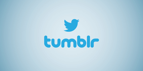
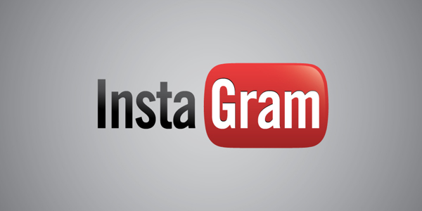

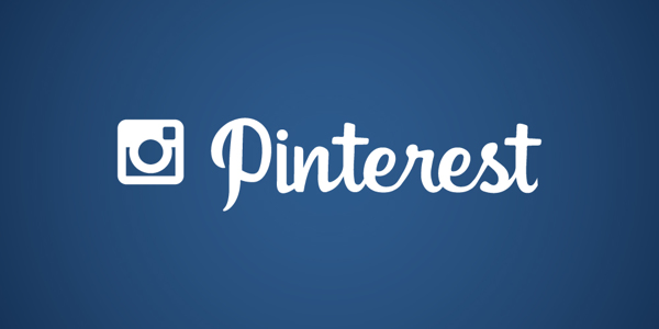
A five-minute exercise
Pick one swap from the set and write two columns: “belongs to costume” and “belongs to guest.” List colors, letterforms, icon traits, and emotional tone under each. Then invent a third column—“what the hybrid accidentally invents”—for qualities neither parent fully owned. That third column is often where the piece stops being a prank and becomes design research. Fabio Di Corleto’s series remains effective because it turns brand fluency against itself and leaves you slightly less automatic the next time a familiar blue square asks for your attention.

Comments
Continue reading
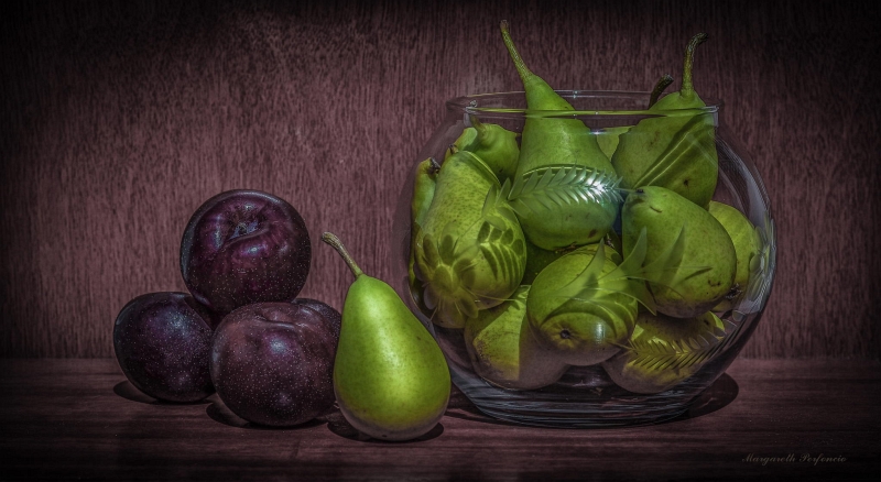
Still-Life Photography by Margareth Perfoncio
São Paulo photographer Margareth Perfoncio’s still lifes of food and flowers—Old Master light, dark wood, and tables that feel inevitable.
Meaningful Love Quotes for Inspiration (and Ink)
Meaningful love quotes that still feel true — short lines for tattoos, gifts, and everyday reminders, with placement and wording tips.
Christina Hess’s Animals From History: Costumed Pets as Playful Portraits
Illustrator Christina Hess reimagines historical icons as ornate animal portraits—Elvis Petme and friends—mixing puns, costume detail, and soft history lessons.