
Roman Numeral Tattoo Designs: Dates, Type, and Placement
Encode birthdays and milestones in Roman numerals with correct conversion, clear letterforms, and placements that keep the number readable.
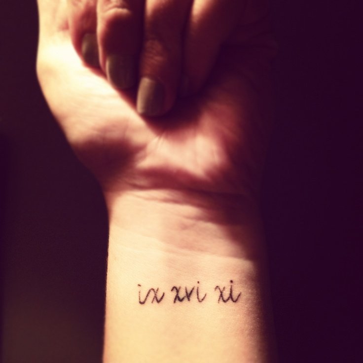
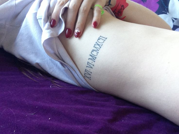
Roman numeral tattoos are a date-and-number craft more than a quote craft. Birthdays, anniversaries, coordinates stripped to digits, jersey numbers, and chapter markers become permanent when converted into I, V, X, L, C, D, and M—then set in a typeface that still reads when the skin moves. This gallery collects numeral-forward designs: clean solo dates, numerals paired with small symbols, and larger compositions where the number is the anchor. It is a design guide for encoding meaning in classical digits—not medical advice, and not a history lecture you must memorize before booking.
Unlike spine lettering, the job here is usually brevity and correctness. One wrong stroke order in a year can change the meaning. Unlike body-quote galleries, the “text” is a closed system of symbols with rules. Get the conversion right first; style second.
Convert the date correctly—then lock it
Write the Arabic numbers you care about, convert them carefully, and verify with more than one trustworthy converter or a reference chart. Common pitfalls include subtractive notation (IV versus IIII in clock-face tradition), year formatting, and leading zeros that do not exist in Roman form. If the date is a birthday, decide whether you want month-day-year, day-month-year, or year alone. Different cultures order dates differently; your skin should match the order you actually speak.
Print the final string large. Read it upside down and in a mirror. Have a second person check it. Artists catch many errors, but the emotional owner of the date should own the proofreading. Once the stencil is approved, that string is the design.
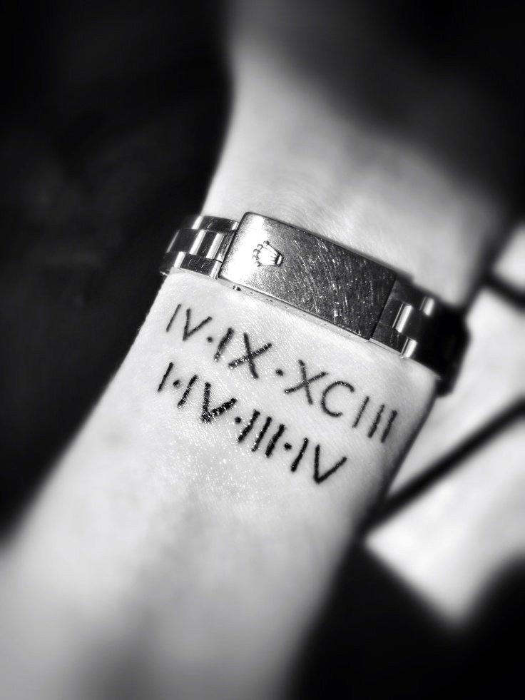
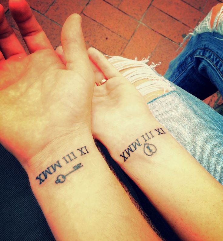
If multiple dates share one story—siblings’ years, a wedding and a child’s birth—decide early whether they live in one composition or as a planned series. Matching type across separate marks creates a family of codes; cramming three full dates into one tiny wrist usually costs clarity. Separators, small ornaments, or shared placement zones can link them without turning the skin into a spreadsheet.
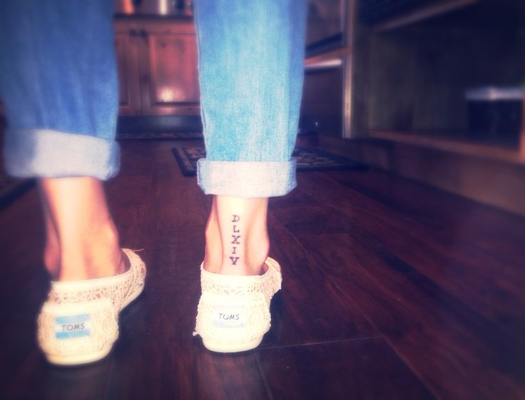
Typefaces built for Roman forms
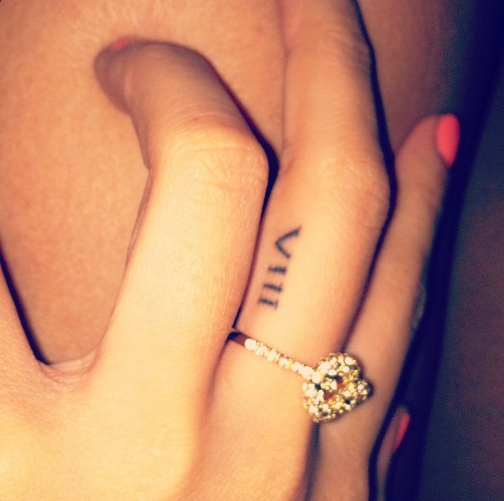
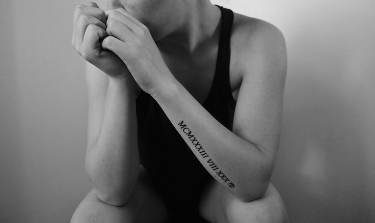
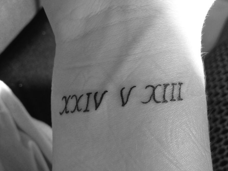
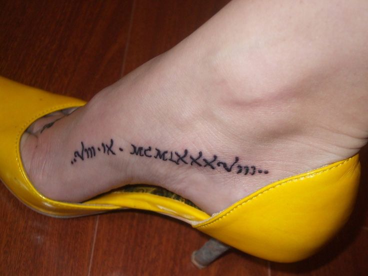
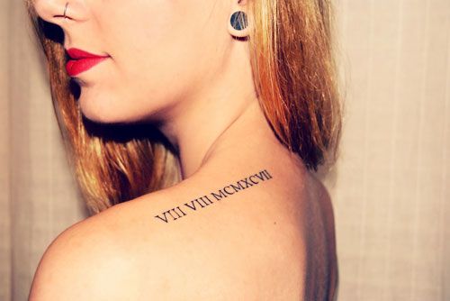
Roman numerals are mostly straight strokes and a few diagonals. Fonts with extreme flourishes can obscure V versus Y-like shapes, or turn X into decoration. Classic serif capitals, clean geometric sans, and restrained serif “inscription” styles often suit numerals because they echo carved lettering. Script numerals can work for short strings if the artist custom-draws each character for clarity rather than forcing a calligraphy font to behave.
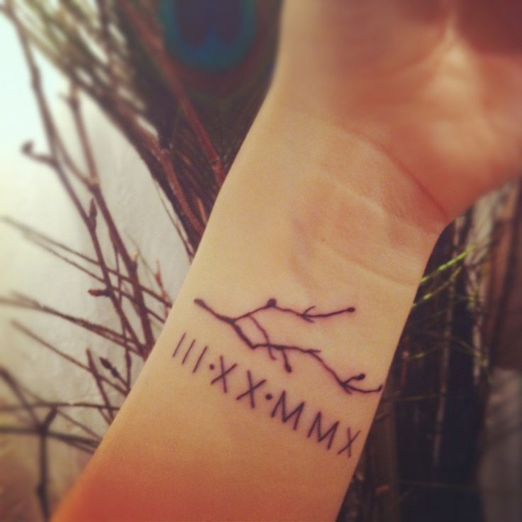
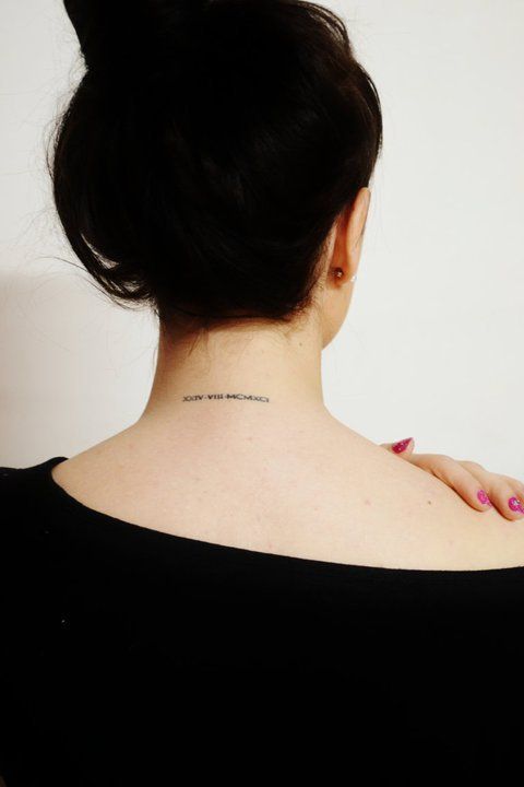
Letterspacing matters more than people expect. Tight tracking looks stylish in a logo and muddy at tattoo scale. Give I’s room so they do not read as a black bar. Keep V and X apertures open. If you add dots, bars, or underlines as separators between month and day, make them lighter than the numerals so the number remains the hero.
Custom-drawn numerals beat downloaded fonts that were never meant for skin. An artist who letters regularly will adjust stroke endings, serif size, and the width of M and W so the string feels even. Bring font inspiration as a mood, then invite redrawing. The goal is a date that reads at arm’s length in ordinary light, not only in a macro photo.
Placement for small codes versus statement numerals
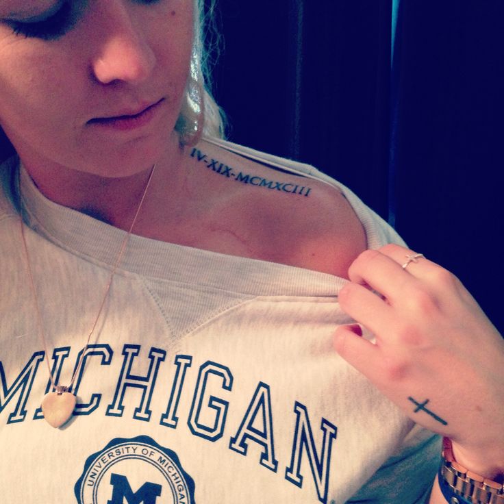
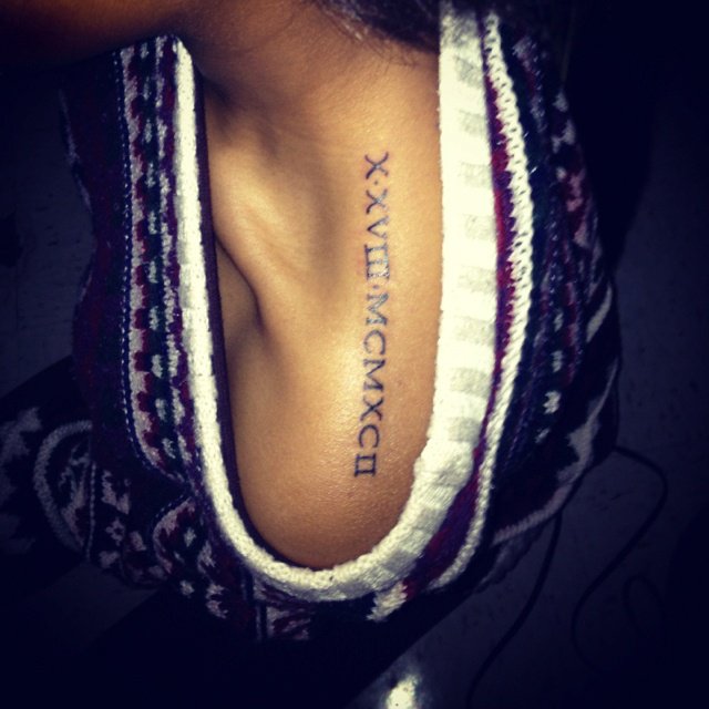
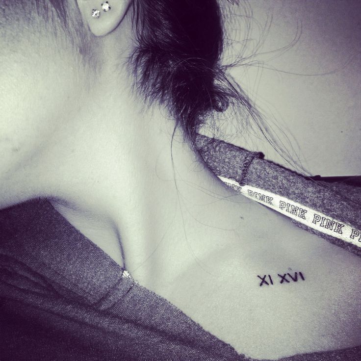
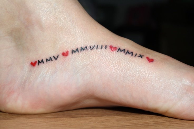
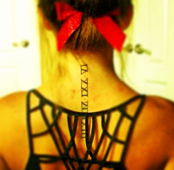
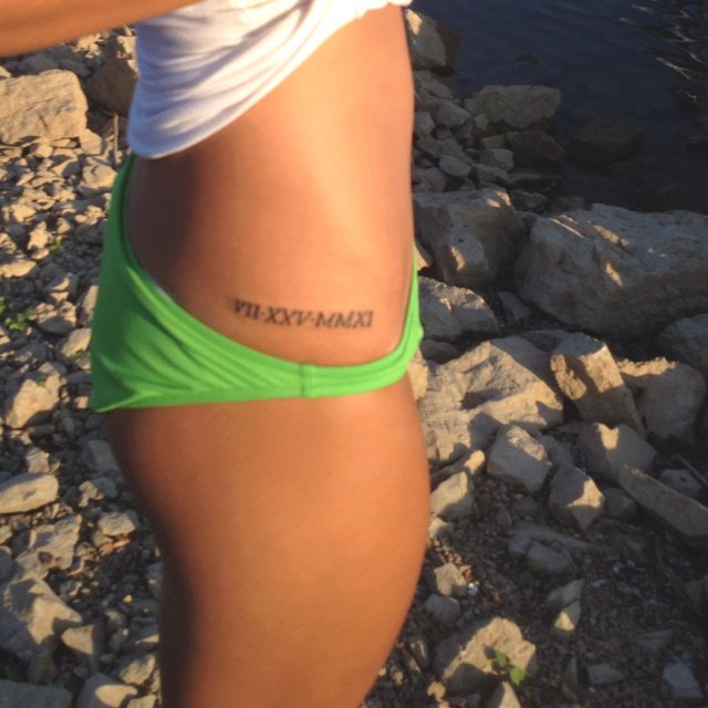
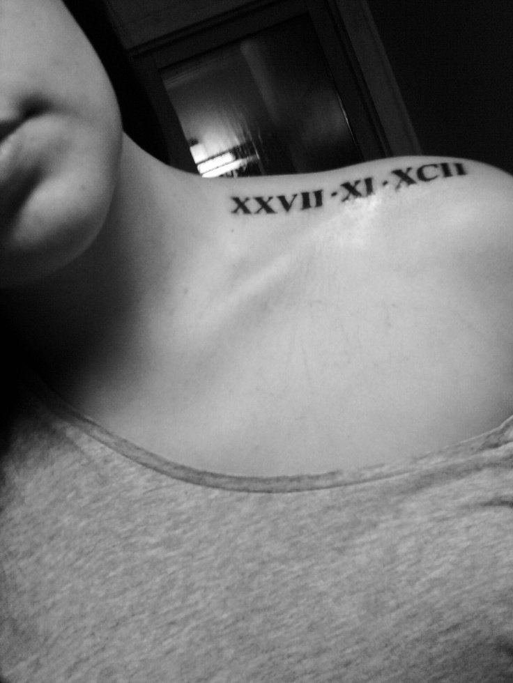
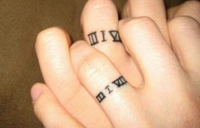
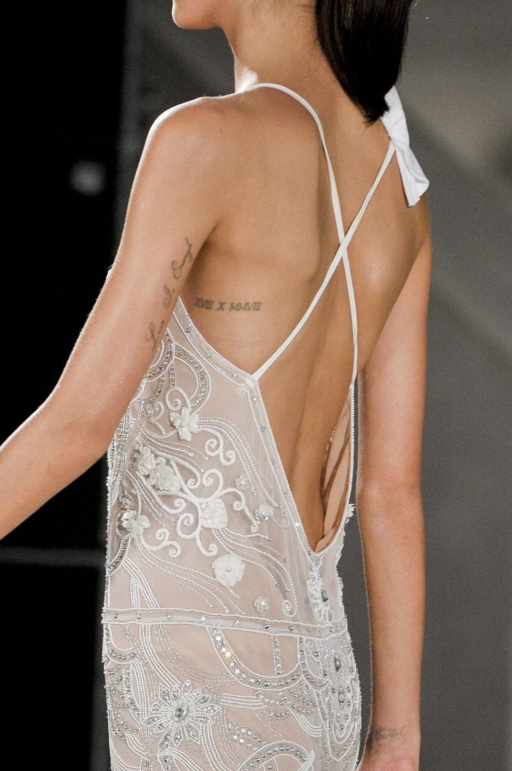
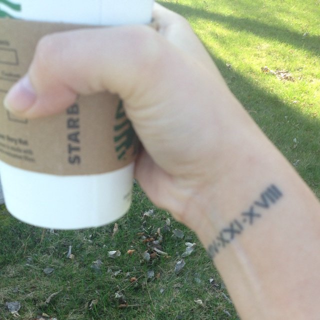
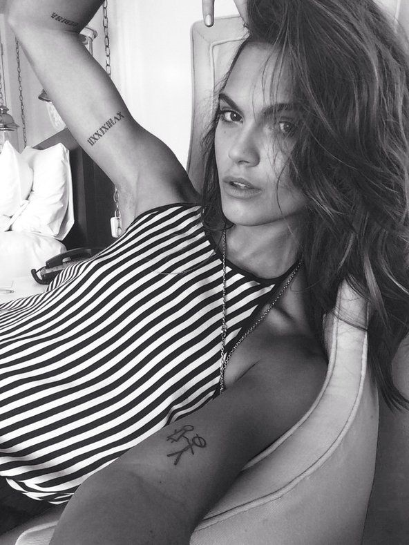
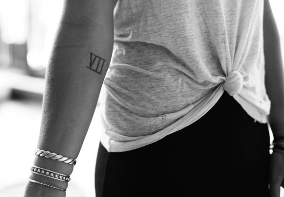
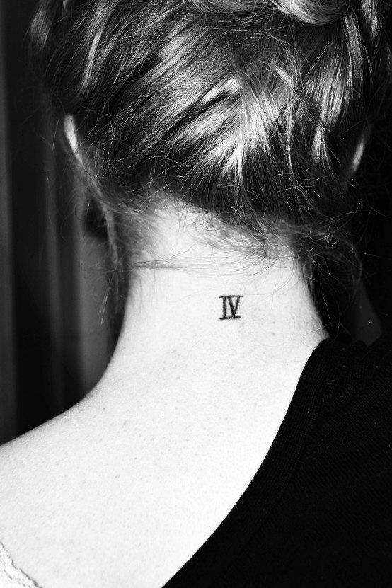
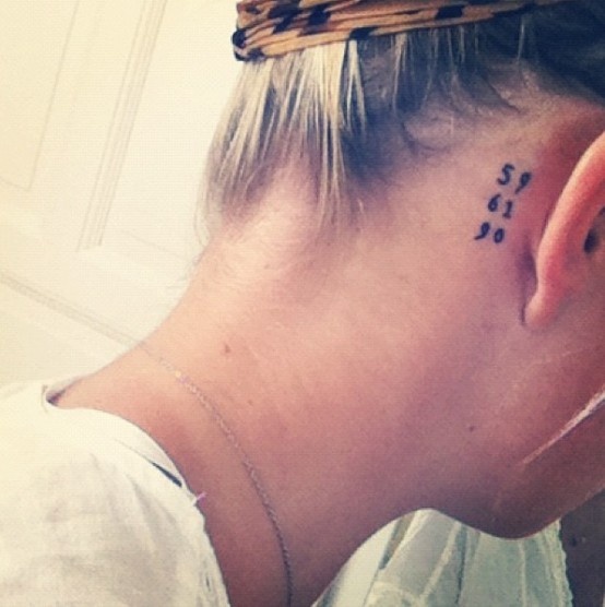
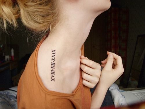
Roman dates shine in compact sites: inner forearm, wrist, ankle, behind the ear, along a finger (with realistic expectations about wear), over the heart, or as a discreet rib line. Small sites favor short strings—year alone, or a tightly spaced full date. Large sites—chest, thigh, outer arm—can carry taller capitals or numerals integrated into a shield, wreath, or blackwork frame.
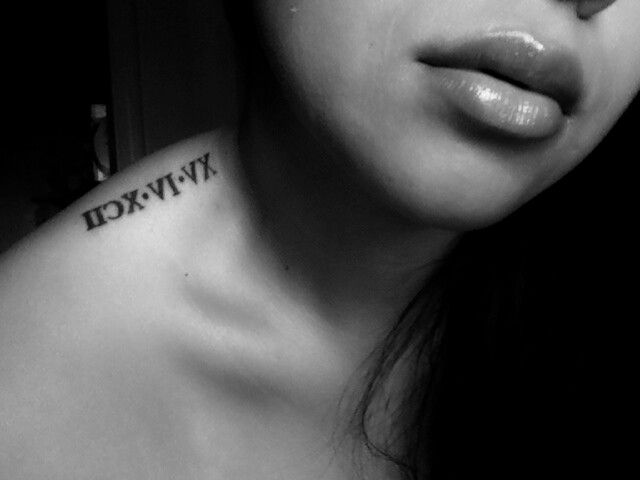
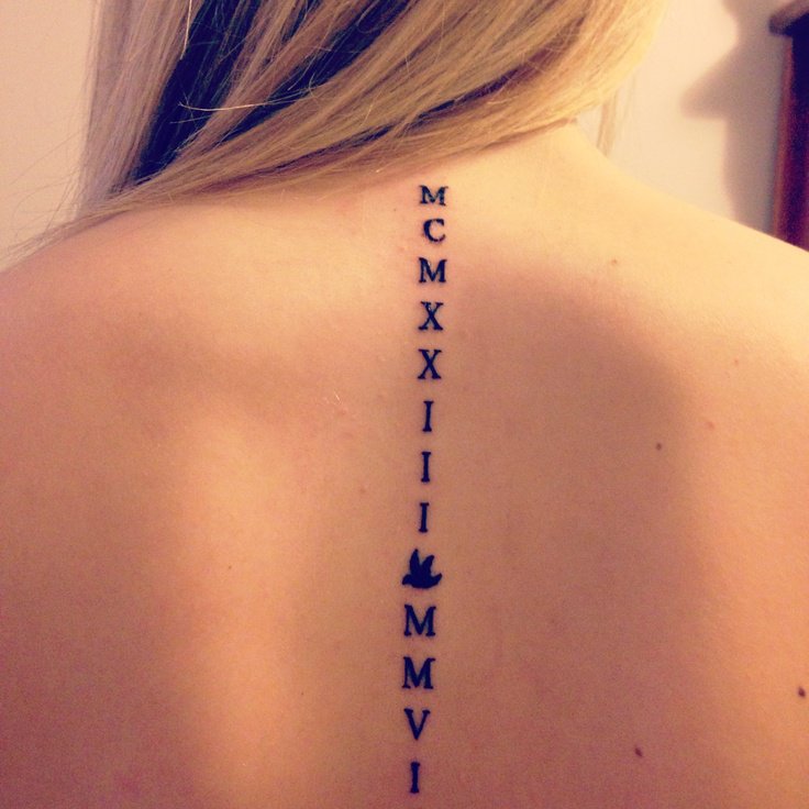
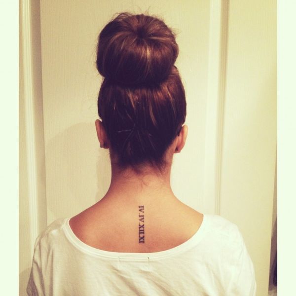
Think about orientation. Horizontal dates read like a headline. Vertical stacks of characters read like a seal. Curved placements along a collarbone or rib need custom kerning so the string does not look accidentally warped. Ask for a stencil test in the pose you live in, not only standing stiff for a photo.

Pairing symbols without burying the number
Hearts, stars, semicolons, tiny botanicals, crowns, and geometric brackets appear often with numeral tattoos. Used lightly, they personalize. Used heavily, they turn the date into background noise. A good rule: if you cover the ornaments with your thumb and the numerals still feel complete, the hierarchy is healthy. If the date disappears without the doodles, simplify.
Some people combine Roman numerals with a short word—names, “always,” coordinates’ place names. Keep language and numerals in related weights so the piece does not look like two tattoos colliding. Bilingual or mixed-script designs need an artist comfortable with both systems.
Ordinary Arabic numbers and hybrid looks
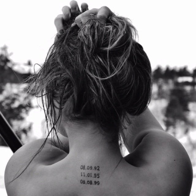
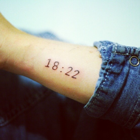
Not every meaningful number must be Roman. Arabic numerals can feel modern, sporty, or quietly literal. Hybrids—Roman year with Arabic day—rarely look intentional unless designed as a clear system. Pick one numeric language for the core memorial and stick to it. If you love both, separate them on the body rather than forcing a mashup in one tiny wrist piece.
Clock faces, chapter headings, and outline “stone carving” effects are stylistic cousins of Roman numeral tattoos. They still depend on the same clarity test: can a stranger identify the number at a glance? Decorative serifs that close counters fail that test over time.
Aging, contrast, and size honesty
Fine hairline numerals look elegant fresh and can lose definition if they were sized for a trend photo rather than for skin. Slightly bolder strokes and sensible minimum heights help dates stay readable. Sun exposure and friction zones change contrast over years; that is ordinary wear. Choose artists whose healed numeral work you have seen—fresh black always looks sharper than reality.
White ink, pastel washes, and ultra-light gray washes behind numerals are artistic choices with different longevity profiles. Ask to see healed examples of the exact approach. This page will not prescribe aftercare chemistry; follow your studio’s instructions.
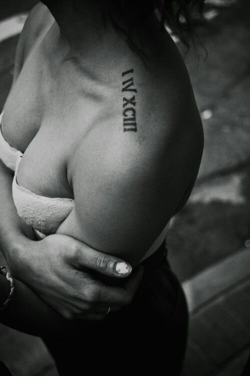
Consult checklist for numeral tattoos
Bring the date in Arabic and Roman, the order you want, and three type references. Mark placements on photos of your own body. Say whether the piece must stay workplace-quiet. Budget for custom lettering rather than flash that almost matches. If multiple dates belong to one story—children’s birth years, for example—decide whether they share one composition or separate marks with a planned relationship.
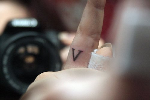
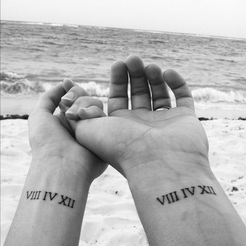
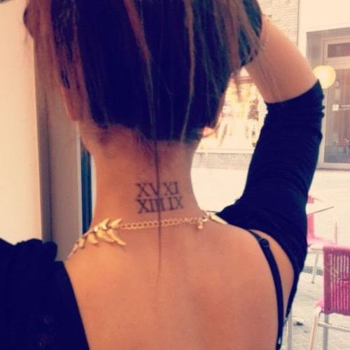
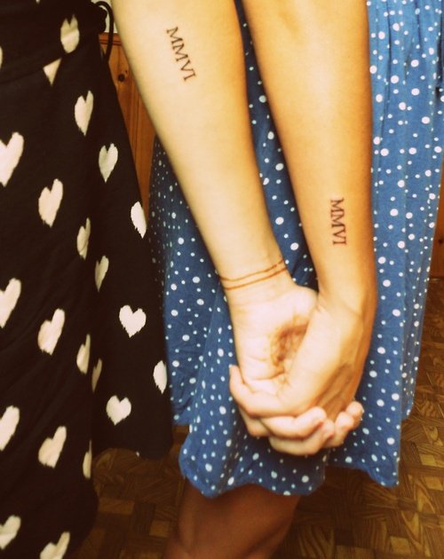
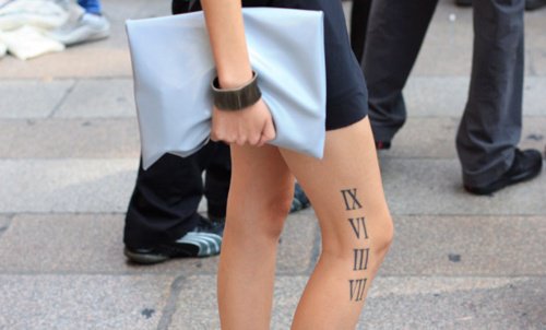
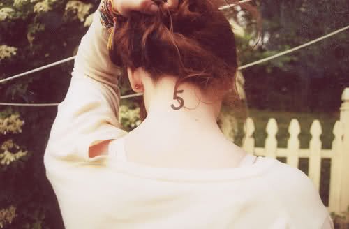
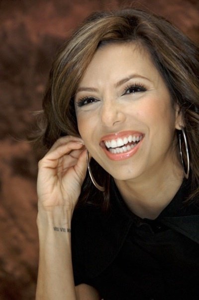
Roman numeral tattoos earn their keep when the number is true, the type is clear, and the placement matches how private or public you want the memory to be. Use this gallery to study scale, ornament restraint, and how different bodies wear classical digits. Then leave with a verified string and a type direction—not only a feeling—so the ink encodes what you meant on purpose.

Comments
Continue reading
Meaningful Love Quotes for Inspiration (and Ink)
Meaningful love quotes that still feel true — short lines for tattoos, gifts, and everyday reminders, with placement and wording tips.
40 One-Word Tattoo Ideas: Placement, Type, and Meaning
A gallery of single-word tattoos—love, faith, strength, wanderlust, and more—with guidance on typography, body placement, and choosing a word that still fits years later.
16 Taurus Tattoo Ideas: Bulls, Glyphs, and Venus-Inspired Ink
Sixteen Taurus tattoo directions—from minimal glyphs and constellation maps to floral bulls and bold blackwork—plus placement and artist tips for lasting earth-sign ink.