
Very French Gangsters: Kids Eyewear with Fashion Attitude
Very Boss, Very Bombe, Very Panpan—how the French kids’ eyewear label turned acetate frames into a playful fashion lookbook for ages 3–10.
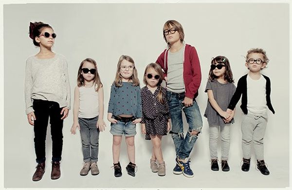
Very French Gangsters did not begin as a novelty slogan. In the early 2010s, two professionals working in children’s fashion looked at the eyewear aisle and saw the same gap: frames for kids aged roughly three to ten that felt stylish rather than apologetic. Corrective glasses were treated like medical hardware. The brand’s answer was blunt and playful at once—treat kids’ eyewear as a fashion accessory with attitude, made to be worn with pride at recess.
The name nods to the documentary title A Very British Gangster, flipped toward France and childhood mischief. “Gangster” here is costume and swagger, not crime romance: little rebels in acetate, not a lifestyle manual. From the first collection shown to opticians in 2012, the line leaned bold in shape and color, “anti-soppy” by design, and rooted in French manufacture rather than anonymous mass import.
What follows is a creative kids-fashion and photo feature: how a niche eyewear label used photography, naming, and silhouette to change how children’s glasses look in pictures—and on faces. It is not a hairstyle tutorial, and it is not adult streetwear cosplay. It is a lookbook story about frames small enough for children and big enough in character to steal a portrait.
Three early styles: Boss, Bombe, Panpan
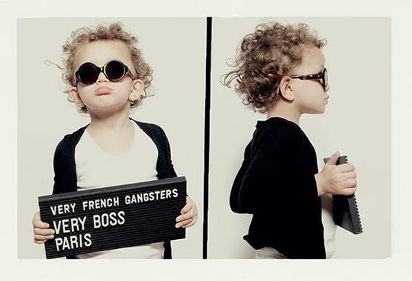
The early collection distilled into three named characters—Very Boss, Very Bombe, and Very Panpan—each with a vocabulary parents and kids could argue over together. Naming mattered. Instead of clinical model numbers alone, the frames arrived with personalities, closer to fashion SKUs than pharmacy stock.
Very Boss suggests structure and authority in miniature: cleaner lines, a frame that can look almost executive on a small face. It photographs well with simple knits and collared shirts, the “tiny editor” energy of kids’ fashion campaigns.
Very Bombe leans rounder, punchier, more comic-book graphic. The silhouette reads playful without dissolving into cartoon plastic. It is the frame that makes a portrait feel designed rather than documentary.
Very Panpan carries a mischievous, comic-strip cadence in the name—playful onomatopoeia more than menace. In lookbooks it often reads as the cheeky middle sibling of the trio—distinct enough to recognize across a campaign grid.
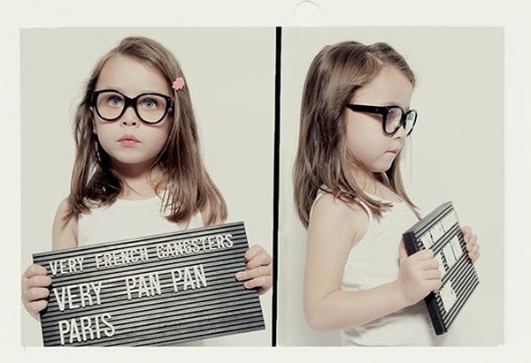
Those three names also solved a retail conversation problem. Opticians could hand a child two or three strong options instead of a wall of beige ovals. Parents got a compromise language: style the adult eye notices, comfort and durability the child will actually keep on. Founders spoke about wanting frames that could move from sunny weekends to city school days without looking medical—an everyday fashion problem dressed up as a gangster joke.
Why the photography feels like fashion, not a catalog
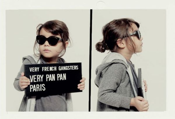
Kids’ product imagery often defaults to white seamless backgrounds and forced smiles. Very French Gangsters campaigns pushed toward fashion editorial codes: attitude in the pose, deliberate wardrobe, color stories, and a sense that the glasses are the hero accessory rather than a problem to disguise. Children appear as characters—styled, directed, allowed a little insolence.
That choice is strategic. If the goal is to move glasses from “prosthesis” to “accessory,” the pictures must look like clothing campaigns. You see coordination with coats, hats, patterns, and outdoor light. The frames sit in a full outfit ecosystem. Once a child sees themselves as stylish in the mirror, compliance stops being a lecture and starts being identity.
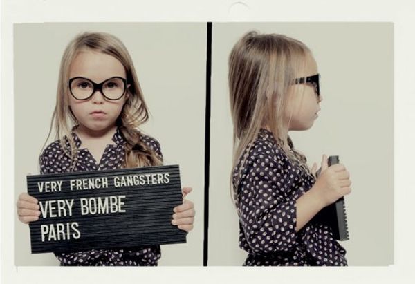
Look across the set and you notice recurring ideas: strong contrast between face and frame color; outfits that do not compete with the acetate; compositions that treat the child as a model with agency. Even when the mood is playful, the craft is adult—framing, styling, and finish taken seriously. Soft nursery pastels are largely refused. Deep tortoiseshell, graphic black, and saturated solids do the talking.
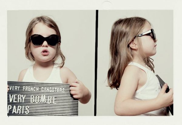
Made in France as part of the aesthetic
From early on, production was tied to family workshops in Oyonnax, in the French Jura—historic country for eyewear manufacturing. Acetate frames, flexible hinges suited to active wearers, and a repair-minded approach sit behind the rock-and-roll naming. “Made in France” here is not only a label claim; it is part of why the objects photograph with a certain density and color depth that cheap injection-molded toys rarely match.
For a fashion feature, that material story matters because acetate takes dye and polish in ways that read on camera. Tortoiseshell, deep blacks, bright solids—these are the same visual pleasures adult fashion eyewear sells, scaled and tuned for smaller faces. The brand later expanded into broader collections and sunglasses with serious UV categories, but the founding idea remains visible in these early images: high-end kids’ frames without the nursery palette.
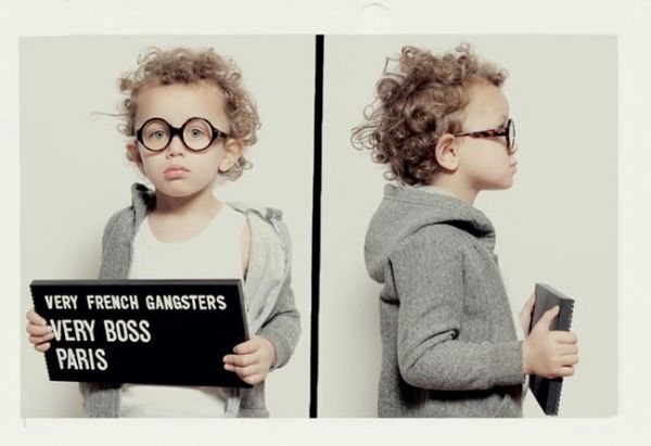
What parents were actually buying
Beyond the lookbook glamour, the practical pitch was simple. Children remove glasses they hate. Frames that feel like a costume they chose—and that parents find handsome—are more likely to stay on during school and sport. The “gangster” humor made the category less heavy for families navigating a first prescription. Style became a negotiation tool instead of a fight.
Optician partnerships mattered too. Technical fit still belongs to professionals; the brand’s job was to widen the emotional range of what “kids’ glasses” could mean. That division of labor—craft at the bench, attitude in the campaign—is why the project landed as both product and cultural object in early-2010s design coverage. You could discuss hinge quality and still enjoy the photos as fashion.
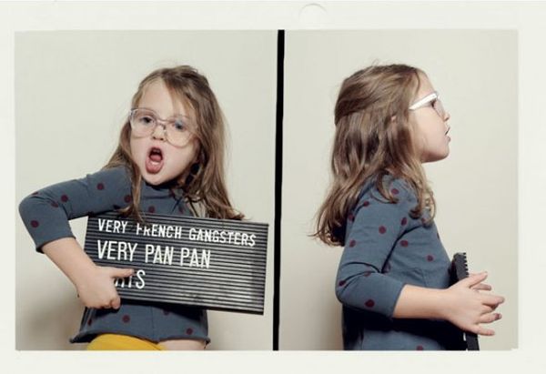
How to read this as a design story
If you collect references in kids’ fashion, file Very French Gangsters beside other projects that refused the pastel default: bold knitwear labels, miniature tailoring, sneakers treated as design objects. The innovation is not inventing glasses; it is refusing the visual shame that used to surround them.
Scan the photographs for three things: silhouette of the frame against the face, color relationship to the outfit, and whether the child looks directed or diminished. In the strongest frames, the wearer looks in on the joke. That is the brand’s lasting fashion argument—small faces, large personality, and eyewear as the detail that makes the whole look click.
Boss, Bombe, Panpan: three names, one thesis. Kids’ optical can be as intentional as adult ready-to-wear if someone bothers to design—and photograph—it that way.

Comments
Continue reading
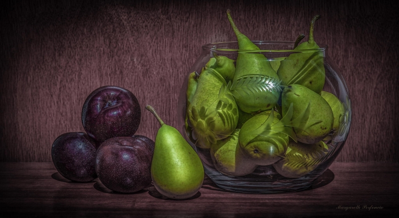
Still-Life Photography by Margareth Perfoncio
São Paulo photographer Margareth Perfoncio’s still lifes of food and flowers—Old Master light, dark wood, and tables that feel inevitable.
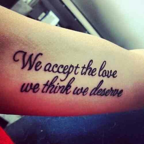
Meaningful Love Quotes for Inspiration (and Ink)
Meaningful love quotes that still feel true — short lines for tattoos, gifts, and everyday reminders, with placement and wording tips.
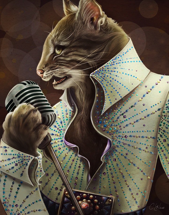
Christina Hess’s Animals From History: Costumed Pets as Playful Portraits
Illustrator Christina Hess reimagines historical icons as ornate animal portraits—Elvis Petme and friends—mixing puns, costume detail, and soft history lessons.