
24 Clever Print and Ambient Ads That Trust the Viewer
From Frontline’s mall-floor fleas to LEGO shadows and Jeep parking stunts—twenty-four print and ambient ads that finish the idea in the viewer’s head.
In print and ambient advertising, agencies are stuck with a beautiful constraint: one still image (or one place) must carry the whole idea. There is no autoplay, no carousel, no “swipe up for more.” The work counts on intelligence—visual puns, borrowed environments, and typography that behaves like a plot—because the viewer will not wait for a second explanation. Smart pictures attract attention and, when they are honest about the brand or the cause, they harden into a kind of public art. The twenty-four examples below keep the original gallery and treat each piece as craft: what turns, why it sticks, and how little copy is required once the thought is true.
Across flea floors, coffee cups, gym cranes, and climate hourglasses, a shared rule appears. The clever ad finishes inside the audience’s head. The logo arrives late, small, and inevitable.
1. Frontline mall-floor fleas
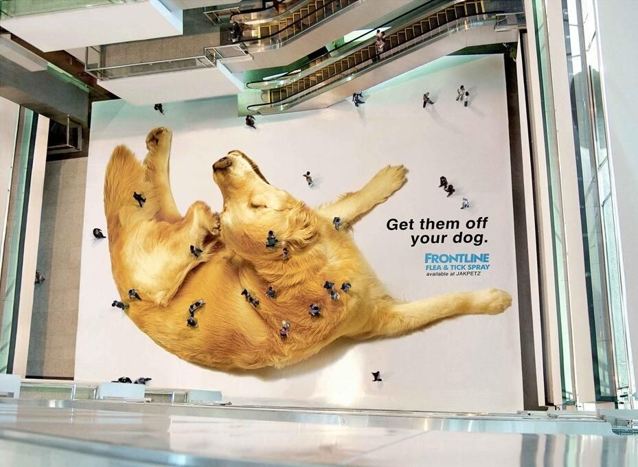
A giant golden dog scratches across a shopping-mall atrium; from the upper levels, pedestrians shrink into fleas on fur. Scale and viewpoint do the selling before “Get them off your dog” and the Frontline lockup appear. Ambient media wins when the building’s architecture supplies the punchline—here, elevation turns shoppers into pests without a single animated flea.
2. Van Gogh Museum Café cup
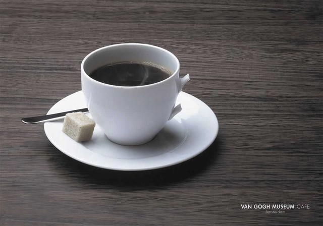
A white cup sits with its handle snapped to stubs—an ear joke told through porcelain. Negative space and a quiet “Van Gogh Museum Cafe / Amsterdam” credit trust cultural literacy. The wit stays gentle: dark biography as café wink, not a lecture. Minimal props (sugar cube, spoon tip) keep the frame from apologizing for the gag.
3. Tattoo studio QR skill test
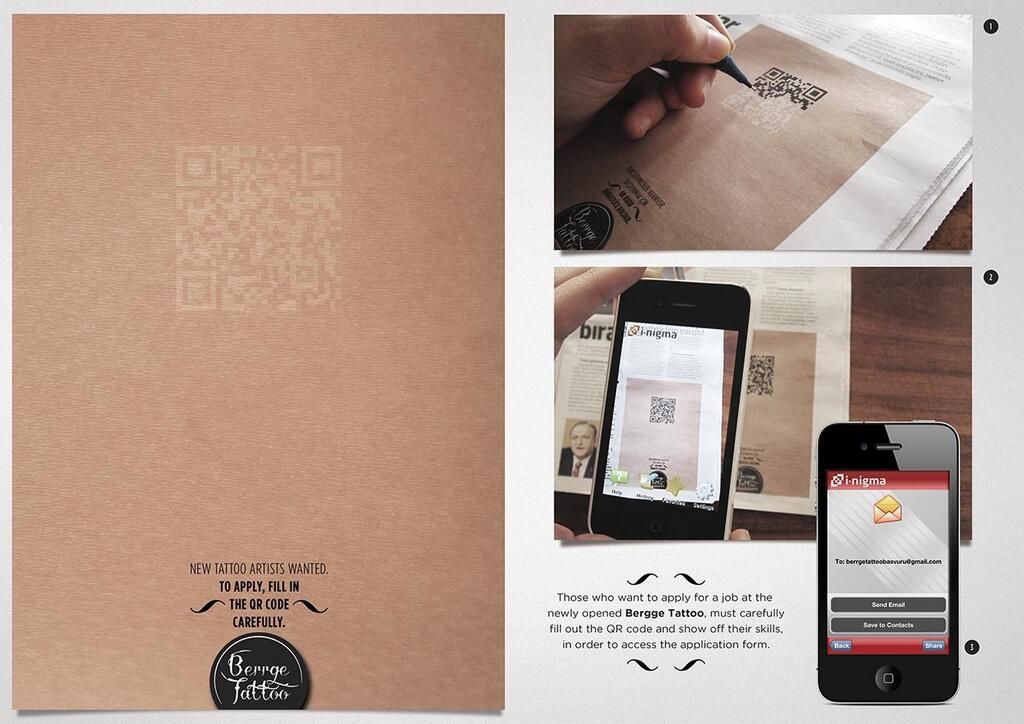
Berrge Tattoo prints a faint QR code and asks applicants to fill it carefully before scanning. The barrier is the audition: steady hands unlock the form. Print stops being a poster and becomes a filter for the exact motor skill the job needs—recruitment as craft test, not keyword spam.
4. El Colombiano “slide to unlock”
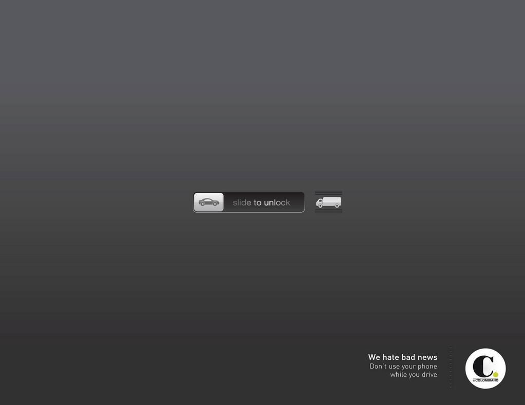
A phone slider sends a car icon toward a truck silhouette: unlocking equals collision. “We hate bad news / Don’t use your phone while you drive” fits a newspaper’s voice—they report the wrecks. Familiar UI chrome borrowed for PSA gravity proves how a mundane gesture can be restaged as fatal stakes.
5. Vermont smoke fetus
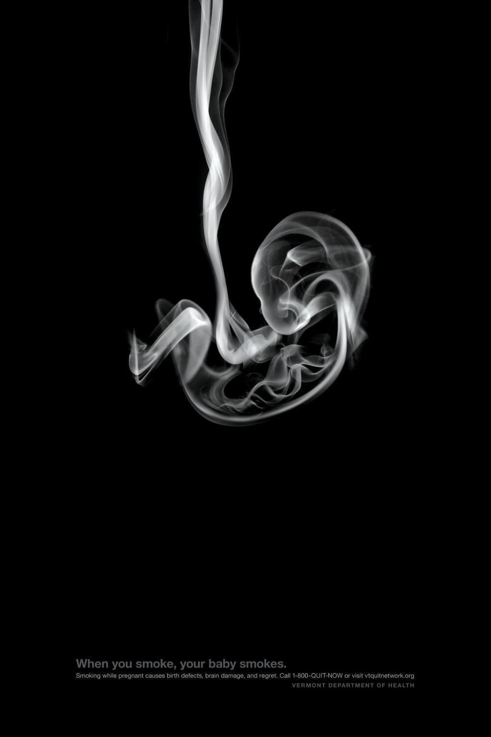
A plume of smoke curls into a fetal silhouette on black: “When you smoke, your baby smokes.” The Vermont Department of Health lets the substance of harm become the picture of the victim. Somber craft, short quit-line copy, and almost no decoration—hard to unsee, which is the point of public-health print.
6. Jeep impossible parking spots
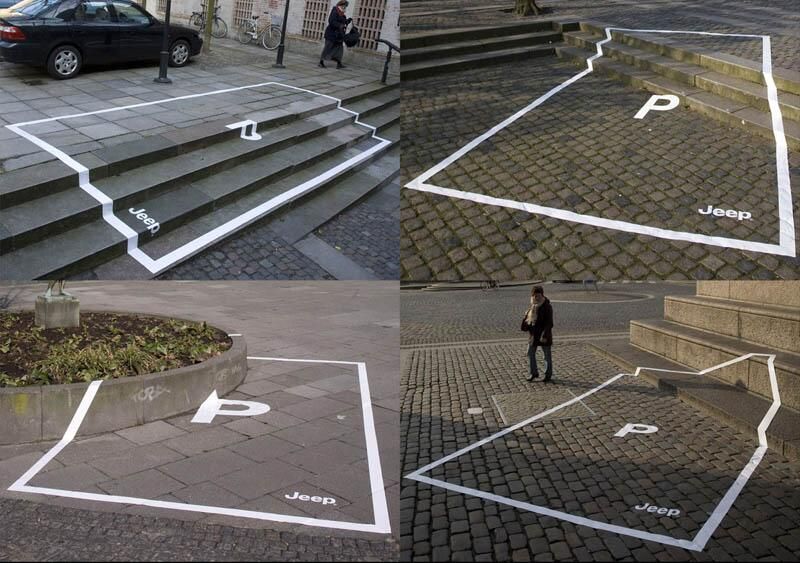
White parking outlines climb stairs, cobbles, and planter walls with a “P” and Jeep mark inside. Capability without showing the vehicle. Ambient lines turn city texture into brand proof: if the stall is absurd for a sedan, it is exactly right for the myth Jeep sells.
7. Advertisers Without Borders ocean blanket
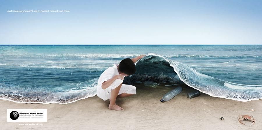
A child lifts the sea like a sheet and reveals bottled trash on the sand. “Just because you can’t see it, doesn’t mean it isn’t there.” Invisible pollution made literal; the headline only restates what the picture already proves. Surreal photography in service of an NGO message.
8. Volkswagen autocorrect wheelchair
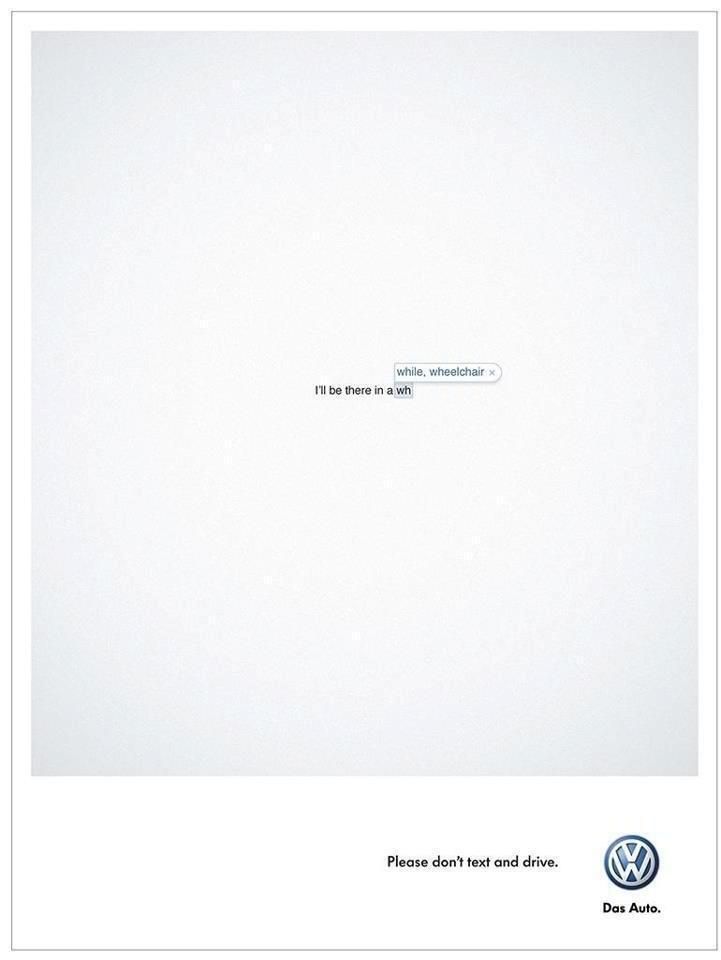
“I’ll be there in a wh—” floats on white, with autocorrect offering while or wheelchair. One UI bubble carries the whole don’t-text-and-drive PSA for Volkswagen. Emptiness is not wasted inventory; it isolates the dread so the brand tagline can stay small and serious.
9. Sprite beach soda-fountain showers
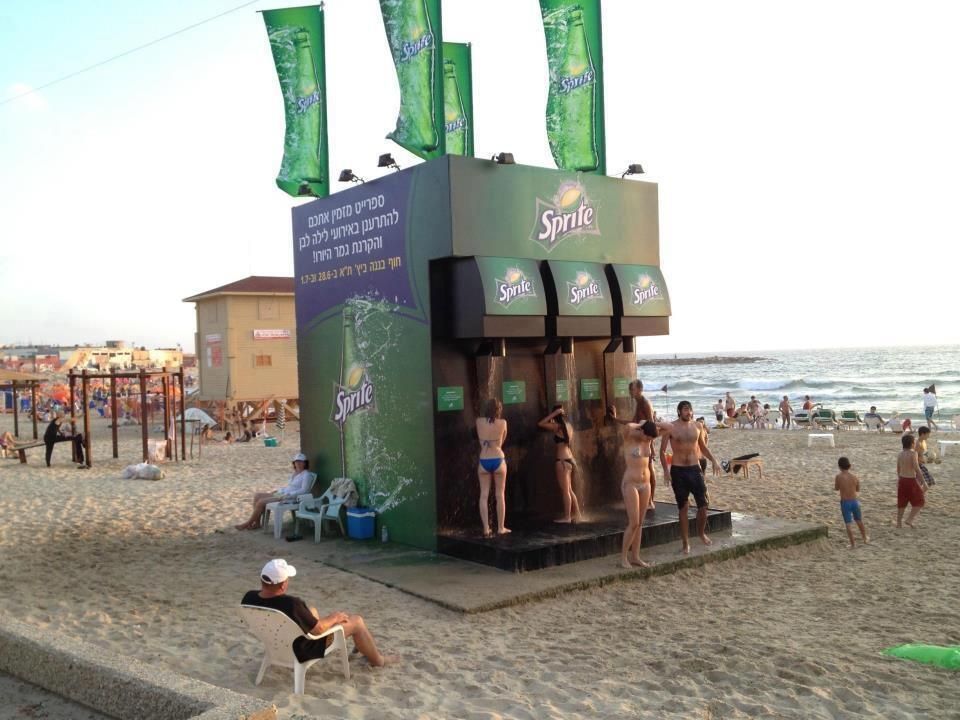
Oversized fountain levers on a beach kiosk dispense rinse water instead of soda. Product silhouette becomes public utility under heat and sand. Experiential branding that aligns refreshment with a service people actually queue for—clever because useful.
10. WMF knife cuts the board
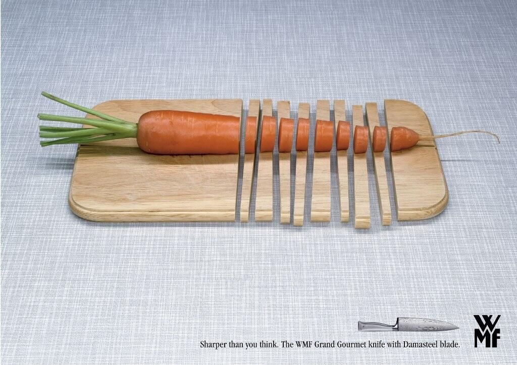
Carrot rounds align with sliced strips of the wooden board itself. Hyperbole for Damasteel sharpness without centering a hero product shot. “Sharper than you think” confirms what the impossible cut already claimed—show the result, then name the tool.
11. Bosch IXO wood-grain whirlpool
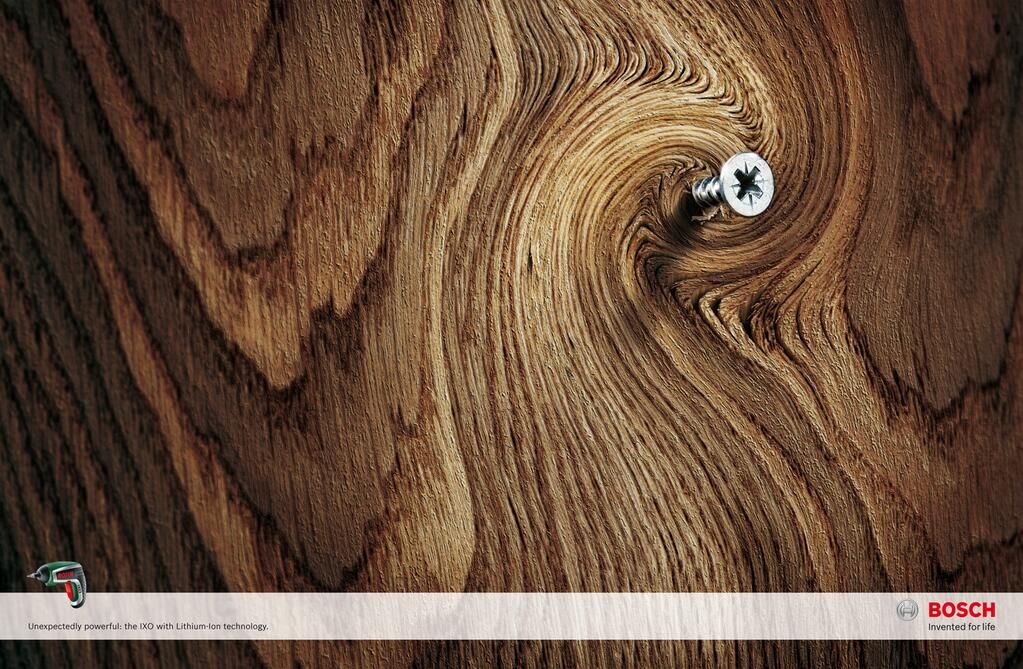
Grain swirls into a vortex around one Phillips screw—torque made visible for the compact IXO. A tiny tool icon and “Unexpectedly powerful” ride the photograph instead of replacing it. Visual physics sells lithium muscle better than a spec sheet.
12. Aquafresh sleep masks on mouths
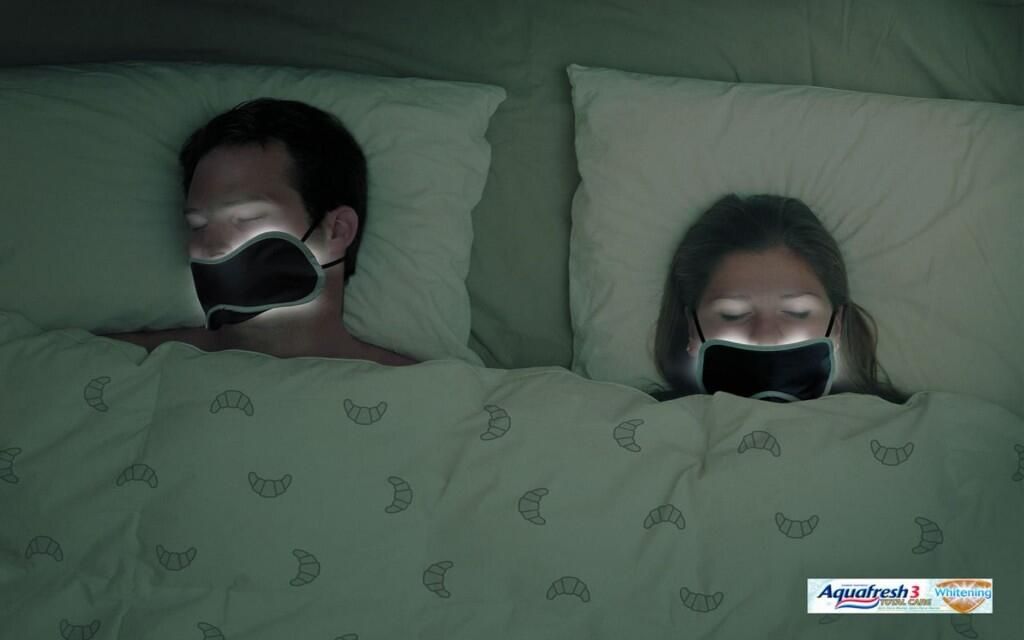
A couple sleeps with masks over mouths that glow white: whitening so bright it needs blackout. Surreal bedroom humor for a commodity claim. The Aquafresh lockup stays corner-small while the joke does the demonstration work.
13. LEGO jet shadow
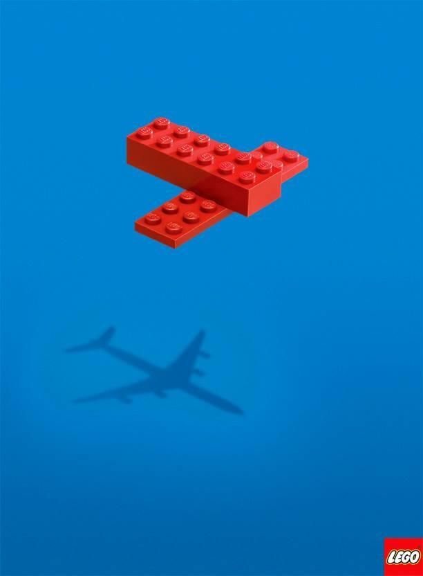
Three red bricks cast an airliner shadow on blue sky. Imagination is the product benefit; almost no copy appears beyond the logo. The gap between object and silhouette is the entire brief—child mind as brand territory.
14. Lotus biscuit coffee hug
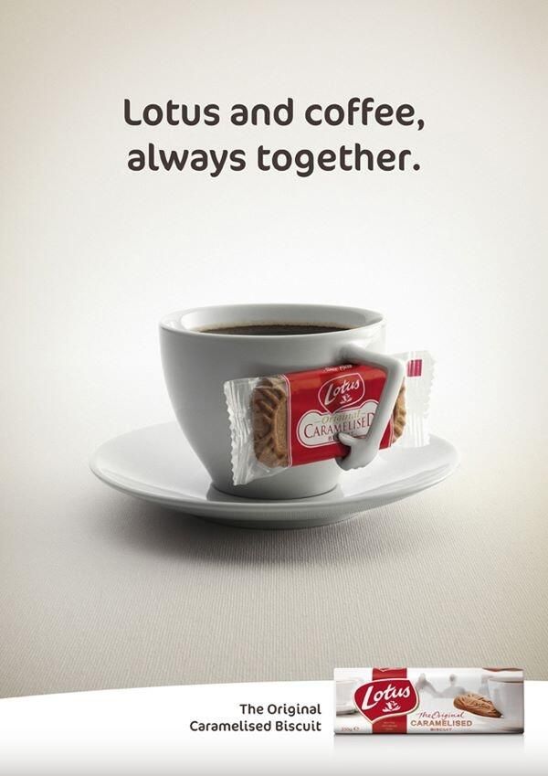
A cup handle becomes an arm clutching a wrapped Biscoff: “Lotus and coffee, always together.” Pairing ritual turned anthropomorphic prop. Soft sell for a habitual duo that cafés already understand—print simply makes the hug visible.
15. Powerhouse Gym crane cables
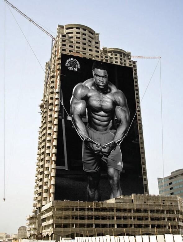
A building wrap aligns a cable-crossover pose with real crane lines overhead. Architecture finishes the workout. Strength claimed at city scale—the kind of ambient integration that photographs itself into legend.
16. Chupa Chups ants detour
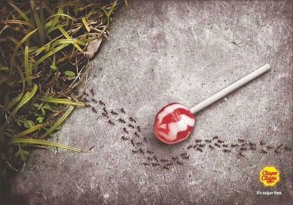
Ants curve around an unwrapped lollipop on concrete. “It’s sugar free” needs no nutrition table when nature refuses the bait. Funny, instant, brand-clear—proof by insect behavior.
17. Nike RUN bench without a seat
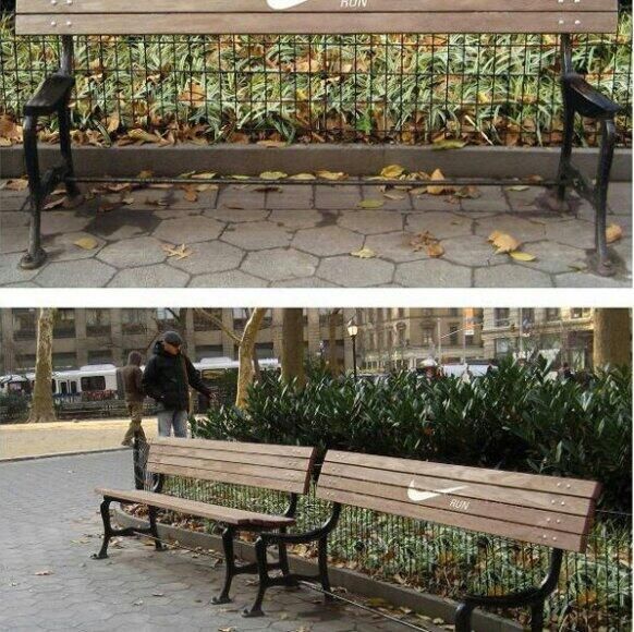
A park bench keeps the backrest, loses the seat, and prints swoosh plus RUN. Rest is not the option; the neighboring intact bench makes the edit obvious. Ambient object as slogan you can walk past twice before it clicks.
18. Nescafé Z-to-N grid
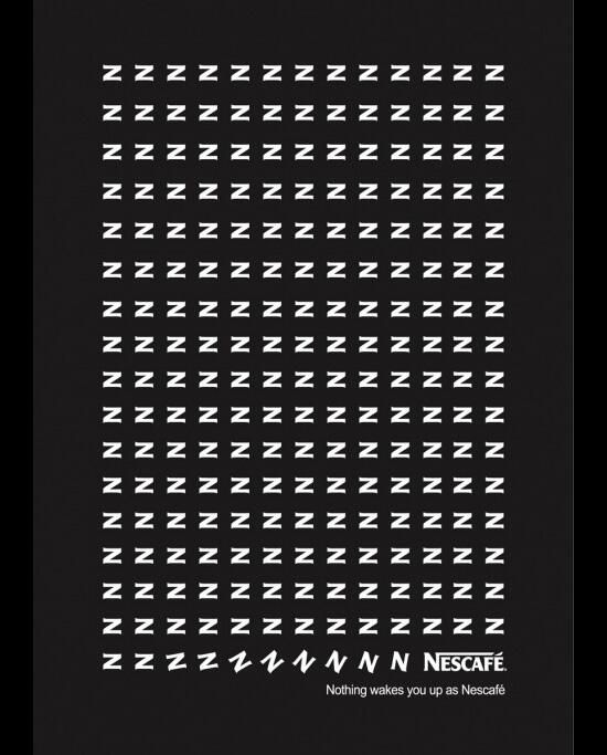
Rows of sleeping Z’s tilt into N and the Nescafé wordmark. Typography as wake-up narrative on black. “Nothing wakes you up as Nescafé” seals a letter trick that barely needs photography.
19. Yoga Shelter vanishing prints
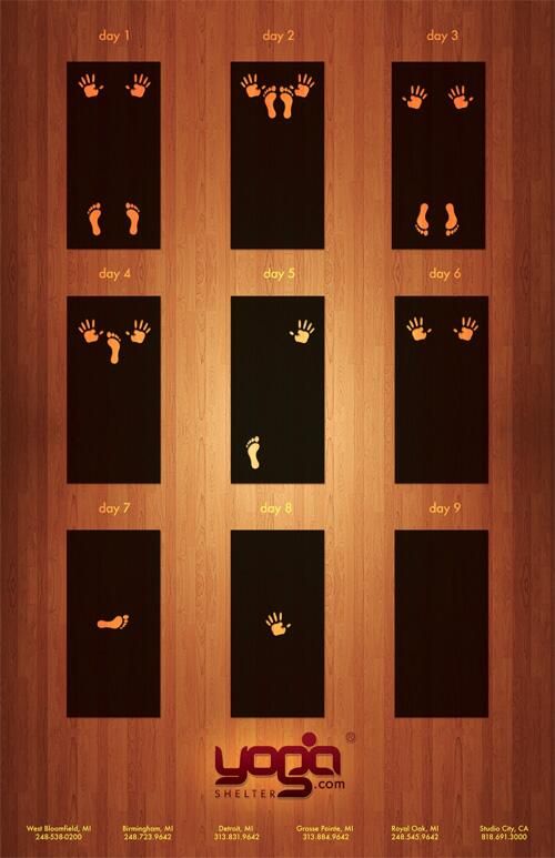
Nine mats track hand and foot prints thinning to empty day by day—practice until presence vanishes into stillness. Sequence storytelling on wood grain; humor with a spiritual wink and studio locations in the footer.
20. WWF suitcase blood trail
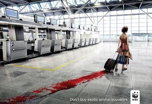
A traveler’s rolling bag leaves a blood streak across a sterile airport floor. “Don’t buy exotic animal souvenirs.” Mundane tourism meets visceral cost—a PSA that refuses polite understatement.
21. Climate hourglass
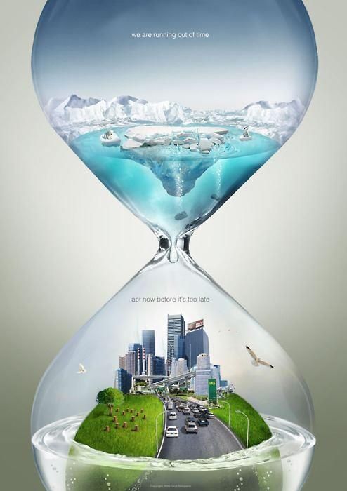
Melting Arctic drains into a flooding city inside one hourglass: cause, effect, and deadline in a single vessel. “We are running out of time” / “act now before it’s too late.” Conceptual environmental print at its clearest—time is the medium.
22. Glass cleaner goldfish helmet
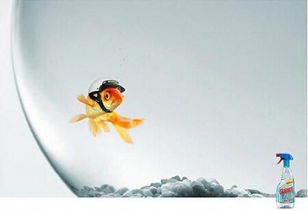
A goldfish wears a tiny motorcycle helmet because the bowl glass has become invisible. Clarity demonstrated by absurd safety gear; the spray bottle sits small in the corner. Demo by consequence, not by sparkle macro.
23. Axe exit-sign chase
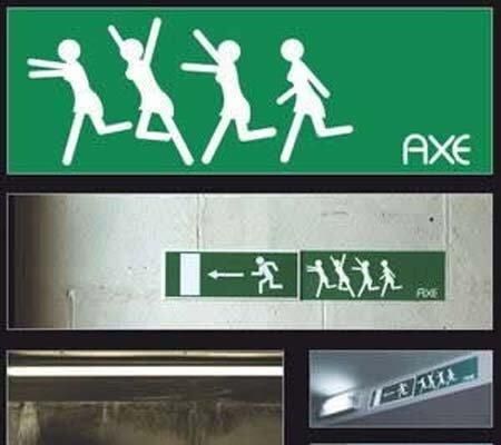
A custom green panel extends a real exit pictogram into a chase of stick-figure pursuers—the long-running “effect” joke in safety vernacular. Ambient comedy that only works flush against the official sign; remove the neighbor panel and the story collapses.
24. Hard Rock Cafe fork horns
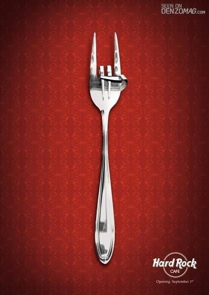
Fork tines bend into the “rock on” horns against damask red. Dining tool meets music myth; opening date and logo finish a poster that barely needs words. Object transformation as brand handshake.
Reading ads like a maker
What these twenty-four share is collaboration with the viewer. They borrow phone UI, park furniture, crane cables, ant trails, and exit icons because the world already speaks—clever print edits the sentence. Logo size shrinks when the idea is strong; it swells when the idea is weak. PSAs and soda showers obey the same physics: one turn, then silence.
Keep the gallery open when you brief the next campaign. Ask whether the concept still works if you delete half the copy, move the brand to a corner, or stage the joke in a place that is not a magazine page. If the answer is yes, you are closer to the kind of work this collection celebrates—ads that look like intelligence first, and inventory second.

Comments
Continue reading
30 Interesting Ad Ideas Worth Studying for Craft and Catchiness
Thirty advertising craft moves—visual puns, placement tricks, scale, typography, and honesty—paired with a gallery of clever ads built to stop the scroll.
20 Creative Advertising Moves Worth Studying
Twenty craft principles behind ads that stop the scroll—visual puns, medium-as-joke, scale, silence, honest demos, and endings where the brand is the punchline.
Faber-Castell True Colours: Pencils Sharpened from the World
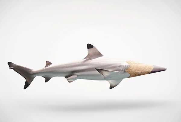
Serviceplan’s True Colours posters for Faber-Castell turn fire engines, sharks, and more into colour-matched pencil tips—an art-materials idea told without hard sell.