
30 Interesting Ad Ideas Worth Studying for Craft and Catchiness
Thirty advertising craft moves—visual puns, placement tricks, scale, typography, and honesty—paired with a gallery of clever ads built to stop the scroll.

Interesting ads earn a second look in a world that rarely offers a second chance. Catchiness stops the eye; humor, surprise, or craft makes the idea stick long enough to talk about. Promotion and public-awareness work both live or die on that short window of attention.
This gallery collects thirty advertising moves worth studying—visual wit, placement tricks, and idea discipline—paired with the frames that survived from the original roundup. Treat each image as a case study in stopping power, not as a product endorsement.
1. One idea, one glance
The strongest ads refuse to multitask. They dramatize a single promise until a stranger can retell it after one look. If a second benefit needs a footnote, the first idea is unfinished.

2. Make the medium part of the joke
Bus shelters, bottle necks, elevator floors, and magazine gutters can become props. When placement participates, the ad feels invented rather than pasted onto generic space.
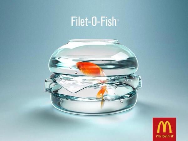
3. Prefer visual puns to lectures
A picture that completes a double meaning outruns a paragraph of claims. Both readings must be fair: literal image and brand meaning should click together without a caption rescue.
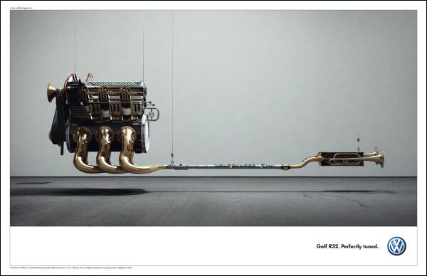
4. Surprise without punching down
Humor that humiliates a stereotype rarely becomes a classic. Aim for recognition—“I’ve felt that”—instead of a laugh that requires someone else to stay the butt of the joke forever.
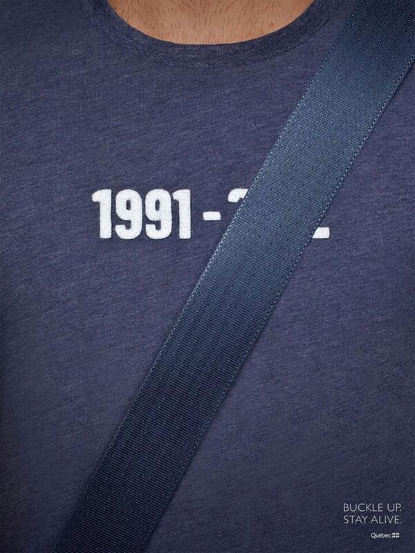
5. Play with scale
Giant everyday objects and miniature monuments reframe attention fast. Scale still works when tied to a product truth—big appetite, small price, tiny detail that matters—not when it is carnival décor alone.
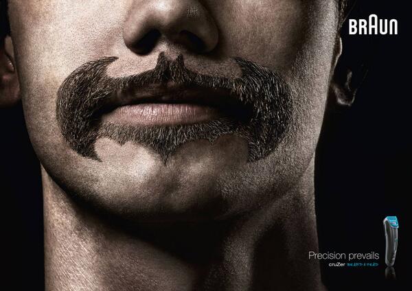
6. Leave the last beat for the viewer
Ads that finish every thought feel like ads. A missing word or half-open metaphor can persuade harder than a slogan that shouts the answer in advance.
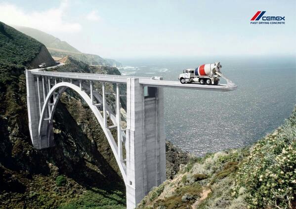
7. Treat white space as strategy
Emptiness is not wasted inventory. Calm fields of negative space can sell exclusivity, clarity, or dread. Crowded layouts often signal too many claims fighting for the same square inch.
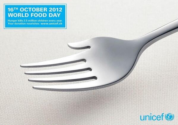
8. Compress a story into three seconds
Outdoor boards and social stills rarely get more than a glance. Design a micro-arc: setup, twist, brand reason. If the story needs a paragraph to unlock, it fails at street speed.
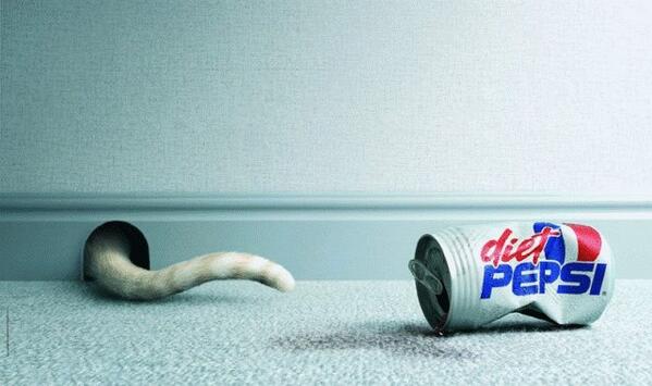
9. Borrow culture carefully
Memes and film references turbocharge recognition—and date an ad overnight. Use culture when it clarifies a brand truth, not when it costumes a weak idea.
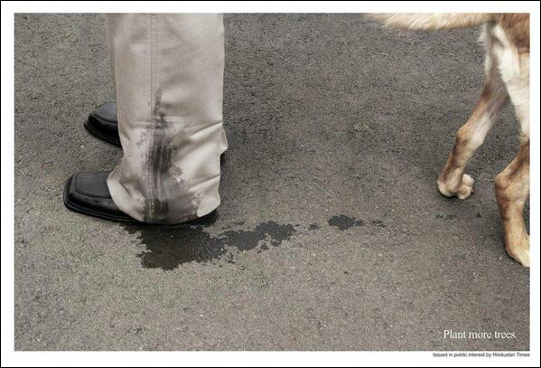
10. Make demonstration witty
Before-and-after and stress-test demos do not have to be dull. Wit without proof is decoration; proof without wit is a manual nobody finishes.

11. Use contrast on purpose
Black beside neon, silk beside grit—contrast creates meaning faster than adjectives. Pair opposites that illuminate the promise; random contrast is only noise.
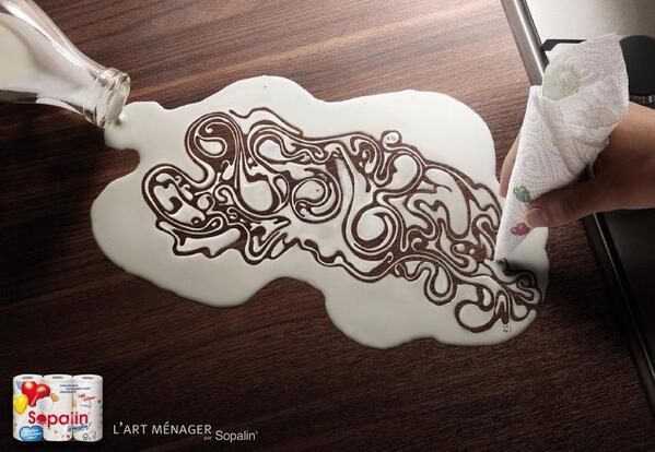
12. Let typography carry the idea
Sometimes the leap is lettering itself: a word that becomes a shape, a headline that acts out the benefit. Design type with the same care as a photograph when removing it would kill the concept.
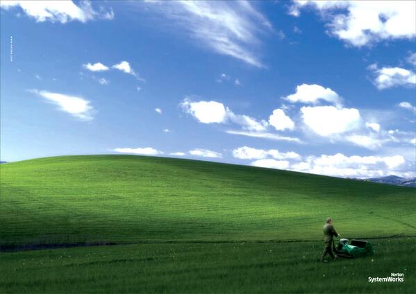
13. Sell feeling before features
Specs convince buyers who already care. Feeling recruits the ones who do not yet. Show the emotional outcome, then let the product sit quietly as the cause.
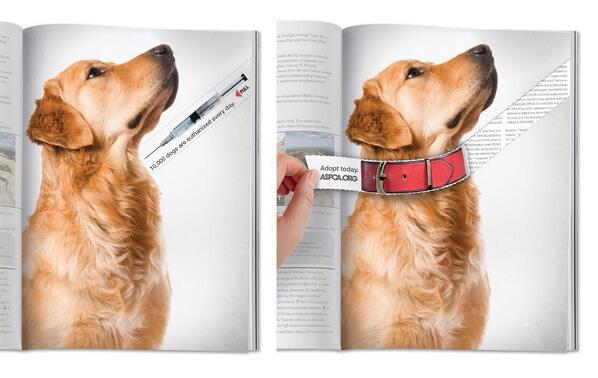
14. Keep the product honest
Exaggeration for comedy is craft; lying about performance is risk. Viewers forgive jokes. They do not forgive bait-and-switch once the box is open.
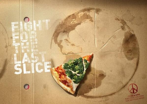
15. Design for two distances
Great print and outdoor work reads from across the street and rewards a closer look. Bold silhouette stops the eye; a small detail pays off the pause.
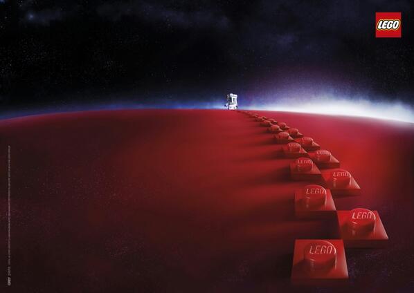
16. Turn constraints into concepts
Tiny budgets, banned claims, and awkward package shapes are prompts. Some memorable ads exist because someone was forbidden to do the obvious thing.
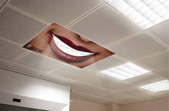
17. Imply sound in a still
Even silent posters suggest noise or quiet you can feel. Pacing—knowing when not to shout—often outperforms wall-to-wall claims.
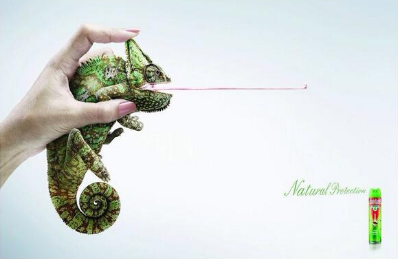
18. Build a series language
A single clever execution is a spark. A series with shared logic becomes a language people recognize before they read the logo.
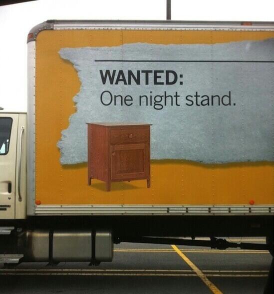
19. Earn shareability
“Share this” is not a strategy. Shareability arrives when the idea is clear, surprising, and easy to retell without a paragraph of explanation.
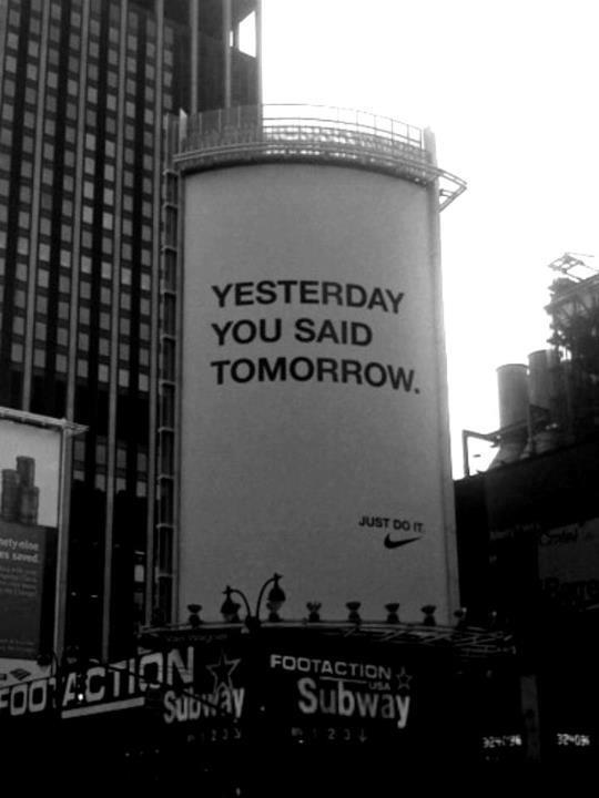
20. Use fear or urgency sparingly
Alarm can motivate safety campaigns; constant panic fatigues audiences. Pair urgency with a clear action, or the emotion evaporates into noise.
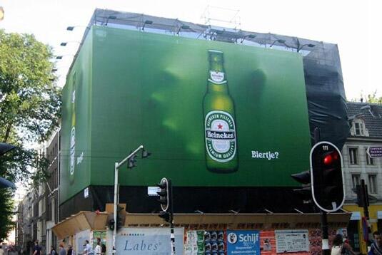
21. Personify the product carefully
Giving objects personality can charm—or tip into creepy. The character should express a real benefit, not distract from one.
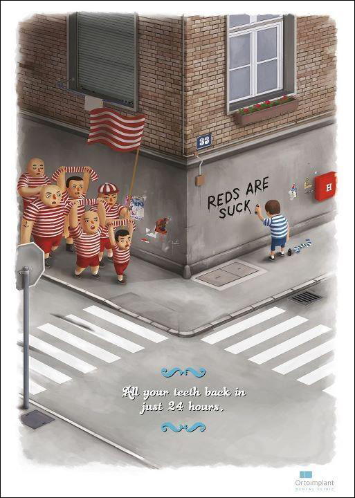
22. Juxtapose before-and-after worlds
Split frames and mirrored scenes make change visible. The cut between “without” and “with” should be the idea, not a decorative line.
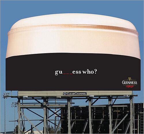
23. Hide the logo until the punchline
Some ads delay branding so the viewer solves the puzzle first. The logo then feels like an answer, not a stamp. Only works when the puzzle is fair.

24. Go minimal with one object
A lone product on a calm field can feel luxurious or starkly honest. Minimalism fails when emptiness is only a budget excuse with no craft behind it.
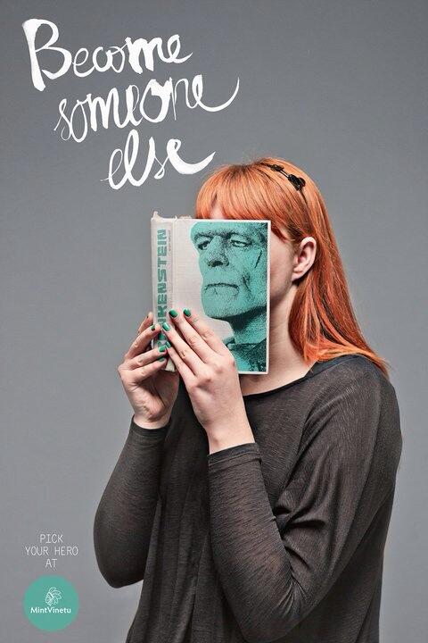
25. Twist a familiar scene
Take a setting everyone knows—kitchen, commute, beach—and change one element. The brain notices difference faster than it notices novelty from scratch.
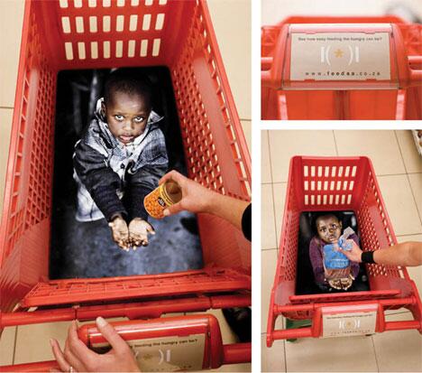
26. Use color as the claim
Sometimes hue is the message: freshness, danger, calm, appetite. If the ad still works in grayscale, color was decoration; if it collapses, color was concept.
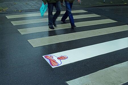
27. Respect public-awareness gravity
Cause ads need craft, not just sincerity. Cleverness should clarify the issue, not decorate suffering. The call to action must be specific enough to act on.
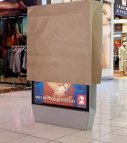
28. Test the retell
After you draft a concept, ask whether someone could describe it from memory at dinner. If the retell needs the layout in front of them, simplify.
29. Avoid cleverness that needs a manual
Inside jokes and over-layered metaphors feel smart in the agency room and die on the street. Interesting is not the same as complicated.
30. End on craft, not volume
Shouting louder is not a creative strategy. The ads people remember usually look inevitable after you see them—as if no other execution could have carried that idea.
Study these frames the way a musician studies covers: not to copy the notes, but to hear how economy, timing, and nerve make a short performance linger. Then apply one discipline to your own work—one claim, one twist, one honest reason to care.

Comments
Continue reading
24 Clever Print and Ambient Ads That Trust the Viewer
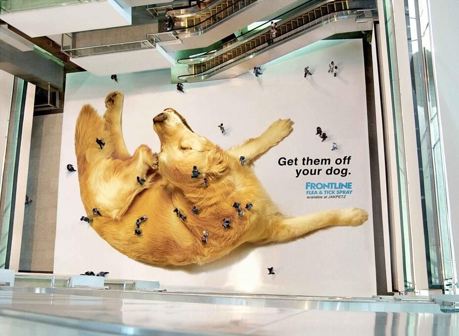
From Frontline’s mall-floor fleas to LEGO shadows and Jeep parking stunts—twenty-four print and ambient ads that finish the idea in the viewer’s head.
20 Creative Advertising Moves Worth Studying
Twenty craft principles behind ads that stop the scroll—visual puns, medium-as-joke, scale, silence, honest demos, and endings where the brand is the punchline.

Faber-Castell True Colours: Pencils Sharpened from the World
Serviceplan’s True Colours posters for Faber-Castell turn fire engines, sharks, and more into colour-matched pencil tips—an art-materials idea told without hard sell.