
DIY Typographic Wall Art: Paint, Wood, Paper, Fabric, and Upcycled Letter Ideas
Practical DIY typography for walls—stencils, wood letters, yarn wraps, vinyl, thrift finds, and layout tips so quotes and words actually read as décor.
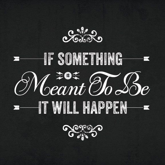
Typographic wall art earns its place because letters already carry meaning. A favorite lyric, a short line from a novel, a family motto, or a single word can turn a blank wall into something personal without needing a gallery budget. The materials are approachable—wood, cardboard, paint, paper, metal blanks, even leftover wallpaper—and the results range from quiet and gallery-like to bold and playful. Below is a practical tour of DIY lettering ideas you can adapt to living rooms, kitchens, hallways, nurseries, and studios.
Start with the phrase, not the craft. Short text reads cleaner at a distance. One strong word often beats a paragraph. Serif fonts feel classic; sans-serif fonts feel modern; script fonts feel intimate but need careful spacing so they stay legible from across the room. Once you know the words, pick a method that matches your tools, wall size, and patience.
Painted and stenciled lettering
Paint remains the most flexible route. Tape a baseline with painter’s tape, transfer letter outlines with graphite paper or a projector, then fill with acrylic or wall paint. For crisp edges, stencil vinyl letters cut on a craft machine, or buy reusable alphabet stencils and space them by eye. A single oversized word in matte black on a light wall reads like modern art; soft charcoal gray or muted sage keeps the same idea calmer for bedrooms.
Chalkboard paint opens a rotating gallery. Paint a rectangle or irregular organic shape, let it cure fully, then write quotes in chalk or chalk markers and wipe them when the mood changes. This works especially well in kitchens and mudrooms where messages can be seasonal. If you want permanence with chalkboard texture, write once in chalk marker and seal lightly so smudges do not erase the design.
Ombré lettering looks intentional with almost no calligraphy skill. Paint the full word in a mid-tone, then dry-brush a lighter tone across the tops of the letters and a darker tone along the bottoms. The gradient sells the piece even if the letterforms are simple block capitals.
Dimensional wood and scrap letters
Unfinished wood letters from craft stores take stain, paint, fabric wrap, or decoupage. Mount them with picture-hanging strips for rental-friendly installs, or screw through the wall into studs for heavier compositions. Mix heights—one tall initial with smaller supporting words—to avoid a flat “sign shop” look. Distressed white letters on a dark accent wall feel coastal; deep walnut stain on cream feels library-warm.
Pallet wood and scrap boards make excellent backers. Cut a board to the width of your phrase, sand, stain, then attach individual letters with wood glue and finishing nails. Hang the whole board as one piece so spacing stays locked. Reclaimed barn wood under white letters is a familiar farmhouse formula; black letters on pale ash read more Scandinavian.
Scroll-sawn plywood letters let you design custom fonts. Print the alphabet at scale, spray-mount to plywood, cut with a jigsaw or scroll saw, sand edges, then paint. The DIY payoff is huge: your wall art matches no catalog. Keep strokes thick enough that thin serifs do not snap during cutting.
Paper, cardboard, and bookish builds
Paper letters are light, cheap, and surprisingly sharp when done carefully. Cut chipboard or heavy watercolor paper with a craft knife, stack two or three layers for depth, then paint the edges so the laminate reads as one solid form. Mount on foam board for a floating effect. Book-page letters—cut from discarded paperbacks or sheet music—suit reading nooks and home libraries. Seal with matte Mod Podge so the paper does not yellow unevenly.
Wasabi tape or washi tape lettering is temporary and renter-safe. Sketch the word lightly in pencil, then outline with tape strips. Geometric fonts made of straight tape segments look crisp; soft scripts need narrower tape and more patience. When you move or change seasons, peel and start over.
Quilled paper letters turn typography into sculpture. Roll thin paper strips into coils and glue them inside letter outlines drawn on a backing board. The texture catches light beautifully in hallways. This is slow craft, best for a monogram or a three-letter word rather than a full quotation.
Fabric, yarn, and soft typography
Fabric-wrapped letters hide cheap foam or cardboard cores. Cut fabric with a half-inch allowance, wrap snugly, and glue on the back. Mix patterns within one word—stripes on consonants, florals on vowels—for a patchwork look that still reads as one phrase. Felt letters cut with scissors or a die cutter sew or glue onto canvas panels for nursery art that softens acoustics as well as décor.
Yarn-wrapped cardboard letters are weekend projects with high visual impact. Wind yarn tightly in one direction, secure ends with hot glue, and hang with ribbon loops. Chunky wool reads cozy; thin cotton baker’s twine reads beachy. Neon yarn on white walls is playful for kids’ rooms; oatmeal yarn on soft gray walls feels adult and calm.
Embroidery hoop art with stitched words bridges craft and gallery. Stretch linen in a hoop, transfer a short quote, and stitch in backstitch or chain stitch. Hang several small hoops in a cluster rather than one oversized hoop so the composition feels intentional.
Metal, acrylic, and mixed-media letters
Metal alphabet blanks—tin, aluminum, or thrifted channel letters—bring industrial weight. Leave them raw for loft style, spray them matte black for graphic punch, or lightly distress gold spray for glam. Mount with stand-offs so shadows deepen the letters. If true metalworking tools are out of reach, metallic spray on MDF letters fakes the look from five feet away.
Acrylic and plastic letters catch light differently than wood. Clear acrylic with frosted fronts looks contemporary against dark paint. Colored acrylic in coral, teal, or mustard energizes a white hallway. When shopping blanks, choose a thickness that will not warp on warm walls; thin plastic can bow over time.
Mixed media wins when one material alone feels flat. Try wood letters on a painted canvas, metal initials over a wallpaper remnant, or paper letters inside an old window frame. Shadow-box frames turn small letter assemblages into finished objects you can lean on a shelf if hanging is not an option.
Wallpaper, vinyl, and large-scale graphics
Removable vinyl lettering is the fastest path to clean typography. Design the quote in a free layout tool, export mirrored if needed for transfer tape, and apply carefully from the center outward. Measure twice: a crooked baseline is hard to forgive on a long quote. For renters, peelable vinyl leaves walls intact.
Wallpaper scraps make striking letter fills. Trace letters onto the back of leftover wallpaper, cut, and mount on painted MDF or foam board. Floral paper letters on solid walls create contrast; geometric paper on calm walls keeps the room modern. This is an excellent use for sample books from home stores.
Full-wall typography murals need restraint. One oversized phrase on a feature wall can dominate a room; smaller supporting art nearby should stay quiet. If you paint freehand murals, block in letters with chalk first and photograph the wall from across the room before committing paint—camera distance reveals spacing errors the eye misses up close.
Upcycled and unexpected letter sources
Thrift stores hide letter gold: scrabble tiles, vintage sign fragments, marquee bulbs, sports jerseys with numbers, and old printer’s blocks. Arrange scrabble tiles into a phrase on a painted board. Wire marquee letters with battery fairy lights for evening glow. Printer’s blocks look authentic mounted in a grid even if they do not spell a continuous sentence—treat them as texture that happens to be typographic.
Bottle caps, wine corks, and buttons can mosaic large letter outlines drawn on plywood. Fill the outline densely, seal, and hang. These pieces lean whimsical, so place them where playfulness belongs—game rooms, kitchens, kids’ spaces—rather than formal dining rooms unless your whole aesthetic is eclectic.
Old book covers, sheet music, maps, and blueprints become letter skins the same way fabric does. Map letters suit travel lovers; blueprint letters suit architects and makers. Always seal porous paper so humidity does not lift edges.
Composition, placement, and finishing
Typography fails more often from layout than from craft. Align baselines. Keep consistent gaps between letters unless you are intentionally kerning for style. Leave breathing room around the whole phrase—letters jammed against a ceiling molding look accidental. In galleries of multiple small pieces, hang them so the optical center of the group sits near eye level, not so each frame’s top edge matches.
Lighting finishes the piece. A picture light or nearby sconce turns dimensional letters into evening sculpture. Matte finishes hide brush strokes; gloss finishes amplify color but show flaws. If you photograph your finished wall for sharing, shoot in daylight from a slight angle so depth reads clearly.
Scale matters as much as font. A delicate script that looks charming on a craft table can vanish on a twelve-foot wall. Print a paper mock-up at full size, tape it up, and live with it for a day before cutting wood or buying vinyl. That single habit prevents most expensive regrets.
Room-by-room starting points
In living rooms, choose quieter quotes and richer materials—stained wood, soft neutrals, metal with patina. Kitchens tolerate bolder color and chalkboard rotation. Bedrooms favor one gentle word or a short line in fabric or embroidery. Hallways love vertical stacks of single words or a long horizontal quote above a console. Nurseries and playrooms welcome yarn, felt, and bright vinyl.
Offices and studios benefit from short functional reminders rather than sentimental poetry—words like “draft,” “make,” or a personal mantra in clean sans-serif keep the room sharp. Bathrooms need moisture-aware materials: sealed wood, vinyl, or acrylic rather than raw paper.
A simple project path
If you want one project this weekend: pick a three-to-six-word phrase, buy or cut wood letters, paint them in a color already present in the room, mount them on a stained board, and hang the board as one unit. That formula teaches spacing, finishing, and installation without requiring specialty tools. Next time, graduate to mixed materials, custom-cut fonts, or a full painted mural.
Typographic wall art works because it is both décor and voice. Whether you stencil a lyric, wrap yarn around cardboard initials, mosaic cork into a monogram, or hang thrifted marquee letters above a sofa, the wall stops being empty space and starts speaking in your handwriting—literal or chosen. Pick the words you actually want to live with, match the method to your tools, and let the letters do the rest.

Comments
Continue reading
Window Seats That People Actually Sit In
Depth, cushions, storage, and light—how to build or dress a window seat so it becomes a reading spot instead of a dumping ground for laundry.
Garden Decoration Beyond Beds: Lace, Mosaiculture, and Upcycled Yard Art
From dressed topiary and floral cyclists to license-plate dragonflies and lace between trees—garden decorations that give a yard a voice.
Kitchen Design Ideas: Layout, Storage, Light, and Finishes That Work
Practical kitchen design ideas—work zones, cabinetry, lighting, and durable finishes—so inspiration translates into rooms that cook and gather well.