
Photo vs Illustrated Save-the-Dates: How to Choose a Format
A practical comparison of photographic and illustrated save-the-dates—when a portrait earns the stamp, when a drawing carries the date, and how to match format to venue, guests, and printing.
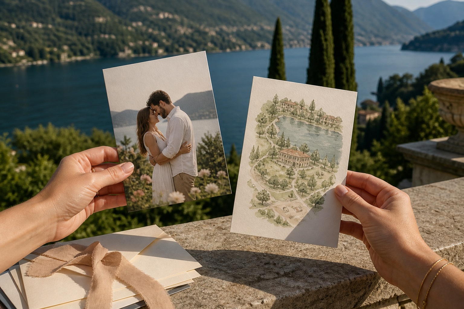
A save-the-date has one job: make a weekend real in other people’s calendars. The format you choose—photograph or illustration—changes how that job feels in the hand, in a feed, and on a fridge. This is not a roundup of card styles; it is a decision between two production paths. For layout, wording, and timing, start with the existing save-the-date card ideas and then use this page to pick a medium.
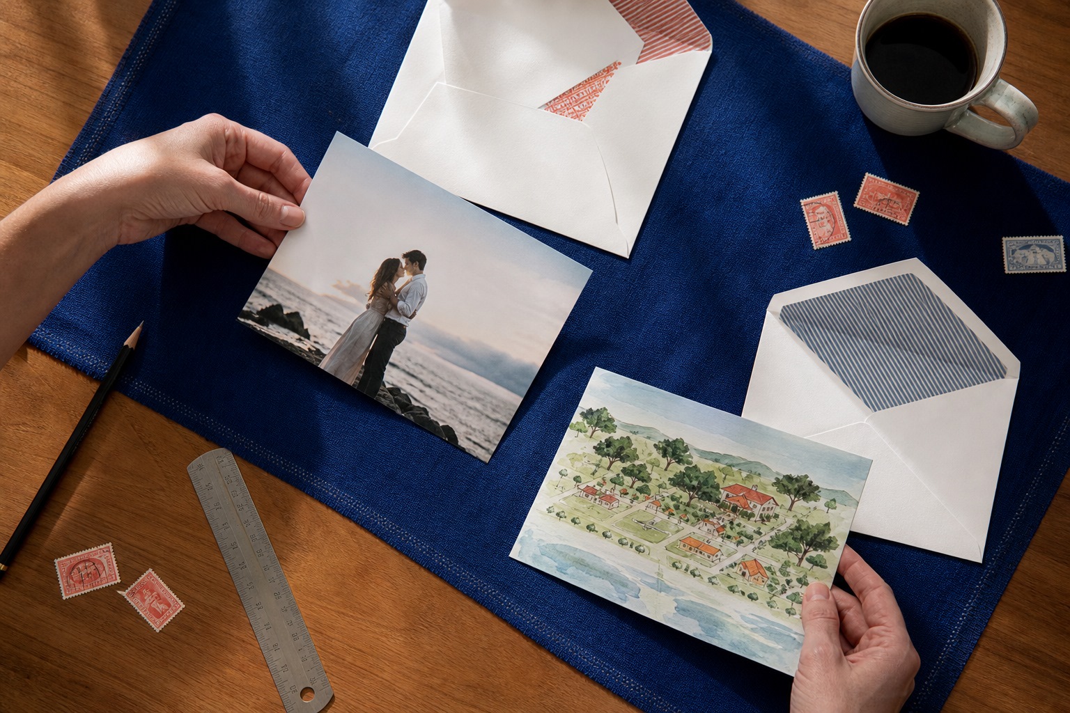
What each format is actually saying
A photograph says: these people, this light, this season. Guests recognize faces faster than they read a date. That helps when the guest list includes distant cousins and office friends who have not seen you in years. It also locks you to a shoot: hair, clothes, weather, a photographer’s hour, and a file that must survive cheap home printers as well as a letterpress shop.
An illustration says: this event has a visual language. A drawn chapel, a coastline, a motif that will reappear on the invitation and the menu. Guests who do not know your face still get a postcard they can pin up. You are not waiting on a golden hour. You are waiting on an artist’s revision round—and you must live with a drawing that will sit next to your later stationery without looking like a different wedding.
When a photograph earns the stamp
Choose a photo when the relationship is the story. Engagement portraits, a quiet kitchen shot, a walk you already take on weekends. Avoid the “posed in a field we have never visited” cliché unless that field is actually the venue. Guests can tell.
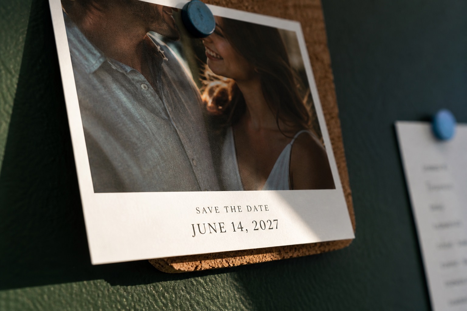
Technical checks matter more than romance. Faces should read at wallet size. A couple shot that looks cinematic on a phone often collapses to two dark ovals on a 4×6 card. Ask for a crop test at print size before you approve. Leave a quiet margin for the date line; type over a busy background is how save-the-dates become unreadable in a stack of mail.
Black-and-white can hide a mismatched outfit. Color should match the season you are announcing, not the season you shot—unless you are comfortable sending autumn leaves for a June date. If the wedding is black-tie in a ballroom, a muddy hiking photo needs a graphic frame so the card still feels like an event, not a holiday snapshot.
When illustration is the clearer tool
Draw when the place is more distinctive than a portrait, or when you simply do not want your faces on a hundred fridges. Destination weekends, historic houses, tents in a field, a city skyline guests will fly toward—these sit well as line, watercolor, or a simple isometric map.
Commission with constraints. Give the illustrator the venue name, three reference photos, the exact date string, and the print method. Watercolor that looks lush on screen can band and muddy on digital print. Flat vector color survives almost any press. If you plan letterpress later, start the save-the-date in two or three inks so the suite does not jump from a rainbow postcard to a monochrome invite.
DIY illustration works if you already draw. A shaky first attempt scanned and printed at quantity will look like a shaky first attempt at quantity. Better to use one strong motif—monogram, building silhouette, botanical—and repeat it than to invent a full scene under deadline.
Hybrids that do not look confused
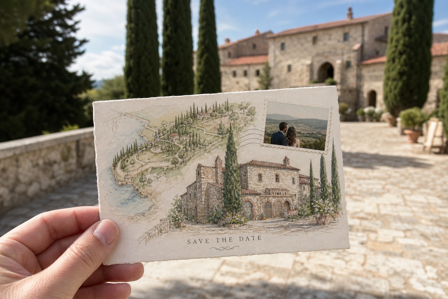
A small portrait inset on an illustrated field can work if the photo is treated as a stamp, not a competing poster. Keep one hierarchy: either the drawing is the card and the photo is a cameo, or the photo is the card and a drawn motif sits in a corner like a printer’s mark. Two full-bleed systems on one small rectangle fight.
Foil, letterpress, and thick cotton stock favor illustration and type. Soft-touch lamination and photographic paper favor a real photograph. Mixing a glossy photo panel on a kraft illustrated folder is possible; test one dummy in the hand. Guests notice thickness and slipperiness before they notice your font.
Production, postage, and the later invitation
Photograph files: sRGB, 300 ppi at final size, no heavy Instagram filters that print as mud. Illustrated files: vector when you can; if raster, work large. Both need a bleed if ink goes to the edge.
Square cards often cost extra postage. Odd die-cuts catch in sorting machines. If you are mailing internationally, a simple rectangle with a clear address panel beats a sculptural envelope that cannot take a customs form.
The save-the-date should preview the invitation without cloning it. Same paper family, same ink palette, same spelling of names. If the photo card is casual and the invitation is formal copperplate, guests get two different events. Decide the temperature of the weekend now—garden, city hall, ballroom—and let both pieces sit on that temperature.
Guest list, culture, and who is opening the envelope
Older relatives still treat mail as an event. A photograph of faces they love will be taped to a cabinet. An abstract illustration may be admired and then lost in a drawer unless the date is huge. Younger guests may photograph the card and never keep the paper; for them, contrast and a short URL or wedding site line matter more than cotton stock.
If a large share of the list is abroad, illustration plus a clear city name travels better than a portrait nobody can place. If the list is mostly local and the venue is a hall they already know, a portrait is not competing with a mystery destination. Mixed lists are why many couples print two runs: same type system, photo for family, drawing for the destination crowd. That only works if the two cards still look related on a table.
Religious or formal families sometimes read a casual photo as the wrong register. You can keep the photograph and raise the register with paper, type, and a restrained crop. You can also keep the illustration and lower the register with a joke map. The format is not the formality. The styling is.
Budget, timeline, and who you have to wait for
A friend with a good camera can finish a photo card in a weekend if you already like how you look in those files. An illustrator’s calendar is the hidden cost: sketches, revisions, “can you move the steeple.” Build three weeks, not three days. Stock illustrations and AI-looking venue drawings are how save-the-dates start to resemble every other Pinterest wedding. If you cannot commission, a strong type-only card is more honest than a generic chapel clip-art.
Printing: digital is enough for photographs. Illustrated flat color can go digital or offset. Letterpress and foil want fewer inks and no tiny photographic detail. Get a paper dummy in the mail to yourselves. Color on screen is a rumor.
Addressing: calligraphy on a photo card has to sit on a quiet panel. On an illustrated card, leave a dedicated address block that is not part of the drawing. Printers who “print over the art” are how names vanish into a watercolor wash.
A short way to choose
If guests need to recognize you, shoot. If guests need to recognize a place or a mood, draw. If you have neither a usable portrait nor a patient illustrator, a typographic card with one honest detail—the city, the season, a line of the venue name—will still clear a calendar. The photograph and the drawing are tools. The date is the content.

Comments
Continue reading
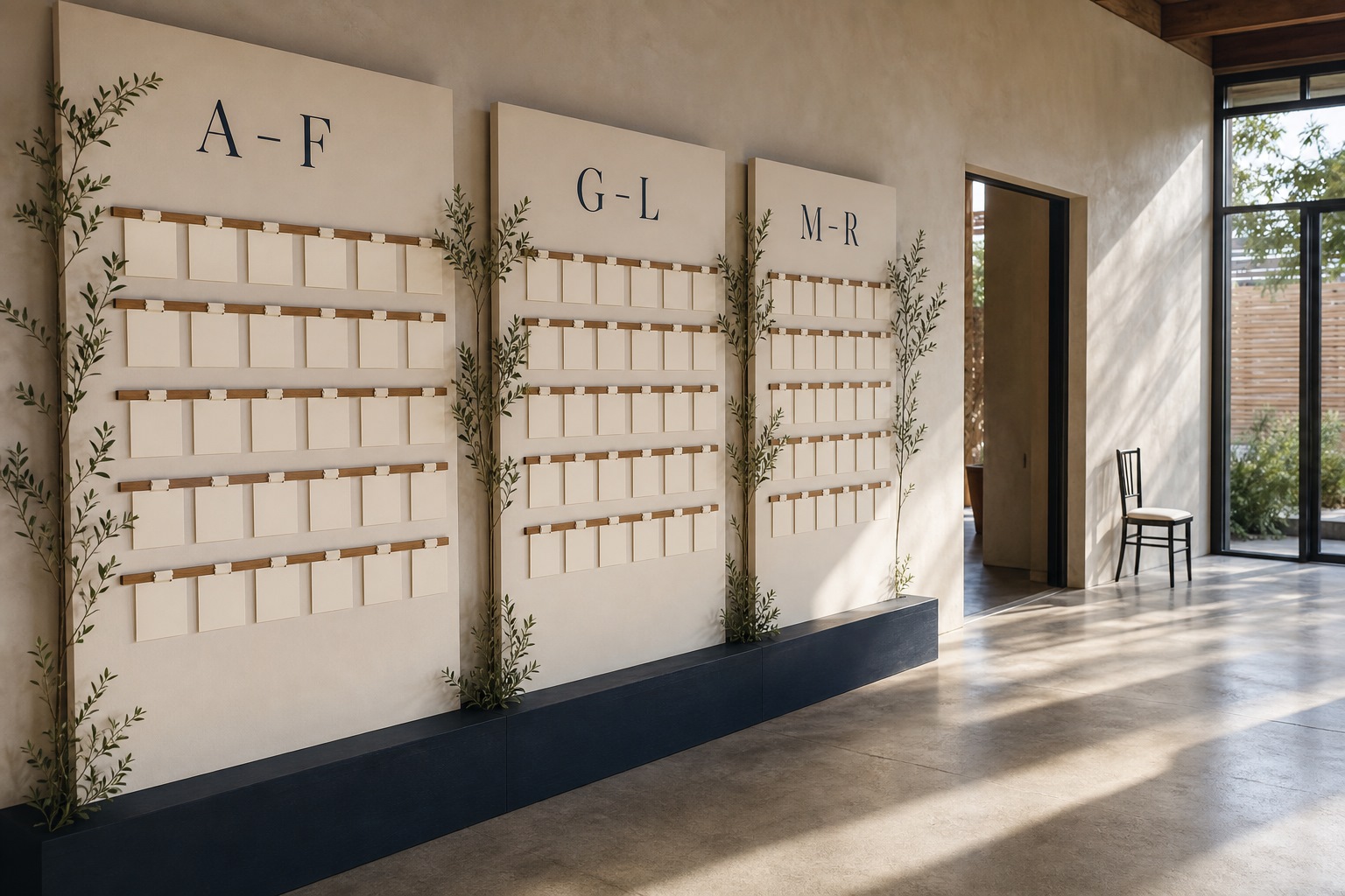
Escort-Card Displays That Aren’t a Table of Tiny Cards
Walls, branches, envelopes, mirrors, and numbered installations—how to stage escort cards so guests find their tables without a crowded lobby table.

Berry, Brick, and Brown Lipsticks That Still Read as Color
A guide to berry, brick, and brown lipsticks—undertones, finishes, and light—when classic fire-engine red is not the shade you want to wear.
Funny Animal Signs That Warn People (While Animals Ignore Them)
From a seagull on a no-birds disc to classic zoo and park ironies—why animal warning signs get funny, and what the rules are still for.