
Romantic Love Quotes for Your Walls
A gallery of romantic typographic wall art—how to choose a line, place it, and keep Valentine energy from looking like gift-aisle décor.

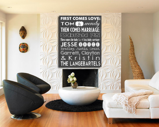
Love quotes on walls work when they feel chosen, not stamped. A single line in the right typeface can steady a hallway, soften a bedroom corner, or give a rented flat a signal that someone lives there on purpose. Around Valentine’s Day the shops fill with temporary hearts; wall text is a quieter move. It stays after the roses wilt. The collection below gathers romantic typographic pieces—script and sans, intimate and declarative—for people who want words as décor without turning the home into a gift-aisle display.
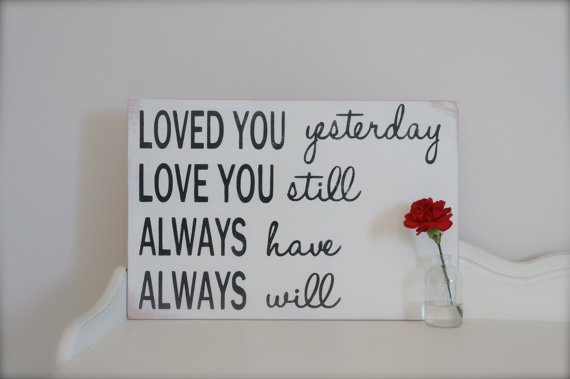
Use the gallery as a menu of moods. Some lines want a headboard wall. Others belong beside a mirror, above a desk, or in a kitchen where mornings start shared. The craft question is less “which quote is famous” than “which sentence you will still mean in August.”
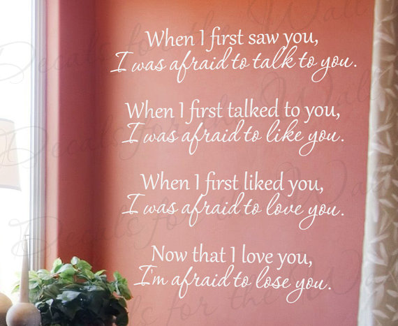
Why wall quotes still work
Interior trends cycle through gallery walls, giant botanicals, and bare plaster. Text persists because it is both decoration and reminder. A romantic line is a private caption for the room: not advertising love to guests so much as anchoring it for the people who sleep and cook there. Vinyl decals, letterpress-style prints, hand-painted murals, and framed typeset sheets all count. The medium should match how temporary you want the gesture to be. Renters often prefer removable vinyl; homeowners may commit to paint or wood lettering.
Valentine’s season is a useful deadline, not a requirement. Couples use February as permission to refresh a wall they have ignored since moving in. Singles use the same permission to claim a favorite line without waiting for a shared anniversary. Either way, the wall does not need a calendar holiday to justify beauty. It needs a sentence that fits the architecture.
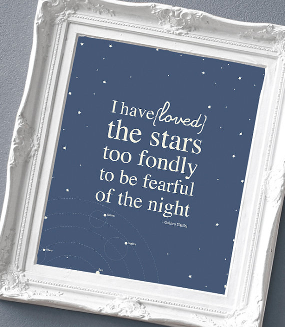
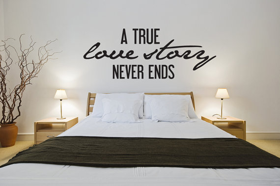
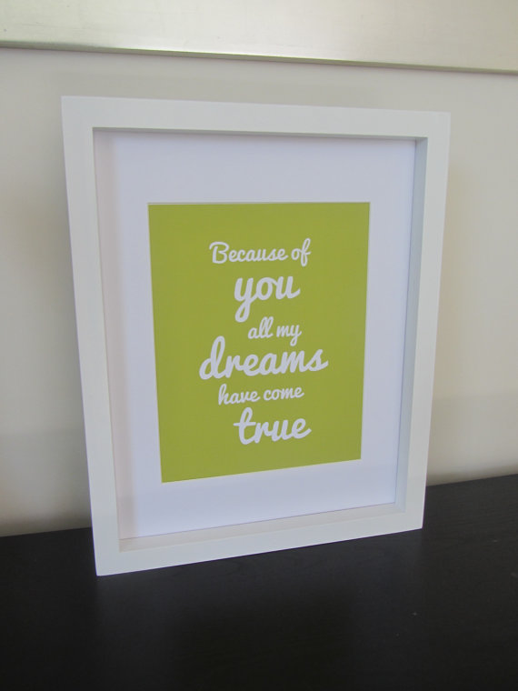
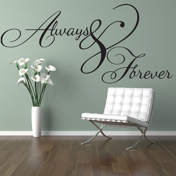
Choosing words that age well
Avoid lines you only like because a film trailer used them once. Prefer sentences you have already underlined in a book, texted to someone, or said out loud without irony. Short beats long on walls; a paragraph becomes wallpaper noise. Two to twelve words usually hold a room. If the quote is longer, break it into measured lines and give the eye a resting hierarchy—one word larger, the rest supporting.
Tone matters as much as length. Some households want soft vows; others want wit. A wry line can be more romantic than a gushing one if it sounds like the people who live there. Match the quote’s temperature to the room’s job. Bedrooms tolerate intimacy. Entryways may want welcome without confession. Kitchens can handle playful commands—“kiss the cook” energy—if that is actually your humor.
Language choice is personal. English classics sit beside lines in other languages that matter to a family. Handwriting-style fonts feel diary-close; clean geometric sans feel modern and calm; high-contrast scripts feel ceremonial. Mixing three fonts on one wall usually fails. One primary face, optional small secondary for attribution, is enough.


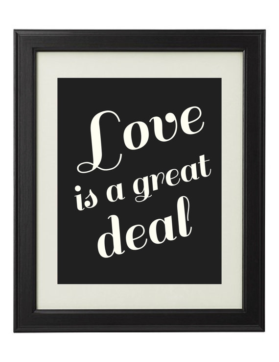

Placement, scale, and wall manners
Measure twice. A quote that looks perfect on a phone screen can shrink into irrelevance on a large wall or overwhelm a narrow corridor. As a rule of thumb, the text block should relate to the furniture below it—roughly the width of a headboard, console, or sofa segment—unless you are committing to a full mural. Leave breathing room from ceilings and corners. Crowded lettering next to a busy gallery wall creates visual static.
Color is strategy. Soft gray or warm black on pale walls reads as typography. Metallic gold can look luxe or dated depending on the rest of the room; test a sample. White vinyl on a dark feature wall can feel dramatic without needing pink. If your home already uses a strong accent color, let the quote borrow it rather than introducing a Valentine red that appears nowhere else.
Installation habits save heartbreak. Clean the surface. Level the first line. For multi-line decals, tape a paper template first. For framed prints, hang at a height where the center of the text sits near eye level when you stand naturally in the room—not where you stand on a ladder imagining a catalog shoot. Lighting helps: a picture light or nearby lamp turns evening reading of the wall into a small ritual.


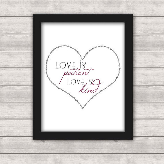
DIY routes and ready-made paths
If you like making small changes yourself, removable vinyl kits and printable templates are the fastest route. Trace lettering with transfer tape, or project a type layout onto the wall and paint with a steady brush. Wood words cut on a scroll saw or ordered as blanks can be stained to match existing trim. Watercolor wash behind calligraphy on heavy paper gives a one-off print without digital fuss.
Ready-made art still rewards editing. Buy the piece for the words and the proportion, then reframe if the included frame fights your room. Skip anything with aggressive branding watermarks or novelty glitter that sheds onto pillows. Attribution—poet, songwriter, anonymous proverb—can sit in smaller type if you care about credit; many romantic walls omit names and keep only the line. Either approach is fine if it matches how you treat books on your shelves.
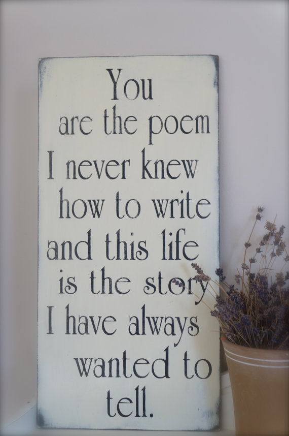

A simple selection method
Stand in the room at the time of day you actually use it. Read candidate lines aloud. If you cringe, cut. If you smile and keep reading, shortlist. Then check the wall’s empty rectangle with painter’s tape approximating the text block. Live with the tape for a day. If you stop noticing it, the scale is probably right. If it annoys you, shrink or move.
Couples should veto power each other without drama. A quote only one person loves will become silent clutter for the other. Shared walls need shared sentences. Private spaces—a wardrobe interior, a bedside nook—can hold a line meant for one reader.
When the letters are up, resist the urge to add three more romantic objects in the same sightline. One strong text piece usually wants quieter neighbors: a plant, a lamp, an uncluttered surface. The quote is already doing the emotional work. Let it.
Scroll the images again and notice which proportions your eye returns to—tall stacks, wide banners, square emblems. That preference is your design brief. Pick a line that sounds like your life, set it in a face that fits your rooms, and give it a wall with enough quiet to be heard.

Comments
Continue reading
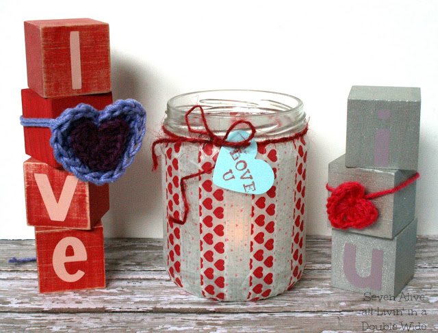
25 DIY Valentine’s Day Decorative Crafts for Home and Parties
Twenty-five Valentine décor DIYs—paper garlands, washi votives, balloon hearts, wreaths, sequins, crochet, and mobiles—to dress rooms without store-bought clutter.
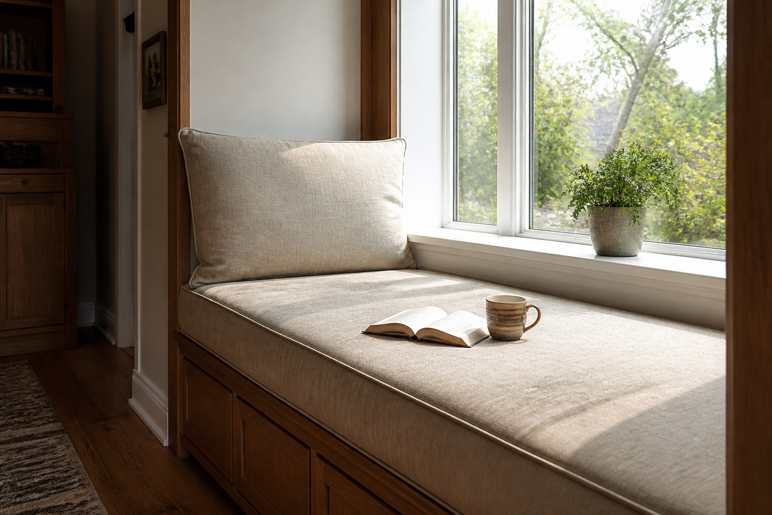
Window Seats That People Actually Sit In
Depth, cushions, storage, and light—how to build or dress a window seat so it becomes a reading spot instead of a dumping ground for laundry.

Garden Decoration Beyond Beds: Lace, Mosaiculture, and Upcycled Yard Art
From dressed topiary and floral cyclists to license-plate dragonflies and lace between trees—garden decorations that give a yard a voice.