
Konstantin Datz’s Braillecube: A Rubik’s Cube You Can Feel
German designer Konstantin Datz’s tactile Braillecube translates Rubik’s colors into raised type—MoMA-shown inclusive design that keeps the classic puzzle playable by touch.
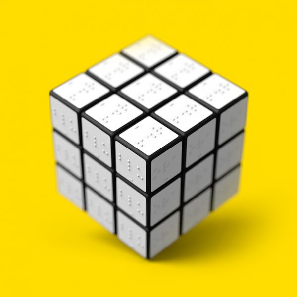
A Rubik’s Cube is usually a problem of color: six faces, six hues, a sequence of turns until each side is uniform. For someone who cannot see those hues, the classic cube is not a puzzle—it is a sealed object. German designer Konstantin Datz answered that gap with a tactile redesign that became widely known as the Braillecube: adhesive panels embossed with Braille for each color, laid over a standard cube so the “colors” can be read with the fingertips.
The idea is simple enough to explain in a sentence and hard enough to execute well. Datz did not invent a new mechanical core. He kept the familiar 3×3 structure and reframed the information layer. Where sighted solvers rely on red, blue, green, and the rest, a Braillecube user reads raised characters that stand for those colors. The toy’s excitement—scrambling, turning, checking, correcting—stays intact. Only the sensory channel changes.
Who Konstantin Datz is, and what he changed
Konstantin Datz, a German designer born in 1988, approached the cube as a product problem rather than a novelty gag. Starting from the wish for a game blind people could actually play, he developed the surface treatment with care: white adhesive plastic pads carrying Braille words for each color, stuck onto the cube’s stickers. The first prototype drew museum and press attention; it was shown at the Museum of Modern Art in New York as part of the “Talk to Me” exhibition context that highlighted objects as interfaces for communication. Coverage in design magazines followed, and the community response—especially among people who cared about accessible play—made the process of refining the idea feel worthwhile rather than purely theoretical.
That MoMA framing matters. “Talk to Me” treated design as conversation: objects that speak, listen, or translate. Datz’s cube fits that brief cleanly. It translates a visual code into a tactile one without asking the player to abandon the cultural object everyone already recognizes. You still hold a Rubik’s Cube. You solve by touch instead of glance.
How the Braillecube works in the hand
Each face of a standard cube is a field of nine small squares. On Datz’s version, those squares carry Braille that names the color assigned to that sticker set. A player explores a face with fingertips, builds a mental map of which “color” sits where, then turns layers the way any cubist would. Progress is checked by re-reading the raised text after each sequence. Memory and spatial reasoning do the same work they do for sighted solvers; the difference is that confirmation lives in pressure and pattern, not in hue.
The design also makes a quiet social claim. Blind and sighted people can share the same physical object. A sighted friend can still see residual color under or beside the overlays, depending on the build; a blind player can compete on tactile information alone. Shared toys reduce the awkward split where “accessible” versions feel like a different activity entirely.
Why Braille on a rotating cube is not trivial
Braille is orientation-sensitive. Flip or rotate a character and it can become a different character. On a puzzle whose entire point is rotation, that creates a real friction. Critics of early Braille-marked cubes have noted that as faces turn, embossed letters can become harder to read reliably if the reader depends on upright letterforms. Datz’s concept still stands as a clear, elegant statement of intent—feel the colors—but the orientation problem is part of why later tactile cubes often prefer raised geometric shapes, distinct textures, or non-alphabetical marks that remain recognizable no matter which way a cubie points.
That tension does not erase the value of the Braillecube as design thinking. It shows how inclusive redesign often begins: take a beloved object, identify the inaccessible channel, replace it with another sense, then discover second-order issues that only appear once people actually play. Many successful accessibility products are iterations of exactly that loop.
Inclusive design lessons packed into a six-centimeter cube
Datz’s project sits in a broader conversation about toys, games, and who gets invited to play. A puzzle that depends on color alone quietly excludes. A puzzle that carries color as texture invites more people in. Designers working on tactile cubes after Datz—and commercial efforts such as sensory cubes that partner with blindness organizations—tend to keep his core insight while solving for rotation-proof marking systems. The lineage is clear: first prove the cube can be tactile at all, then harden the marking language so it survives scrambling.
There is also a craft lesson. Datz did not wait for a factory redesign of the cube’s plastic. Adhesive Braille panels on an existing cube are a prototype strategy: fast, visible, exhibit-ready. Museums and magazines can photograph it; communities can discuss it; makers can attempt home versions. Precision manufacturing can come later. For many accessibility concepts, that order—prove the idea, then industrialize—is more realistic than waiting for a perfect commercial SKU on day one.
What the photograph shows
The image that travels with this story is the cube itself: a compact, white-panel object whose surface reads as orderly embossing rather than a rainbow. In still photography it can look almost architectural—grids of raised marks, clean edges, the familiar cube silhouette. That cool presentation matches the design ethos. This is not a cartoonish “special needs” toy. It is the same cultural icon, translated.
Looking at it, you can almost rehearse the solving loop: palm the cube, skim a face, turn a layer, skim again. The drama of the Rubik’s Cube was never only visual fireworks. It was always a conversation between hands and a three-dimensional map. Datz simply insisted that conversation remain available when color drops out.
From exhibition object to ongoing conversation
Museum display and magazine coverage do not automatically equal mass retail. Some tactile cube concepts remain scarce as products even when they are famous as ideas. That gap is common in design culture: the prototype communicates so well that it becomes a reference point, while manufacturing, certification, and distribution lag. Still, the Braillecube’s reputation helped keep “Rubik’s for touch” on the agenda. When later products ship with distinct tactile marks per color, they are answering the same brief Datz articulated—let blind people feel the colors and share the excitement.
Educators and parents sometimes use tactile cubes not only for blind players but for mixed classrooms: sighted students close their eyes, or everyone solves by touch, and the group discovers how much of cubing is already haptic. The cube becomes a teaching prop about sensory substitution—an accessible on-ramp to talks about inclusive product design more generally.
Keeping the designer and the concept straight
Credit matters. Konstantin Datz is the designer behind this Braille-overlay approach to a Rubik’s Cube for blind people. The concept’s heart is tactile color encoding via Braille panels on a standard cube, with a prototype path that reached MoMA and design press. Later sensory cubes with geometric textures are cousins, not replacements in the historical record. When the story is told carefully, Datz remains attached to the idea of feeling color through Braille on the world’s most famous twisty puzzle.
If you come to this page for the image alone, stay with that image a moment longer. Under those embossed squares sits a design argument: popular culture should not assume eyesight as the price of entry. A six-centimeter cube is a small place to make that argument. It is also an unforgettable one—because almost everyone already knows what a Rubik’s Cube is supposed to feel like in the hands. Datz simply completed the sentence for people who never had the colors to begin with.

Comments
Continue reading
Still-Life Photography by Margareth Perfoncio
São Paulo photographer Margareth Perfoncio’s still lifes of food and flowers—Old Master light, dark wood, and tables that feel inevitable.
Meaningful Love Quotes for Inspiration (and Ink)
Meaningful love quotes that still feel true — short lines for tattoos, gifts, and everyday reminders, with placement and wording tips.
Christina Hess’s Animals From History: Costumed Pets as Playful Portraits
Illustrator Christina Hess reimagines historical icons as ornate animal portraits—Elvis Petme and friends—mixing puns, costume detail, and soft history lessons.