
Written Portraits: Van Wanten Etcetera’s Book-Week Sculptures
Dutch agency Van Wanten Etcetera carved books into author likenesses for CPNB’s Dutch Book Week—Anne Frank, van Gogh, van Gaal, and Kader Abdolah under an autobiography theme.
Some advertising campaigns borrow literature’s prestige and leave the books themselves untouched. Written Portraits did the opposite. Dutch agency Van Wanten Etcetera carved physical volumes into the likenesses of authors—faces rising from stacked pages—to promote Dutch Book Week, the annual campaign run by CPNB (Collectieve Propaganda van het Nederlandse Boek), the organization charged with collective promotion of Dutch literature. The medium was the message made literal: literature given a human profile.
The campaign’s premise is almost disarmingly simple. Take books. Shape them into a portrait. Let the resulting object stand as both sculpture and advertisement. In practice, the work is far from simple. Carving paper at portrait scale demands planning, structural sense, and a willingness to destroy reading copies in service of a public image. The finished pieces look calm in photographs; the labor behind them is patient, dusty, and irreversible.
Dutch Book Week and the autobiography brief
Dutch Book Week is not a single storefront event. It is a national push to put reading—and Dutch writing in particular—back into daily conversation. Each year the organizers spotlight a genre or theme so bookshops, libraries, schools, and media can orbit the same idea. In the season tied to Written Portraits, that focus was autobiography: lives told in the first person, memory shaped into narrative, private history offered to strangers.
Autobiography is a natural fit for a campaign built on faces. A memoir already argues that a life can be held between covers. Carving an author’s features from bound pages pushes that argument into physical space. You do not merely see a name on a spine; you meet a constructed likeness made of the material the industry sells. The joke and the sincerity travel together. Books become the clay; the portrait becomes the pitch.
CPNB’s role matters here. Collective promotion means the campaign speaks for a field rather than one publisher’s list. Written Portraits could therefore feel civic as well as commercial—an invitation to treat reading as shared culture, not only as retail. That framing helps explain why the work circulated so widely beyond the Netherlands: design blogs and art sites recognized an idea that photographed cleanly and explained itself in one glance.
Van Wanten Etcetera’s advertising-as-object approach
Van Wanten Etcetera’s reputation in creative circles rested on campaigns that behaved like craft objects, not like disposable banners. Written Portraits sits in that tradition. Instead of illustrating authors with stock photography or digital collage, the agency committed to handmade transformation. The advertisement is something you could, in principle, walk around. Depth, shadow, paper grain, and the uneven edge of a cut all become part of the brand language.
That choice also solves a visual problem unique to book marketing. Books are rectangles. Faces are not. Most literary ads reconcile the mismatch with cover art or author headshots beside tidy typography. Written Portraits collapses the mismatch by forcing the rectangle to yield. The stack stays recognizably book-like—page edges, thickness, the suggestion of many leaves—while the silhouette becomes unmistakably human. Viewers decode both signals at once: this is literature; this is a person.
There is a mild provocation in the method. Carving books can read as vandalism to anyone who treats volumes as sacred. In a campaign for Book Week, that tension is useful. It asks whether reverence for the object should outweigh the urge to make reading visible and memorable. The campaign answers by treating destruction as devotion: the books are spent so that literature’s human face can be seen.
Four faces for one theme
The four figures chosen for Written Portraits were Anne Frank, Vincent van Gogh, Louis van Gaal, and Kader Abdolah. The set is not a random celebrity grid. It mixes literary history, visual art, sport, and contemporary authorship, and it keeps autobiography—or life-writing in a broad sense—near the center of each selection.
Anne Frank’s diary remains one of the most widely read first-person documents of the twentieth century. A portrait carved from books nods to a text that was itself a private record turned public inheritance. The face is familiar from photographs; seeing it emerge from paper layers underlines how thoroughly her words have entered collective memory. For a Dutch Book Week campaign, the inclusion also grounds the project in national history without reducing the week to nostalgia alone.
Vincent van Gogh complicates the autobiography brief in a productive way. He is not primarily remembered as a memoirist, yet letters and self-portraits have long taught audiences to read his life through images and correspondence. A book-carved likeness of van Gogh therefore sits at the border of art history and life narrative. It also winks at medium: a painter known for self-representation becomes, briefly, a sculpture made of pages—another kind of self-echo, filtered through advertising craft.
Louis van Gaal brings a different public into the room. Football culture in the Netherlands is a mass conversation; a coach’s autobiography or life story reaches readers who may not browse literary fiction first. Including van Gaal signals that Book Week’s autobiography theme is not reserved for a narrow canon. Life-writing can include the dugout as well as the attic annex. The carved portrait makes that hospitality visible.
Kader Abdolah, the Iranian-Dutch writer, adds a contemporary literary voice shaped by migration, language change, and the work of telling a life across borders. His presence keeps the campaign from freezing into a museum of famous Dutch icons. Autobiography here includes the experience of arriving, translating oneself, and writing into a second literary home. In a national book promotion, that matters: Dutch literature is not only inheritance; it is also ongoing.
Together the four names sketch a map of how “a life in books” can mean very different things—diary as testament, artist as self-myth, sports figure as popular narrator, novelist as bridge between cultures. The campaign does not need a long manifesto when the cast list already argues the range.
What the sculptures do in a photograph
Most people encountered Written Portraits as images rather than as gallery objects. That is how advertising sculpture often lives now: craft for the camera, then circulation through magazines, posters, and websites. The photographs reward close looking. Page edges catch light like geological strata. Recessed eyes and mouths create real shadow, so the faces feel modeled rather than drawn. From a distance you see a head; up close you see binding and pulp.
That double reading is the campaign’s engine. If the portraits had been painted trompe-l’oeil on box fronts, the cleverness would fade faster. Because the material is honestly bookish, the idea keeps regenerating each time someone notices a title fragment or a uneven cut along a cheek. The craftsmanship has to be good enough that the likeness holds, yet not so slick that the paper disappears into plastic illusion.
Scale also works in the campaign’s favor. These are not monumental public statues. They are roughly human-head sized objects built from ordinary publishing stock—intimate enough to feel handmade, solid enough to photograph as serious work. Intimacy suits autobiography. The genre asks for proximity to a life; the sculptures answer with proximity to paper.
Advertising that thinks like installation
Written Portraits belongs to a broader family of campaigns that treat the ad as a temporary installation. The goal is not only to announce dates and slogans for Book Week, but to create an artifact people want to share. Shareability in the early 2010s still leaned on blogs and design portfolios as much as social feeds; a strong still image with a one-sentence concept traveled far.
Importantly, the concept does not insult the audience. It assumes viewers can enjoy a visual pun without being hammered by explanatory copy. “Books shaped into authors’ faces for Book Week” is almost the entire brief. Everything else—choice of subjects, quality of carving, lighting—is execution. When execution is this tactile, the campaign earns attention that purely digital graphics struggle to hold.
There is also a quiet argument about what literature promotion can look like. It can be typographic and polite. It can also be sculptural and slightly strange. Van Wanten Etcetera chose strangeness with discipline: one technique, four faces, a clear seasonal hook. Constraint kept the idea from dissolving into novelty for novelty’s sake.
Why the idea still reads clearly
Years later, Written Portraits remains easy to describe and hard to forget. That durability comes from alignment. Theme (autobiography), medium (books), form (portraits), and occasion (Dutch Book Week) lock together. Remove any one piece and the campaign weakens. Keep all four and the image explains itself across languages.
It also models a useful lesson for anyone promoting culture: physical transformation can outperform metaphor when the product already has a body. Books are objects. Faces are objects of recognition. Joining them invents a hybrid that feels inevitable after you see it, which is often the mark of a strong creative leap.
None of this requires treating the campaign as timeless doctrine. It was a seasonal tool for a specific national program, built by a specific agency, aimed at a year’s genre focus. Seeing it that way keeps the praise honest. What travels is not a claim that every book ad should involve a chisel. What travels is evidence that literary promotion can be as inventive as the writing it hopes to sell.
Look again at the premise in the simplest terms. A country sets aside a week for books. The theme is life told on the page. An agency answers with faces cut from pages. Anne Frank, van Gogh, van Gaal, Abdolah—four different routes into the idea that a life can become literature, and that literature can, briefly, become a face you meet in paper and shadow. That is Written Portraits: advertising that borrowed sculpture’s patience and gave Book Week a profile you could recognize across a room.

Comments
Continue reading

Koen Hauser's Modische Atlas der Anatomie: Fashion Portraits as Elegant Dissection
Dutch artist Koen Hauser's 2000 series Modische Atlas der Anatomie merges fashion photography with anatomical curiosity through early digital manipulation—still unsettling, still elegant.
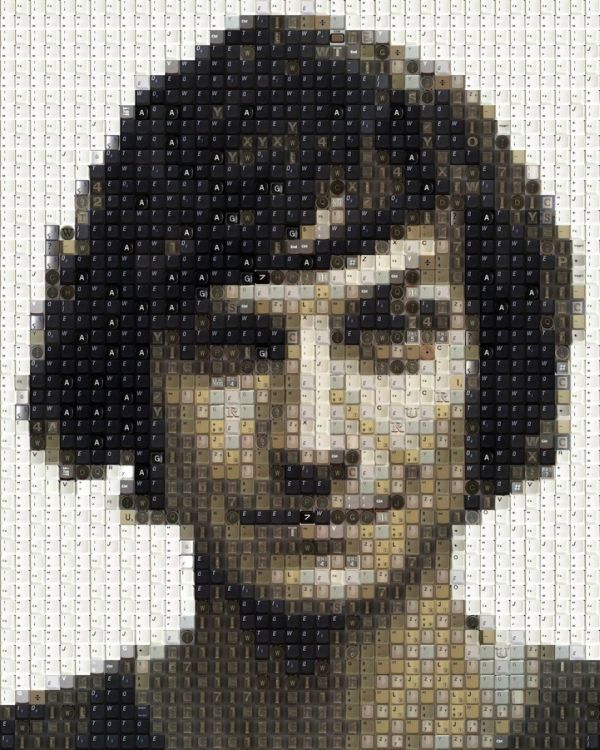
Guy Whitby’s Celebrity Portraits Made of Computer Keys
Australian artist Guy Whitby (WorkByKnight) builds meticulous celebrity mosaics from keyboard keys, calculator pads, and phone buttons—analogue-to-digital faces in tile form.
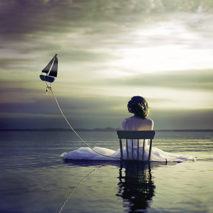
Alicia Savage’s Surreal Self-Portraits of Travel
Boston photographer Alicia Savage turns road trips into Destinations self-portraits—literal miles and metaphorical journeys layered through curiosity and post-production.