
Black and White New York: The City in Monochrome
A gallery of black-and-white New York photographs—why monochrome suits the city, what to look for in the frames, and tips for shooting your own.
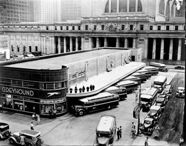
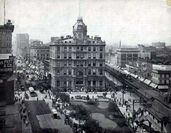
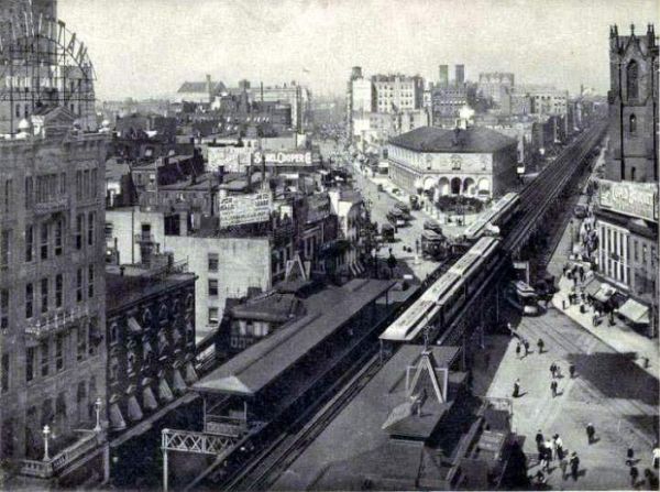
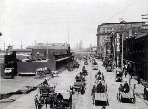
New York is a color city—taxi yellow, signal red, glass blue—but black and white still feels like one of its native dialects. Strip away hue and what remains is structure: avenues as lines, steam as atmosphere, faces cut by hard sidelight between buildings. This gallery collects black-and-white photographs of the city in that register—street scale, architecture, and the everyday theater of sidewalks—where contrast does the storytelling.
Why monochrome suits New York
The city’s vertical density creates natural contrast. Tall buildings throw long shadows; reflective windows throw bright rectangles onto dark pavement; subway stairs drop from glare into tunnel black. In color, those contrasts compete with signage and clothing. In black and white, they become the subject.
There is also a historical echo. Much of the twentieth-century visual memory of New York—news photography, film noir, classic street work—arrived first in grayscale. Modern photographers who choose monochrome are not only making an aesthetic decision; they are stepping into a conversation that includes Weegee’s nights, Helen Levitt’s sidewalks, and countless anonymous press frames of crowds and weather. You do not need to imitate those names to feel their weather in the air.
Black and white also slows tourism. Famous landmarks lose some postcard cheerfulness and regain mass and silhouette. A bridge becomes geometry. A skyline becomes a serrated edge against pale sky. Even a puddle reflection can carry the weight of a skyline without needing a caption. The city stops performing as a color brochure and starts reading as form.
Seasons help. Winter reduces foliage and clarifies stone. Summer haze can soften distant towers into stacked gray bands. Rain turns asphalt into a second sky. Monochrome makes those atmospheric shifts easier to notice because the eye is not busy assigning brand colors to taxis and storefronts.
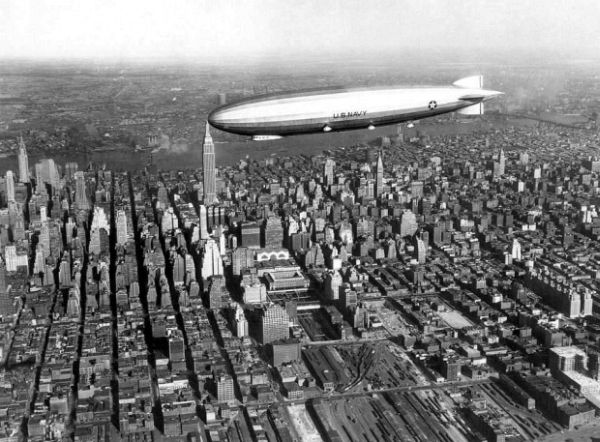
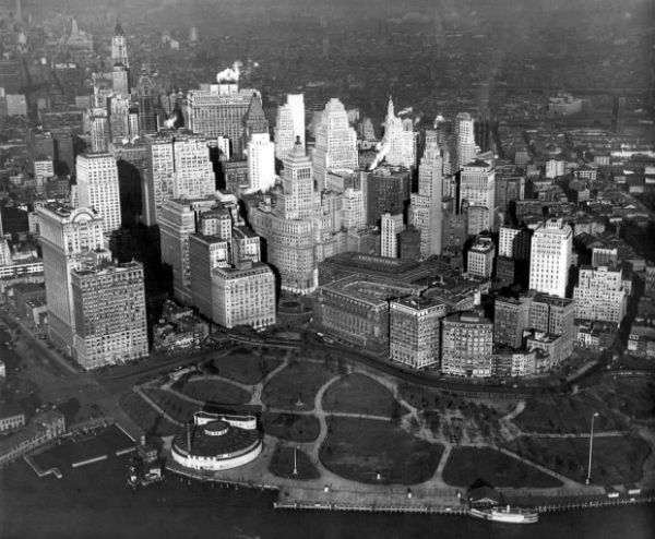
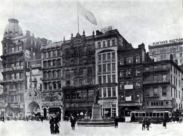
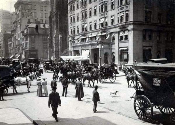
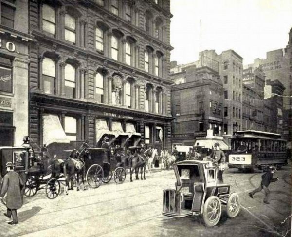
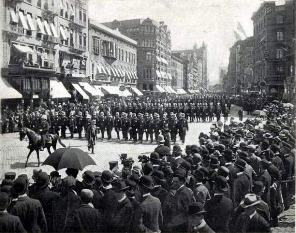
What to look for in these frames
As you move through the selection, watch for a few recurring strengths of monochrome city work:
- Edge light: sun raking across stone or metal, turning ordinary facades into relief sculpture.
- Human scale against mass: a single figure, a pair of walkers, or a cluster at a corner that gives towers something to measure against.
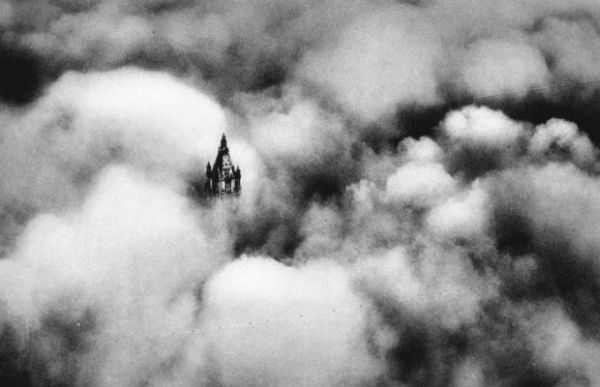
- Weather as actor: fog, rain, snow, and haze simplify backgrounds and deepen mood without needing heavy processing.
- Graphic ground: crosswalks, stairs, fire escapes, and window grids that organize the rectangle.
- Texture over tint: brick, asphalt, wool coats, and wet streets that feel tactile once color stops competing.
- Negative space: empty sidewalk or pale sky that lets a dark figure or dark cornice land with force.
Not every successful New York black-and-white picture is gloomy. Midday hard light can look almost abstract. Soft overcast can feel tender. Night work can be elegant rather than noir if neon is treated as pure luminance. The shared trait is commitment: once color is gone, composition and tonal range have to carry the frame.
Try reading each image twice—once for subject, once for gray values. Ask where the brightest third sits, where the darkest shape anchors the corner, and whether the midtones are muddy or clean. That second reading is how monochrome trains the eye.
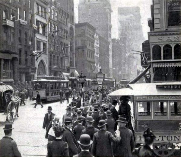
Neighborhood moods without a checklist tour
Black-and-white New York is not only Midtown trophies. Lower buildings and wider sky in some residential stretches produce gentler tonal ladders. Financial-district canyons compress light into vertical slits. Waterfronts offer long horizontals and reflective pavement after rain. Bridges give repeating cables and stone piers that almost design themselves.
People remain the city’s pulse. A coat collar, a gesture at a crosswalk, a vendor’s cart, or a pause under scaffolding can outlast another skyline postcard. Monochrome helps because clothing brands and logo colors stop stealing the scene; posture and spacing take over.
If you are building your own series, pick one constraint for a week—only steam and breath on cold mornings, only staircases, only reflections—then edit ruthlessly. Coherence beats quantity. A dozen related frames usually say more than a hundred unrelated “cool” singles.
Photographing the city in black and white today
If these images push you to try your own, a few practical habits help—whether you shoot film or convert digital files later.
Expose for the mood you want. Protect highlights on bright glass and pale sky if you want deep, heavy shadows. Open up if you care more about face detail in doorways. Monochrome makes exposure errors obvious because there is no color distraction to hide behind.
Seek sidelight and backlight. Midday overhead sun can flatten faces on open plazas; the hours when light slides between avenues are friendlier to separation between subject and background.
Use longer walks, fewer trophies. The Empire State Building and Brooklyn Bridge will always draw cameras. The quieter frames—steam vents, stoops, reflections in puddles, the pause at a Don’t Walk signal—often age better in a personal series.
Decide when to convert. Some photographers set the camera’s monochrome preview to train their eye; others shoot color RAW and convert with channel mixing so reds, greens, and blues fall into distinct gray values. Either method works if the final tones feel intentional.
Respect people. Street photography ethics matter as much as aesthetics. Be aware of context, avoid harassment, and know local expectations around photographing strangers, children, and private grief in public space.
Print small before you print large. Monochrome city photos often reveal their real strength at postcard size, where the eye travels block by block. If a file only impresses on a glowing phone screen, it may not have enough tonal structure for paper.
Reading New York without color
One pleasure of a black-and-white New York set is how quickly the brain fills in what is missing. You may still “see” a yellow cab because the shape is familiar. You may feel cold because the contrast reminds you of winter asphalt. The photographs work with memory as a collaborator.
Another pleasure is comparison across decades. Older news pictures and newer digital conversions can sit side by side more easily when both speak in gray. Fashion changes; scaffolding comes and goes; the tonal drama of stone, steel, and crowds remains legible. That is why monochrome galleries of the city keep feeling current even when the clothes in the frames date themselves.
These particular frames belong to that ongoing scrapbook: not a definitive survey of every borough, but a mood board of the city as pattern and presence. Let them remind you that New York does not need saturation to feel intense. Sometimes the strongest version of the place is the one that keeps only light, dark, and the stubborn life between them.

Comments
Continue reading
Photo vs Illustrated Save-the-Dates: How to Choose a Format
A practical comparison of photographic and illustrated save-the-dates—when a portrait earns the stamp, when a drawing carries the date, and how to match format to venue, guests, and printing.
Escort-Card Displays That Aren’t a Table of Tiny Cards
Walls, branches, envelopes, mirrors, and numbered installations—how to stage escort cards so guests find their tables without a crowded lobby table.

Berry, Brick, and Brown Lipsticks That Still Read as Color
A guide to berry, brick, and brown lipsticks—undertones, finishes, and light—when classic fire-engine red is not the shade you want to wear.