
Jesús Prudencio’s Cars and Films Posters
Spanish designer Jesús Prudencio’s Cars and Films series isolates iconic movie vehicles in clean side-view posters—from Ghostbusters to Goldfinger.
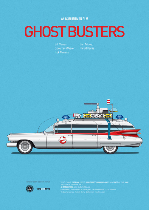
Spanish designer and illustrator Jesús Prudencio built Cars and Films as a personal series: side-view posters that treat iconic movie vehicles as the whole cast. No hero faces, no tagline collage, no forced perspective explosions—just the car (or Vespa, or van) drawn clean and centered, as if the film’s spirit could be summarized by its most memorable ride. When the project circulated widely around 2013, design blogs and film sites treated it as a love letter to cinephile memory. The gallery below gathers several of those early posters that helped define the series’ look.
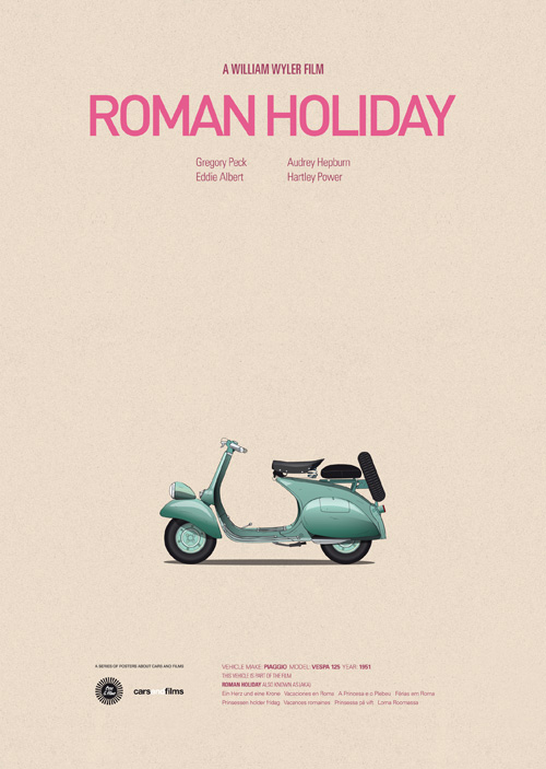
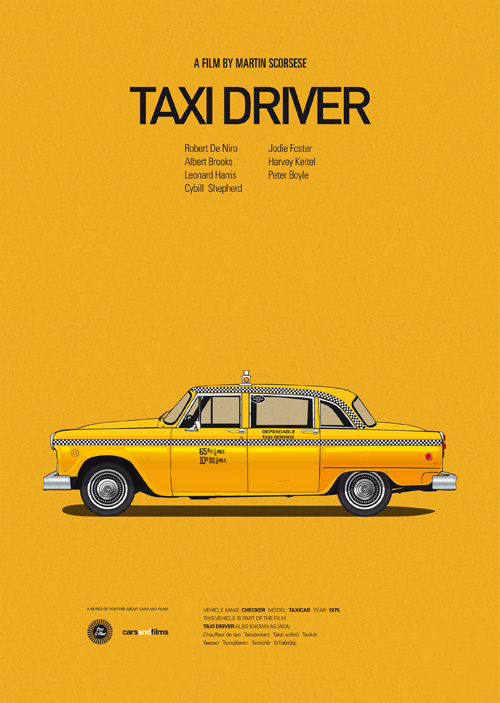
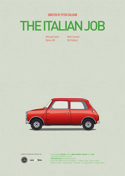
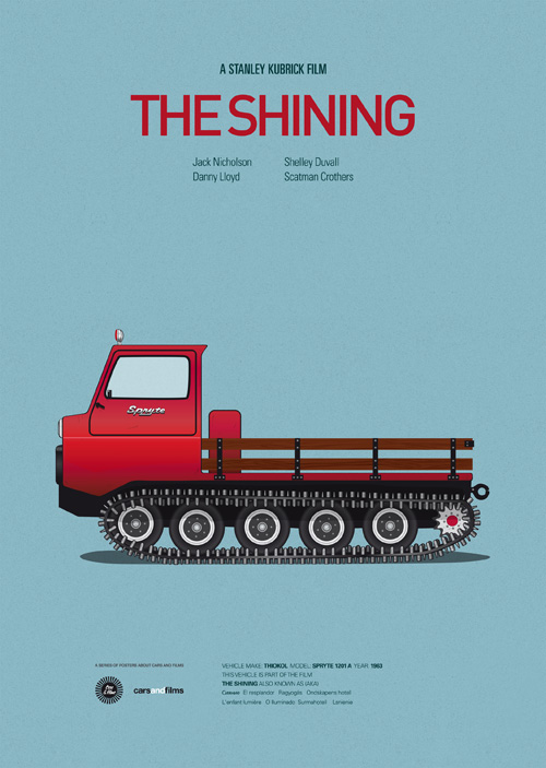
Prudencio’s approach is deceptively simple. Most movie merchandising starts with the star. His posters start with the machine that audiences remember even when they forget a secondary character’s name: the Ghostbusters Cadillac, the Death Proof muscle car, the scorpion-jacket Chevy of Drive, the austere future car of Gattaca, Bond’s Aston Martin from Goldfinger, the yellow Little Miss Sunshine VW, Mr. Bean’s Mini, the Pulp Fiction ride, Audrey Hepburn’s Roman Holiday scooter, Travis Bickle’s taxi, the Mini fleet of The Italian Job, the Overlook’s snowbound vehicle from The Shining. Each silhouette is a plot shortcut you can hang on a wall.
Why side views work so well
A side elevation is the automotive equivalent of a passport photo: identifiable, comparable, slightly formal. By refusing three-quarter action angles, Prudencio turns each vehicle into a specimen. You can almost imagine a museum label. That formality is funny when the subject is Mr. Bean’s cluttered Mini and solemn when the subject is Bond’s DB5. The consistent viewpoint is the series’ real brand. Once you have seen three posters, you recognize the fourth instantly—even at thumbnail size on a blog roundup.
Color does the emotional work that camera angles usually do. The Little Miss Sunshine van’s yellow is optimism and exhaustion in one panel. Ghostbusters white-and-red reads as pop utility. Drive’s darker, night-adjacent palette suggests neo-noir cool without needing Ryan Gosling in the frame. Prudencio understands that film memory is often chromatic: audiences store hue as hard as they store plot. Typography and empty space around the vehicle keep the posters poster-like rather than mere car cutouts floating on white.
Jesús Prudencio’s design background
Based in Seville, Spain, Jesús Prudencio works as a graphic designer and illustrator with a résumé that has included advertising and magazine work across Europe and beyond—agencies and titles that range from commercial campaigns to features in design and lifestyle press. Cars and Films began as a passion project—poster craft meeting automotive obsession—then grew into a recognizable library. Later counts put the collection well past a hundred designs, stretching from pre-war racers and cartoon automobiles to contemporary cult favorites. Early attention in 2013 (design blogs, film roundups, My Modern Met–style features) established the vocabulary; subsequent years expanded the filmography without abandoning the side-view rule.
That consistency is rare in internet-born illustration projects, which often mutate to chase algorithms. Prudencio’s series stays legible because the constraint is strong: one vehicle, one film memory, one clean poster plane. Fans can collect them as a set the way people once collected lobby cards. The wall becomes a personal film festival organized by sheet metal and paint. Later press, exhibitions, and even a cameo as wall décor in television confirmed that the project had left the blog-roundup phase and entered durable pop-design culture—but the early wave still matters as the moment many viewers first met the set.
Reading the gallery film by film
Ghostbusters: The Cadillac hearse-ambulance hybrid is already a character. Drawn in profile, it becomes a logo of paranormal comedy—utility vehicle as punchline and hero transport.
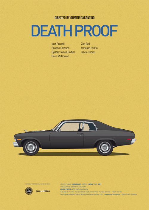
Death Proof: Tarantino’s stunt-world muscle car carries menace in its stance alone. Without Kurt Russell’s face, the vehicle still suggests grindhouse velocity and danger.
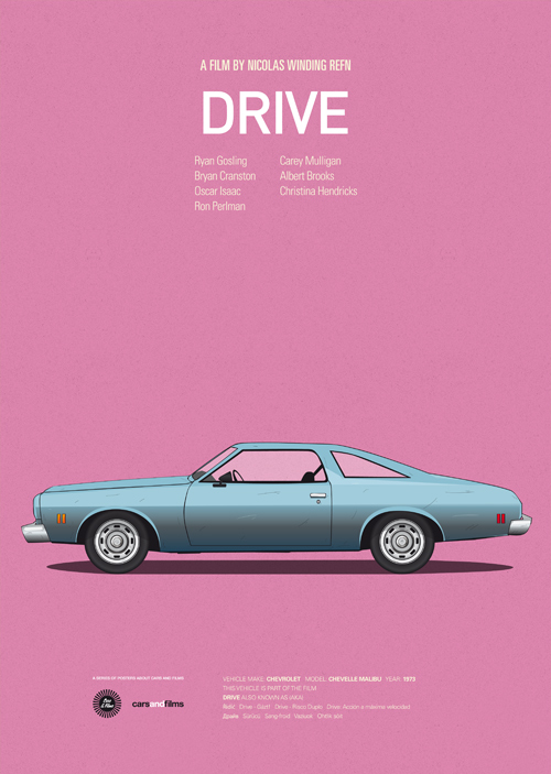
Drive: The film’s car is atmosphere on wheels. A quiet side view fits the movie’s controlled cool better than a screeching chase crop would.
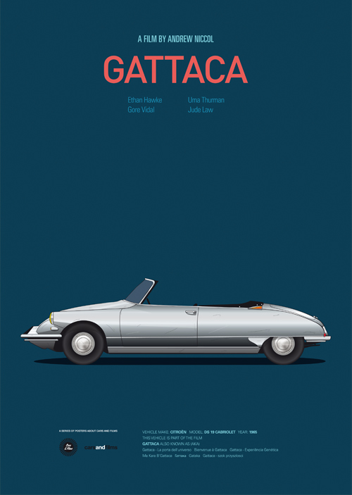
Gattaca: Futurist design and social hierarchy meet in a vehicle that looks engineered for a world of measured DNA. Clean lines suit Prudencio’s graphic restraint.
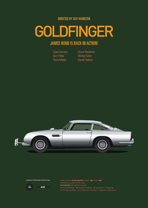
Goldfinger: The Aston Martin DB5 is the series’ natural center of gravity—Prudencio has called Bond’s car a favorite for good reason. Few movie machines are more instantly “poster-ready.”
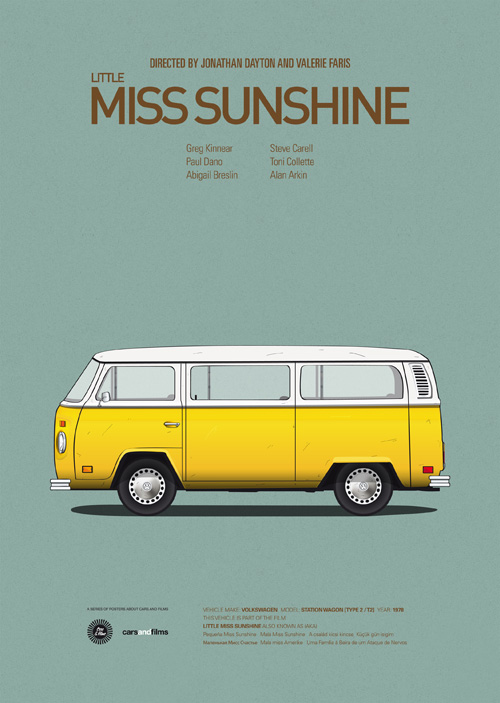
Little Miss Sunshine: The VW bus is a family comedy’s beating heart. Yellow paint does narrative work; dents and proportions remind you the trip was never glamorous.
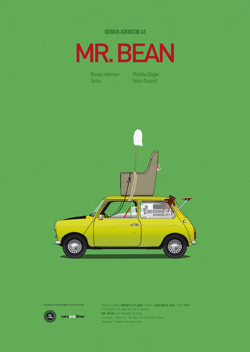
Mr. Bean: Clutter and Mini proportions turn the poster into visual comedy. The side view makes the chaos readable as inventory.
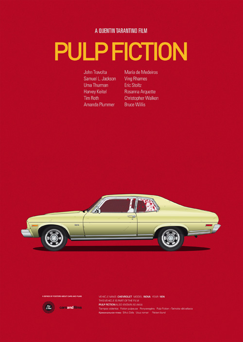
Pulp Fiction: Tarantino’s world again, this time through a different automotive memory—another reminder that 1990s crime cool is partly a car culture fantasy.
Roman Holiday: The Vespa is intimacy and escape. Scaling a two-person scooter in the same poster format as a Cadillac is part of the series’ charm: hierarchy of fame, equality of layout.
Taxi Driver: A yellow cab in profile is already a New York myth. Prudencio’s version lets the vehicle carry Scorsese’s night-city tension without quoting a still.
The Italian Job: Mini Coopers as heist instruments—cute shapes doing serious crime. The poster format loves that contradiction.
The Shining: A vehicle approaching isolation. Even without the hotel facade, the car suggests a journey toward something that will not let go.
What the series teaches about film memory
Cars and Films argues, quietly, that transportation design is part of screenwriting. Directors choose vehicles the way they choose costumes: to declare class, era, danger, comedy, or romance before a line is spoken. By isolating those choices, Jesús Prudencio makes the audience notice craft that usually sits at the edge of the frame. The posters are also excellent teaching tools for designers. Limitation breeds recognition. One viewpoint, repeated, becomes a system you can expand film by film without losing identity.
For collectors comparing the images here, try a simple test: cover any implied title in your mind and ask whether the vehicle still carries the movie. If the answer is immediate, Prudencio’s thesis holds. If you hesitate, you have found a film that relied more on faces than on sheet metal—and that contrast is interesting too. Either way, the Seville illustrator’s filmography of iconic cars remains one of the clearest graphic arguments that cinema is partly designed on four wheels.

Comments
Continue reading
Photo vs Illustrated Save-the-Dates: How to Choose a Format
A practical comparison of photographic and illustrated save-the-dates—when a portrait earns the stamp, when a drawing carries the date, and how to match format to venue, guests, and printing.
Escort-Card Displays That Aren’t a Table of Tiny Cards
Walls, branches, envelopes, mirrors, and numbered installations—how to stage escort cards so guests find their tables without a crowded lobby table.

Berry, Brick, and Brown Lipsticks That Still Read as Color
A guide to berry, brick, and brown lipsticks—undertones, finishes, and light—when classic fire-engine red is not the shade you want to wear.