
Kate Hudson for Harper’s Bazaar US, October 2012
A historical look at Kate Hudson’s dual October 2012 Harper’s Bazaar US covers—shot by Camilla Akrans in couture for the newsstand and subscriber editions.
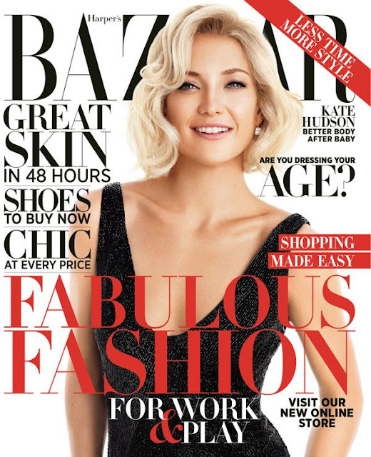
In autumn 2012, Kate Hudson appeared on the covers of Harper’s Bazaar US for the magazine’s October issue—a fashion package issued in dual newsstand and subscriber editions. Photographed by Camilla Akrans and styled by Simon Robins, the sitting framed Hudson in couture glamour rather than casual red-carpet reportage. The gallery below belongs to that historical magazine moment: actress as cover subject, haute couture as costume language, and Bazaar’s early-2010s habit of splitting one star across two cover temperatures.
Hudson was then in her early thirties and already a familiar face on American magazine racks—an actress whose public image mixed comedy, romance, and a blonde ease fashion editors knew how to light. The October 2012 Bazaar feature did not invent that persona. It refined it through couture: crystal embroidery, structured gowns, saturated color, and the kind of still glamour print covers still traded in when the newsstand remained a primary first viewing room. Reading the package now means keeping it inside 2012—not updating it with later career chapters or gossip cycles.
Two covers for one October issue
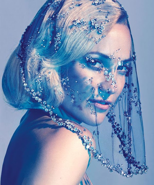
Harper’s Bazaar US ran Hudson on dual October covers, a strategy magazines used to maximize both impulse buys and subscriber satisfaction. Contemporary coverage of the issue noted a newsstand edition featuring Hudson in a Ralph Lauren gown and a subscriber cover built around an Armani Privé crystal-embroidered veil. Same subject, different silhouette temperatures: open gown glamour for the rack, veiled couture mystery for the mailbox. Dual covers let a title test two moods without commissioning two unrelated shoots.
Inside the book, the editorial—discussed in fashion roundups under titles such as “Kate in Couture” and “Blondes Have More Fun”—moved through houses associated with high craft: Valentino, Chanel Haute Couture, Christian Dior Haute Couture, Givenchy Haute Couture, Gaultier Paris, Armani Privé, and jewel accents from houses such as Tiffany & Co. The clothes were the industrial point of the feature. Hudson’s job was to wear them with enough ease that couture looked inhabited rather than rented for an afternoon.
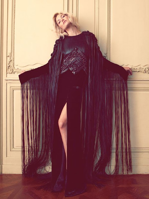
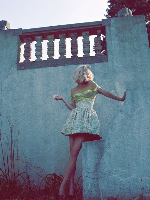
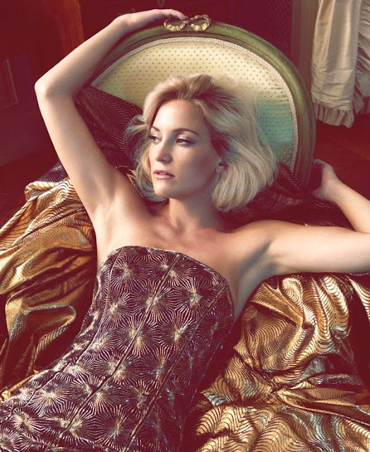
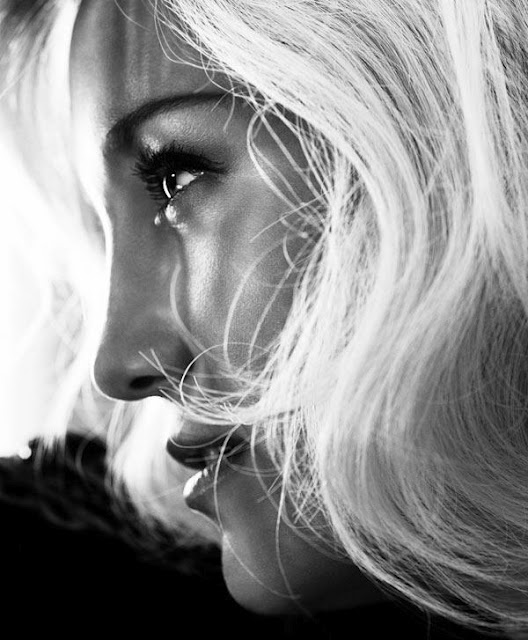
Camilla Akrans’s photographs favor a sensual, relatively unpretentious Kate—close enough for skin and fabric texture, composed enough for a fashion monthly. Simon Robins’s styling keeps silhouettes readable: strong shoulders or veils where needed, jewelry that finishes the line rather than drowning it. Contemporary editorial databases credit beauty work including Franco Gobbi on hair and Wendy Rowe on makeup, tuned for lacquered early-2010s polish—visible contour, finished mouth, lashes that survive newsprint and phone screens alike—rather than the later decade’s muted naturalism.
Why a fashion monthly wanted Hudson in 2012
Cover logic in 2012 still depended on recognition at a glance. Hudson brought Hollywood familiarity without requiring a debutante narrative. She could carry romance, humor, and physical ease—qualities that help when a magazine asks an actress to sell couture to readers who may never attend a couture show. Fashion monthlies of that period often used film and television stars as bridges between atelier fantasy and living-room aspiration. Hudson fit the bridge: accessible enough for mass recognition, glamorous enough for Bazaar’s self-image.
October timing reinforced the wardrobe choice. Fall issues are traditional showcases for eveningwear and statement jewelry. Crystal veils, red Valentino drama, and haute couture volume photograph as seasonal event objects. A dual-cover Hudson package gave Bazaar a celebrity headline and a clothes story in one shipment—efficient packaging for an industry that still measured success partly in newsstand presence and coffee-table longevity.
Historical framing also means what the feature is not. It is not a ranking of Hudson’s later projects, not a relationship timeline, and not a “where is she now” update. The useful record is narrower: Hudson, Akrans, Robins, Bazaar US, October 2012, dual covers, couture wardrobe. Keeping that boundary protects the URL’s topic and keeps the gallery readable as archive rather than as bait for newer headlines.
How to look at the stills and motion clips
Fashion editorials from this era reward slow looking. Notice how veil and crystal catch light differently from matte gown fabric; how blonde hair functions as a second highlight against dark or saturated dresses; how Hudson’s posture alternates between open smile energy and quieter, mouth-closed cover stare. Dual covers often split those moods on purpose—one friendlier for browsers, one more enigmatic for collectors of the issue.
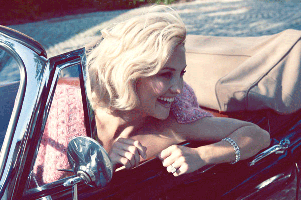
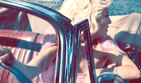
The motion clips preserved with the stills are useful as process documents. They show the difference between a locked cover expression and the in-between breaths of a sitting—hair checks, fabric resets, the small laugh that never makes the final page. Couture covers are labor: lights, fittings, repetition, and a team negotiating wind, sparkle, and timing. Still frames sell myth; adjacent motion restores the workday.
Color and texture do more storytelling than props. Red Valentino reads as drama without needing a narrative caption. Crystal Armani Privé reads as distance and ceremony. Ralph Lauren gown glamour on the newsstand cover reads as approachable eveningwear fantasy. Those distinctions are why dual covers were worth the printing cost. Each edition offered a different door into the same sitting.
Couture as costume for a familiar star
What makes the 2012 Bazaar package coherent is the gap it closes between Hudson’s public accessibility and the distance of haute couture. Valentino red, Dior volume, Chanel craft, Armani Privé crystal—these are not everyday wardrobe notes. On Hudson they become character notes: glamour without stiffness, sensuality without coldness. Akrans’s camera keeps skin and eye contact warm enough that atelier clothes feel like an elevated version of a star readers already thought they knew.
That alchemy was classic for fashion magazines of the period. The celebrity supplies recognition; the couture supplies aspiration; the photographer supplies a mood that can live on a coffee table for a month. Years later, the same images function as archive evidence of how Harper’s Bazaar US packaged Kate Hudson for October 2012, and of how dual covers once split a single sitting into two retail faces.
For a clean research note, keep the credits short: Kate Hudson; Harper’s Bazaar US, October 2012; photography by Camilla Akrans; fashion editing by Simon Robins; dual covers including Ralph Lauren and Armani Privé looks; interior couture from houses such as Valentino, Chanel, Dior, Givenchy, and Gaultier. The frames around those credits do the rest of the remembering.

Comments
Continue reading
Photo vs Illustrated Save-the-Dates: How to Choose a Format
A practical comparison of photographic and illustrated save-the-dates—when a portrait earns the stamp, when a drawing carries the date, and how to match format to venue, guests, and printing.
Escort-Card Displays That Aren’t a Table of Tiny Cards
Walls, branches, envelopes, mirrors, and numbered installations—how to stage escort cards so guests find their tables without a crowded lobby table.
Berry, Brick, and Brown Lipsticks That Still Read as Color
A guide to berry, brick, and brown lipsticks—undertones, finishes, and light—when classic fire-engine red is not the shade you want to wear.