
Miranda Kerr for Mango Fall/Winter 2013 Lookbook
Inez & Vinoodh shoot Miranda Kerr in New York for Mango’s Fall ’13 retail campaign—punk-edged high-street clothes, raw finish, and lookbook logic from 2013.
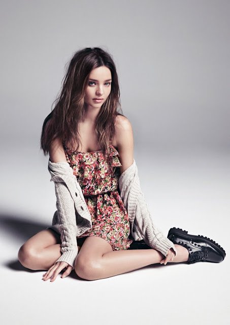
Photographers Inez van Lamsweerde and Vinoodh Matadin captured Australian model Miranda Kerr for Spanish fashion brand Mango’s Fall/Winter 2013 campaign—a retail lookbook and advertising set built to sell clothes, not a men’s-magazine cover story. Shot in New York with the city skyline as recurring backdrop, the pictures push a punk- and grunge-tinged seasonal wardrobe: leather, tartan, boots, denim, checked layers, and high-street pieces meant to read instantly in store windows and e-commerce crops.
By summer 2013, Kerr had already become a returning Mango face after the brand’s Kate Moss era, and this Fall ’13 drop kept the collaboration with Inez & Vinoodh in motion. Styling for the campaign was credited to Géraldine Saglio, with period reports also noting Lisa Butler on makeup and Christiaan on hair. The commercial brief was clear: show Fall clothes on a globally known model, keep the attitude raw enough to match a punk-edged collection, and make garments recognizable at a glance.
Lookbook logic versus magazine heat
This is retail fashion communication. A Mango Fall lookbook has to answer shopper questions: What is the silhouette this season? How heavy is the outerwear? Can tartan trousers work with a pinstripe jacket? Does the leather varsity piece look wearable on a real sidewalk? Esquire-style cover packages answer different questions about desirability and interview personality. Confusing the two flattens Kerr’s 2012–13 image work into one generic “fashion gallery,” when the jobs were distinct.
In the Fall ’13 Mango frames, clothes lead. Kerr still supplies star power, but the garments remain the merchandise. Minimal makeup and a rawer finish—exactly what Kerr praised in period quotes—support that hierarchy. She said she loved that Inez and Vinoodh kept the campaign look raw and natural because it complemented the collection, and she called the season’s clothing fun for its punk-inspired edge. That language is product language dressed as creative appreciation.
Compare the New York location habit with a sealed studio lingerie editorial and the difference becomes obvious. City architecture, daylight or location ambience, and full outfits turn Kerr into a walker through a seasonal story. The viewer is invited to imagine buying into that story at Mango prices, not only admiring a magazine honor.
What Fall ’13 was selling
Contemporary fashion coverage described a diluted, girlish take on grunge and punk rather than museum-costume rebellion: tartan trousers, leather jackets, chunky boots, slouchy layers, checked shirts, military-boot energy, and pieces that could sit beside softer knits or floral options in the same seasonal floor set. The campaign’s job was to make that mix look coherent on one body. Kerr’s continuity as face helped. Shoppers who had trusted her in a previous Mango season did not need a new identity lesson; they needed new clothes.
Look for tonal shifts inside the set even when only a single hero image is shown on a page like this. Casual frames lean on denim and shirts. Sharper frames push leather and tartan structure. Soft counterweights—knits, dresses, checked jackets—keep the collection from becoming costume. That range is classic high-street catalogue thinking: one model, many purchase occasions, one continuous cool.
New York matters as brand theater. Using the skyline as backdrop places Spanish retail inside a global fashion capital without needing couture prices. The city reads as aspiration; the clothes remain accessible. Early-2010s Mango campaigns repeatedly used famous faces for exactly that bridge—Moss before, Kerr here, and a longer history of names such as Penélope Cruz, Naomi Campbell, and others in the brand’s advertising memory.
Inez & Vinoodh for a high-street calendar
Inez and Vinoodh’s campaign vocabulary favors clarity. Even on location, they keep gesture readable and garments central. Kerr’s posture does “already owned” rather than “borrowed for an hour,” which is gold for mass fashion. Shoulders drop, chin finds a natural angle, clothes hang like habit. The duo’s familiarity with Kerr from prior Mango work also helps: the team can chase freshness in wardrobe without rebuilding trust from zero.
Behind the polish sits retail pragmatism. Campaign stills had to survive billboards, magazine inserts, website heroes, and social crops. A lookbook image that depends on an unreadable prop fails those formats. The Fall ’13 pictures keep silhouette and fabric first so a leather sleeve or tartan leg still communicates after aggressive cropping. That is why the set still functions as a historical gallery: you can study 2013 high-street attitude without needing the original store racks.
Kerr’s own notes on the shoot
In quotes circulated with the campaign launch, Kerr emphasized collaboration pleasure as much as clothes. She said she had a great time shooting the Fall/Winter campaign with Inez and Vinoodh, called them an amazing team, and singled out the season’s punk-inspired edge as especially fun. The line about raw, natural finishing is the most useful for viewers: it tells you the creative target was not glossy lingerie-magazine glamour and not over-produced fantasy. It was clothes in a believable temperature.
That temperature is historical. The campaign belongs to 2013’s fashion conversation about wearable grunge revival and high-street punk accents, not to later wardrobe cycles. Reading it as a current trend report misses the point. Reading it as a dated retail document keeps the page honest.
How to read a single lookbook frame
When a recovered gallery preserves only one or a few images, slow down on the survivors. Ask:
- Garment first: What item would a buyer recognize in three seconds?
- Season signals: Boots, leather, tartan, and layered weight say autumn/winter without a caption.
- Location job: Does New York make the clothes feel global and street-ready?
- Finish: Is makeup soft and hair slightly undone on purpose, matching Kerr’s “raw and natural” note?
- Commercial motive: Could this frame hang in a shop window and still explain the collection?
Those questions separate this Mango Fall ’13 lookbook from Kerr’s December 2012 Esquire UK cover moment. One sells a magazine’s year-end myth. The other sells a seasonal wardrobe through a Spanish high-street lens. Same model, neighboring years, different jobs—and the Fall ’13 pictures only make sense when you keep the retail brief in front of your eyes.
Which piece would you have reached for first from that collection: the leather layer, the tartan trousers, or the quieter knit that makes the punk edge wearable on a weekday?

Comments
Continue reading
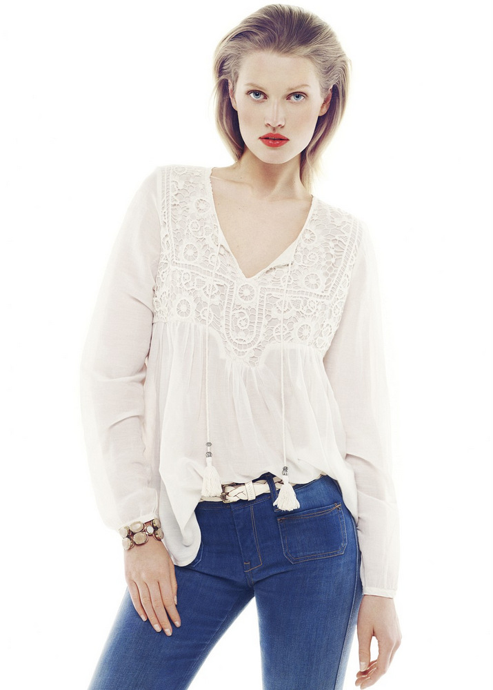
Toni Garrn for Mango Summer 2013: Romantic Essence Lookbook
Toni Garrn fronts Mango’s Summer 2013 Romantic Essence lookbook—pale tones, sheer tops, denim, and warm-weather ease against the denser Winter 2012 story.
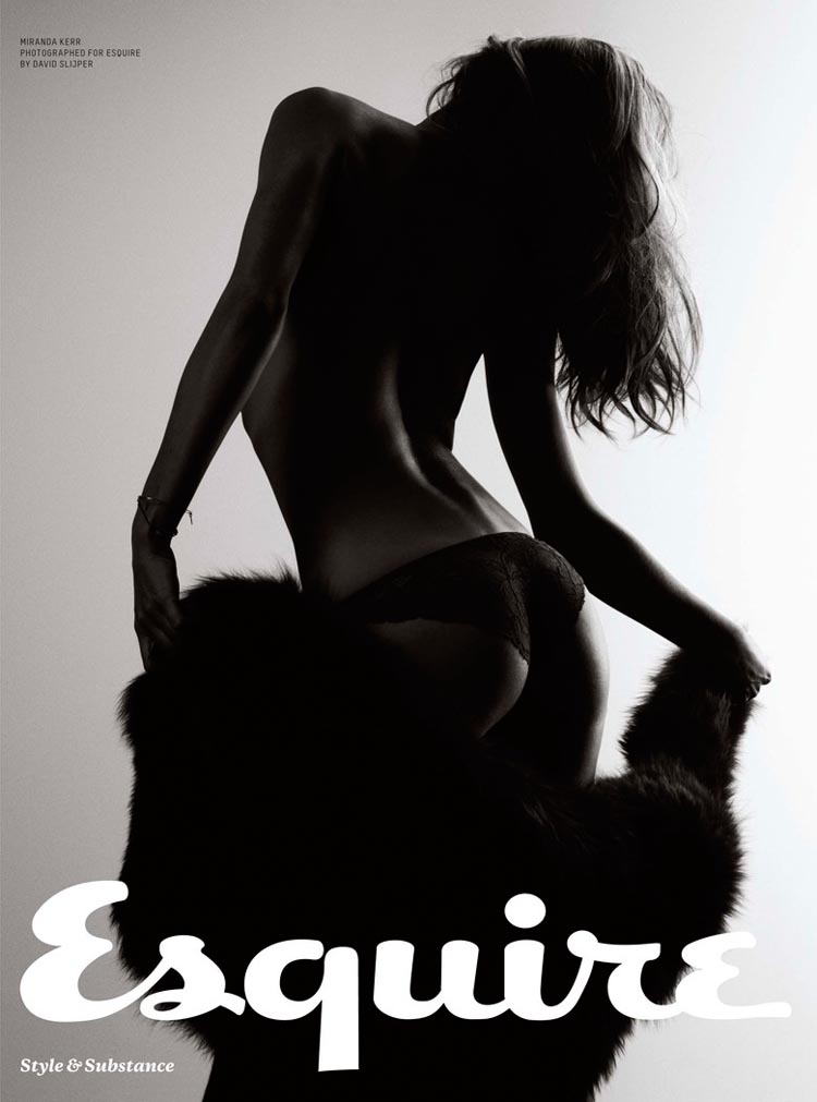
Miranda Kerr on Esquire UK’s December 2012 Cover
A historical look at Miranda Kerr as Esquire UK’s Sexiest Woman Alive 2012—David Slijper’s December cover story, interview notes, and newsstand glamour from late 2012.
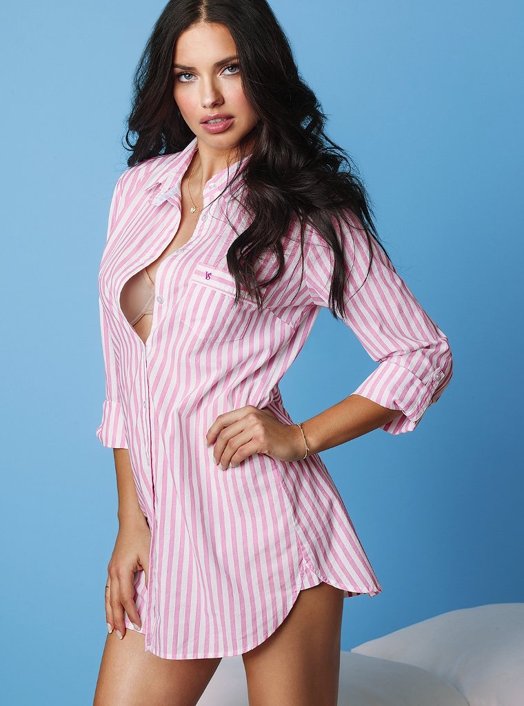
Adriana Lima in Victoria’s Secret’s April 2013 Lookbook
Pink-striped sleep shirt, sky-blue seamless, gold chains—Adriana Lima’s surviving frame from Victoria’s Secret’s April 2013 lookbook.