
Truth & Lies Posters by Justin Barber
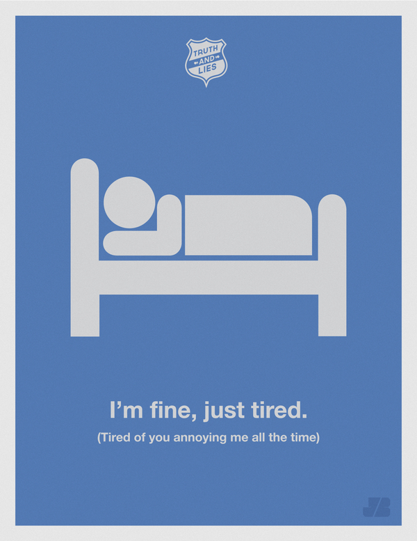
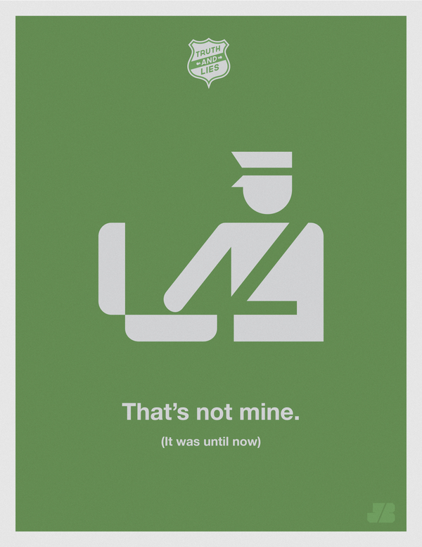
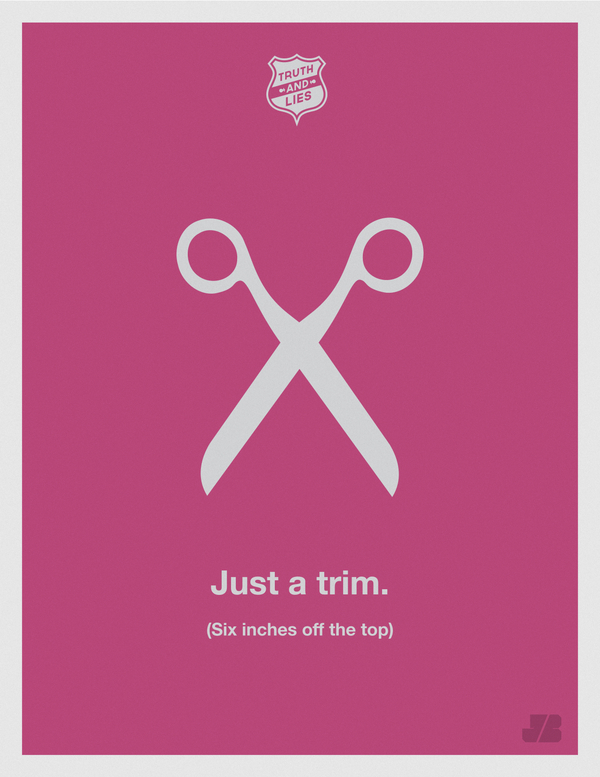
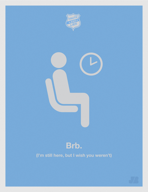
Freelance designer Justin Barber’s Truth & Lies poster series—minimalist typography that diagrams everyday white lies and what we all hear underneath.
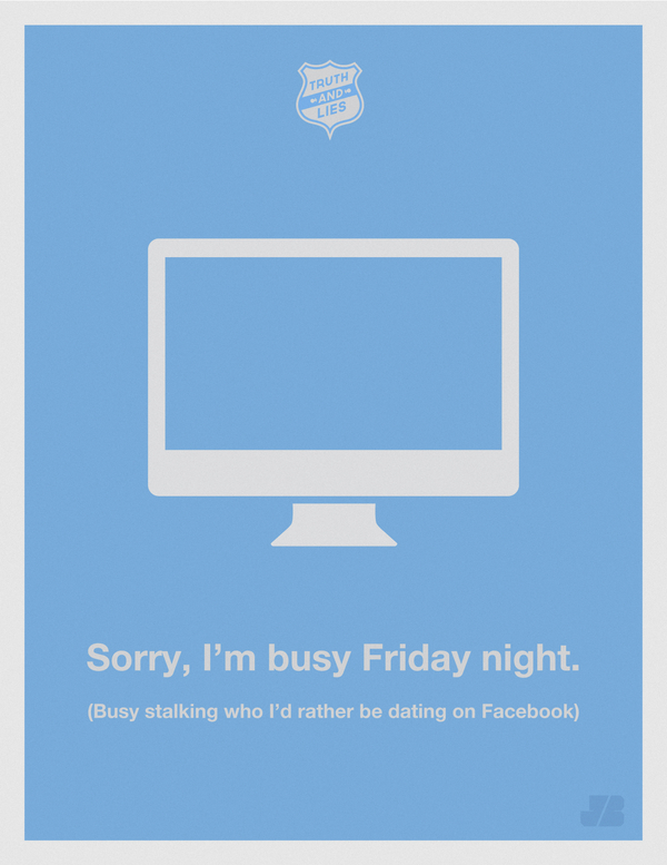
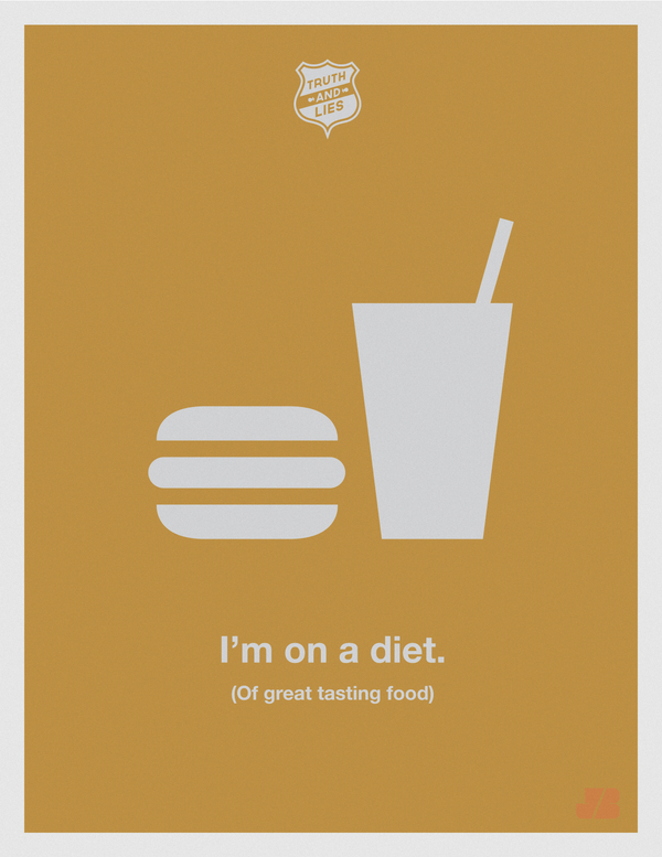
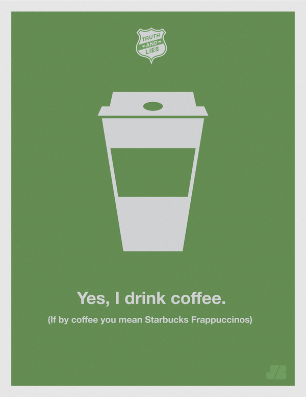
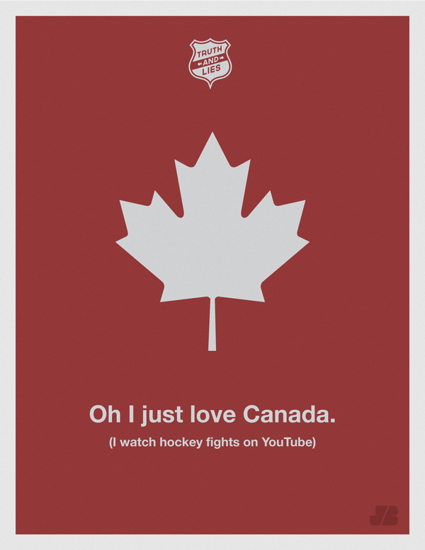
Justin Barber’s Truth & Lies poster series takes everyday white lies — the ones we tell ourselves and the ones we politely accept from others — and sets them in clean, minimalist typography. Each sheet plays a familiar game: what people say on the surface, and what everyone in the room silently translates. The humor works because the situations are ordinary. Missed alarms, vague excuses, social soft landings — Barber does not invent new vices; he diagrams the ones already in circulation among friends, coworkers, and anyone who has ever negotiated with a snooze button.
Barber, working as a freelance graphic designer, framed the project with a simple premise: this is what you say, but this is what you mean, and we all know it. That double register is the engine of the series. The posters are not moral lectures. They are visual punch lines that reward a second glance, closer to wry observation than to scolding, and closer to design craft than to disposable internet humor.
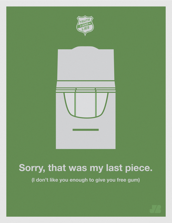
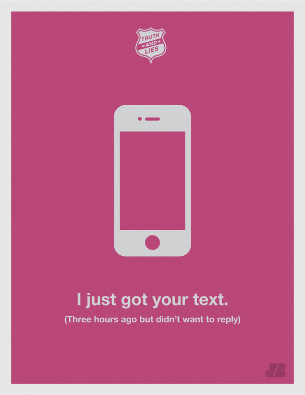

How the concept lands
Little white lies survive because they grease social machinery. “I didn’t hear my alarm” often means the snooze button won after the fifth round. “I’m five minutes away” can mean the shoes are still by the door. “Let’s definitely hang out soon” can mean the calendar will never open. Barber’s posters treat those translations as shared knowledge rather than secrets. The viewer becomes a co-conspirator: you recognize the line, then recognize yourself in the quieter version underneath.
That recognition is why the series travels well as a poster set. Each piece can stand alone on a wall, yet together they form a catalog of modern excuses and gentle self-flattery. The humor stays light because the design stays light. Nothing in the presentation begs for applause; the joke is in the contrast between polite surface and private truth. You do not need a caption explaining the gag. If you have lived through mornings, meetings, and mild self-mythology, you already speak the dialect Barber is lettering.
Importantly, the series does not claim that every courtesy is corruption. It notices the gap between performance and motive — a gap most adults manage daily without drama. The comedy is in naming the gap with neat type instead of pretending it does not exist.
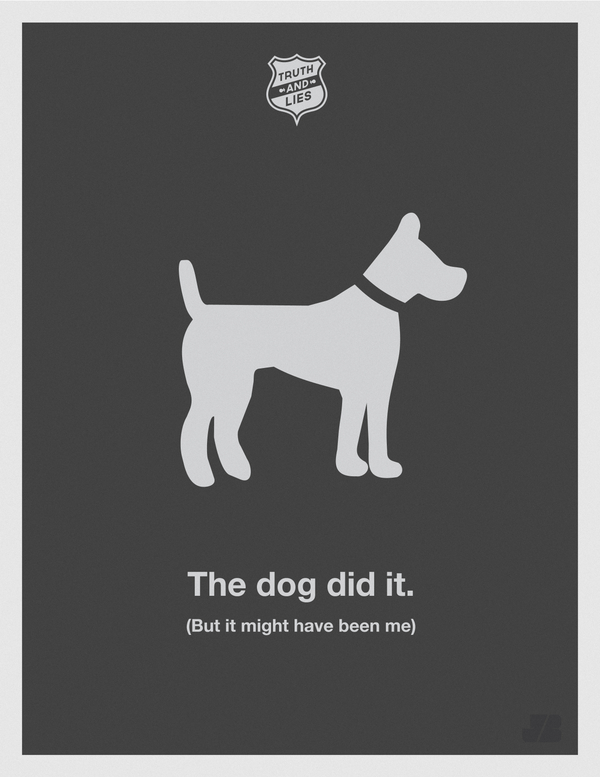
Minimalist graphics as delivery system
The visual language is restrained on purpose. Sparse layouts, clear type hierarchy, and plenty of empty space keep the wit from drowning in decoration. Minimalism here is not fashion; it is timing. Like a good one-liner, the posters leave room for the viewer to complete the thought before the next sheet arrives in the sequence.
Typography does the acting. Weight changes, alignment, and the separation between “said” and “meant” create a before-and-after without needing illustration-heavy scenes. Where imagery appears, it supports the gag rather than competing with it. The posters feel printed for walls, studios, offices, and dorm rooms — objects you encounter while making coffee, not denser artworks that demand a museum label before they land.
That print-forward clarity also explains why the set photographs so cleanly as a run. Scrolling the posters one after another becomes a rhythm: setup, reveal, smile, next. The series rewards binge viewing without exhausting the eye, which is harder than it looks. Many concept series collapse after three pieces once the novelty thins; Barber’s restraint keeps the joke elastic across a full grid of sheets.
From a design-education angle, the work is a useful reminder that concept and craft are not rivals. A clever premise still needs pacing, margins, and type that can be read from across a room. Barber’s freelance polish shows in those unglamorous decisions.
Why the jokes still feel familiar
Social media did not invent polite dishonesty; it only accelerated the audience for it. Barber’s subjects sit in older territory — work, romance, vanity, delay, the tiny performances of being a functional adult. Because the lies are small, the comedy stays affectionate. You are not asked to condemn anyone. You are asked to admit you have heard the line, and maybe used it when the blunt truth would have been socially expensive.
Designers often chase concepts that need paragraphs of explanation. Truth & Lies needs almost none. The premise fits in one sentence, then the posters do the rest. That economy is part of the craft. Barber trusts the viewer’s cultural literacy instead of over-designing the punch line. In a period when graphic humor often shouts with stickers, gradients, and stacked captions, the quiet page becomes the surprise.
There is also a durable lesson for anyone who makes visual work for a living: a strong series can be built from one hinge. Said versus meant. Surface versus subtext. Polite language versus private motive. Once that hinge exists, each poster is a variation rather than a reinvention, and the set gains coherence without sameness. Viewers can skip around and still feel they are inside the same conversation.
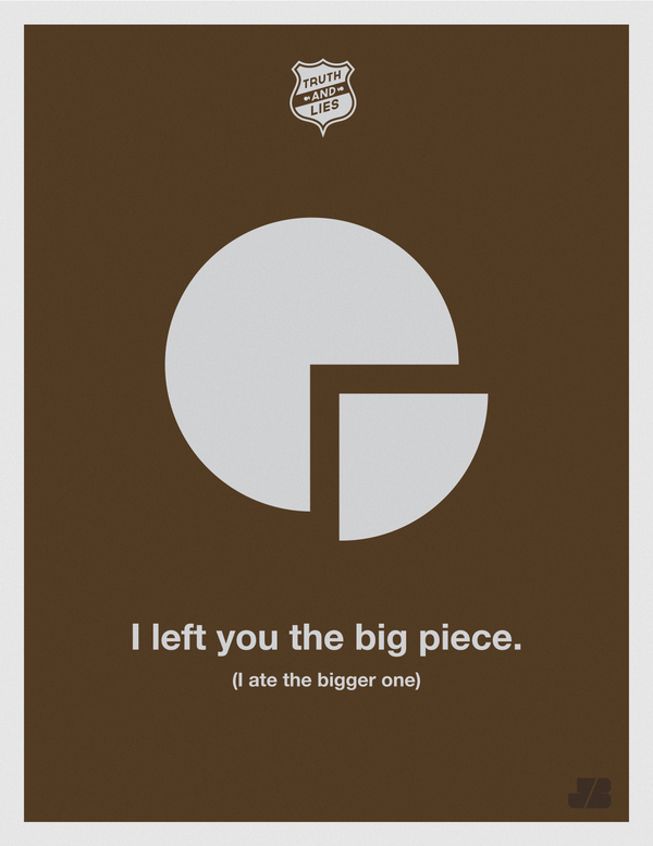
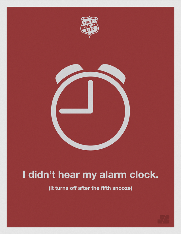
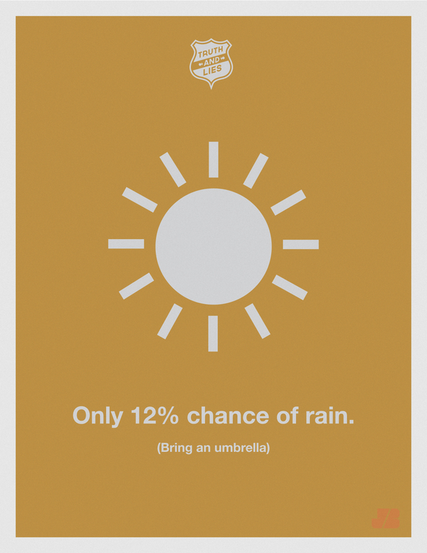
Looking at the set as a whole
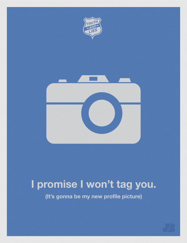
Seen together, the posters behave like chapters in a short comic essay about language. Some hit harder depending on your habits — the snooze-button crowd will claim one sheet; the chronic “on my way” texters will claim another; the people who perform endless optimism will find their own mirror somewhere in the grid. That personal sorting is a feature. The series invites you to curate favorites the way people curate quotes, except here the quote arrives already designed for a wall and ready to face guests.
For viewers interested in graphic design, the takeaway is not only the jokes. It is the demonstration that restraint can carry personality. No gradient storms, no overloaded icons — just type, space, and a cultural wink. Barber’s freelance practice shows up in the professionalism of the finish: these feel like pieces meant to be printed, hung, and lived with, not only liked once and forgotten in a feed.
Hang one poster and it is a wry accent above a desk. Hang several and the room starts to feel like it has a sense of humor about human frailty. Flip through the full set and you may catch yourself ranking which lie is most “you” — which is, in its own way, another small confession. The truths are not shocking. The lies are not monstrous. They are the small edits people make to get through a day — and Barber, with minimalist graphics and a dry smile, put those edits on paper where everyone can recognize them at once.

Comments
Continue reading
Photo vs Illustrated Save-the-Dates: How to Choose a Format
A practical comparison of photographic and illustrated save-the-dates—when a portrait earns the stamp, when a drawing carries the date, and how to match format to venue, guests, and printing.
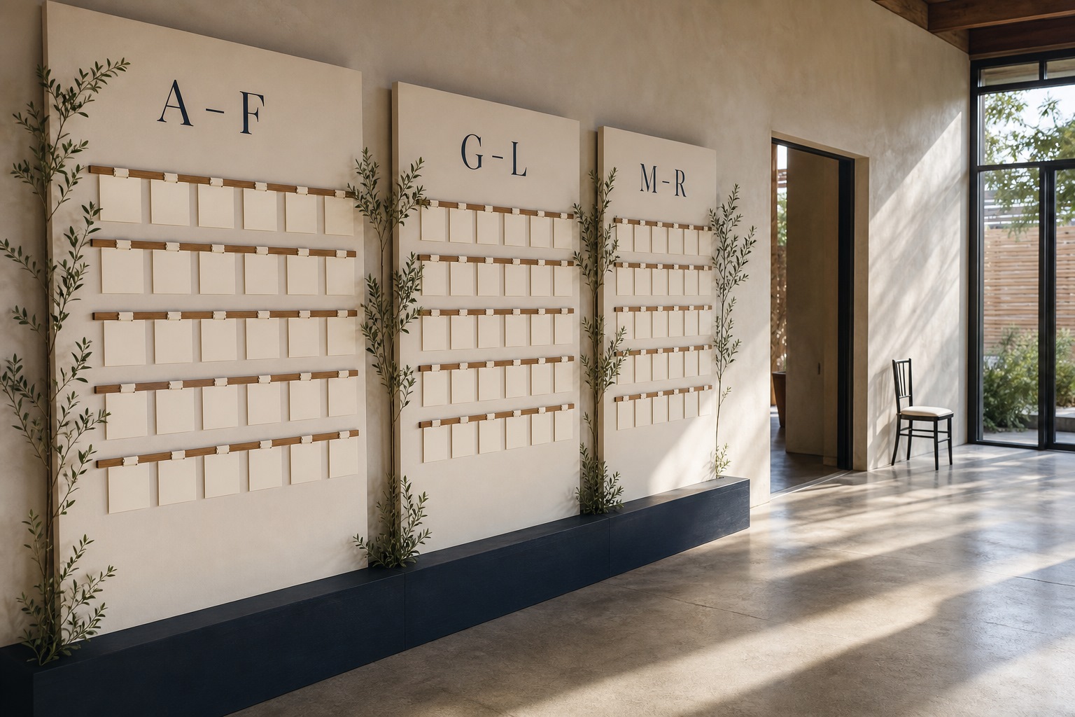
Escort-Card Displays That Aren’t a Table of Tiny Cards
Walls, branches, envelopes, mirrors, and numbered installations—how to stage escort cards so guests find their tables without a crowded lobby table.

Berry, Brick, and Brown Lipsticks That Still Read as Color
A guide to berry, brick, and brown lipsticks—undertones, finishes, and light—when classic fire-engine red is not the shade you want to wear.