
Wedding Place Card Ideas That Actually Seat Guests
Escort cards, seating charts, and at-table place cards that guests can read—coastal trays, cork boards, stationery matching, holders, and flow tips for assigned reception seating.
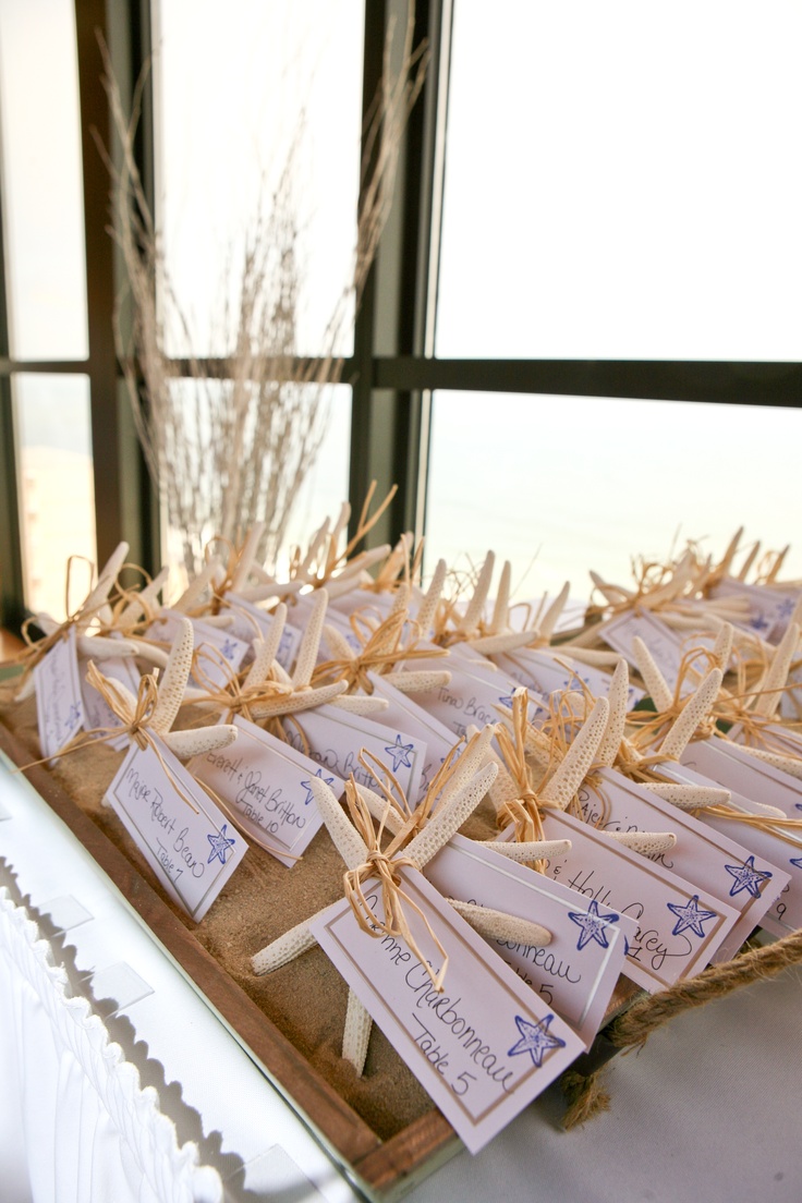
Assigned seating only works when guests can find their names without a scavenger hunt through the foyer. Place cards and escort displays are wayfinding tools with a decorative surface: they tell people which table—and often which chair—before dinner begins. They are not head-table centerpieces and not cake décor. Those pieces solve different problems elsewhere in the room. Here the job is narrower and more practical: readable names, clear table numbers, a display that matches the stationery suite, and a path that does not bottleneck cocktail hour.
Start by choosing the system, not the prop. Escort cards or a seating chart send guests to a table. Place cards at the setting mark a specific seat. Large receptions often use both layers; smaller dinners may need only one. Whatever you pick, write names the way guests expect to see them, put table numbers in a consistent place on every card, and light the display as carefully as you light the cake table. A gorgeous installation that cannot be read under dim entry lighting has already failed its only real test.
Coastal and destination weddings often use natural holders—sand trays, starfish, shells, or driftwood—to keep cards upright and on-theme. The cards themselves should stay simple: guest name, table number, maybe a tiny motif echoed from the invitation. People will pick the cards up. Make attachments secure and keep loose sand from transferring onto dark clothing. Place the tray where a line can form without blocking bathrooms, the bar, or the photographer’s path from ceremony to cocktail space.
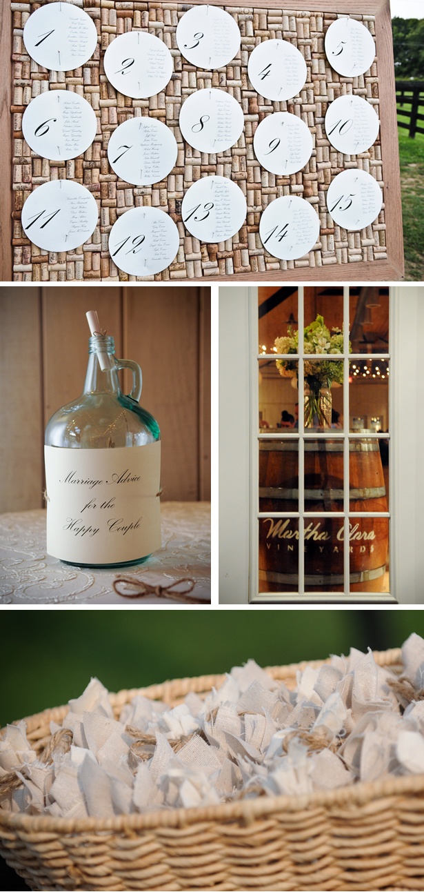
A cork-filled board with numbered circles listing guests turns the seating chart into a textured object that suits vineyards and rustic rooms. Large numerals help from a few steps away; keep each name list short enough to scan in seconds. Related vignettes—an advice jar, a favor basket—can sit nearby if they do not compete for the same eye-level band. One clear hero display is easier to staff and photograph than four small craft moments fighting for attention in a narrow hallway.
Paper, ink, and matching the invitation suite
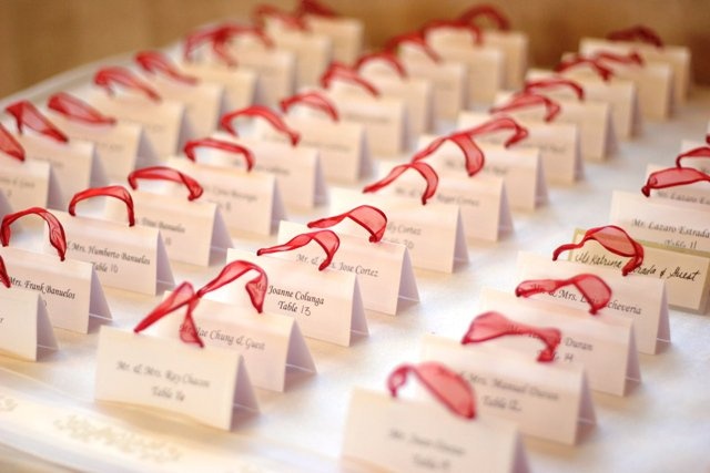
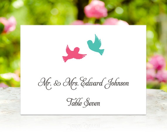
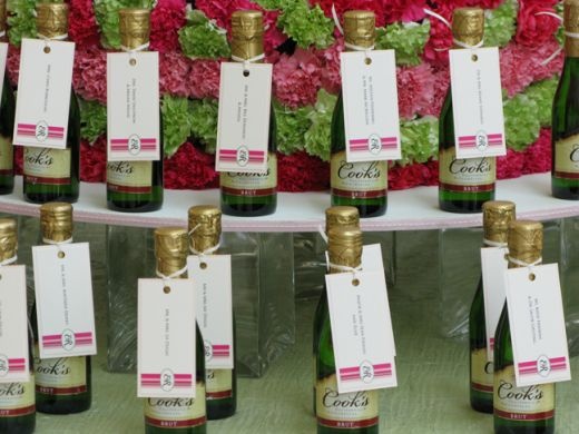
Classic tented cards, flat cards in holders, and calligraphed tags remain the most flexible formats because they scale from twenty guests to two hundred. Match paper weight and ink color to the invitations when budget allows so the day feels like one design system. If full calligraphy for every name is out of reach, print names in a clean, high-contrast font and save hand lettering for a header or the table numbers. Consistency reads as intentional; five competing scripts usually read as last-minute.
Proof the list against final RSVPs in the week of the wedding. Name plus-ones as they prefer to be called when you know the real name. Long compound surnames need type large enough to read at arm’s length. Dark ink on light stock remains the safest contrast under warm reception lighting; pale gray on kraft can look stylish in daylight and vanish after sunset. Leave a few blank cards and a fine pen with the coordinator for seating shifts that arrive after the printer’s cutoff. Confirm accent spellings—accents, hyphens, preferred nicknames—with the couple, not with assumptions from the envelope list.
Holders and favors that do not slow the line
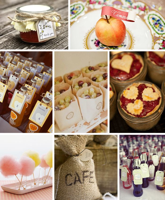
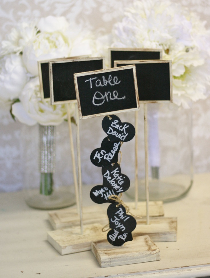
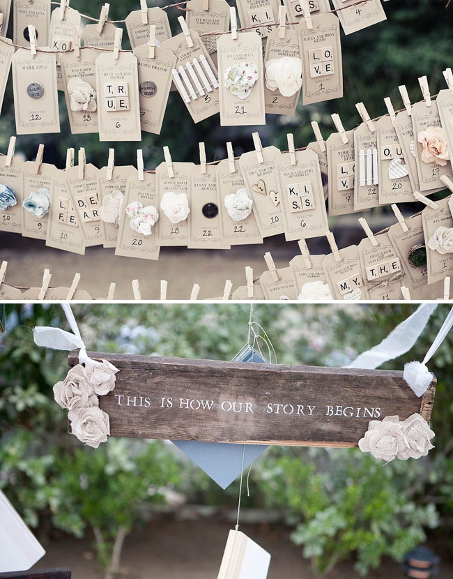
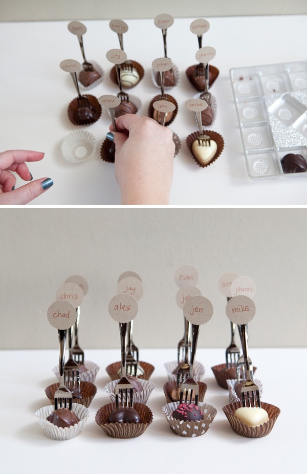
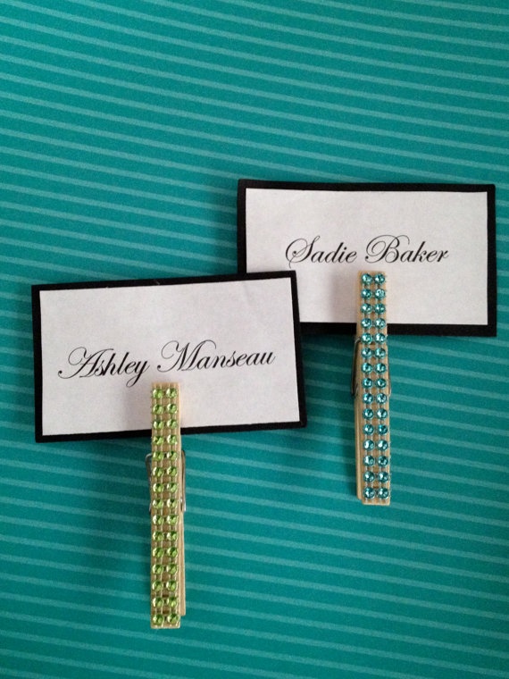
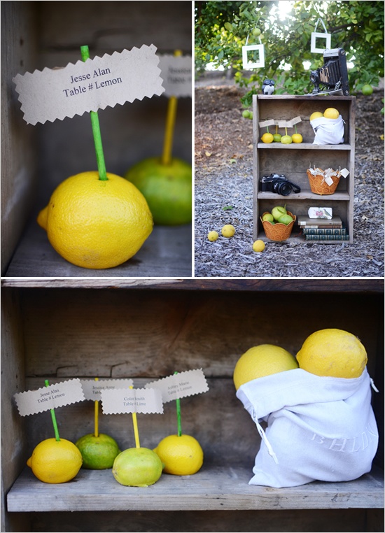
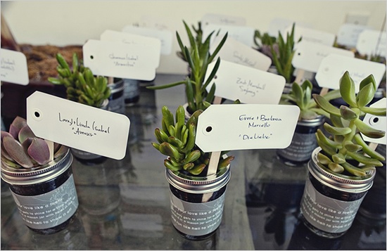
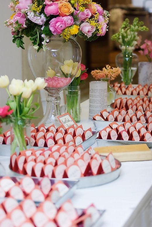
Mini clothespins on twine, herb sprigs, wine corks, small frames, river stones, and geometric stands keep cards from blowing away or lying flat on a crowded escort table. Choose materials that fit the venue: herbs and kraft tags for barns, acrylic and mirror for modern hotels, vintage keys or wax seals for romantic indoor rooms. Avoid oily finishes, heavy perfume, and sharp edges that snag silk. If the place card doubles as a favor—seed packets, tea sachets, tiny bottles—add a clear cue that guests should take it home, and keep the weight modest so trays do not sag while people juggle drinks.
Think about hands and flow. Guests often approach with a cocktail already in one hand. Oversize boards, sticky adhesives, or unstable towers create spills and backups. A waist-high table with cards arranged alphabetically in shallow rows usually empties faster than a tall vertical installation only two people can reach at once. For outdoor foyers, plan weights and a weather backup—clips, heavier stock, or a secondary indoor chart if wind turns hostile. Assign one attendant for the first fifteen minutes; a person who knows the list unsticks confusion faster than any decorative flourish.
Charts and walls guests can actually scan
Large seating charts succeed when names are grouped alphabetically by last name or clearly by table with strong headers. Alphabetical order is usually fastest for strangers; table-number grids help when whole families arrive together already knowing their party. Mount charts at comfortable reading height—not on the floor and not far above eye level. If the venue has two approaches to the dining room, provide a second small chart or a staffed list at the secondary door so half the crowd is not forced into a single choke point.
Mirror calligraphy and acrylic panels photograph beautifully and need a glare check. Take a phone photo in real venue light during setup; faint ink and reflections show immediately. Keep a digital copy of the chart on the planner’s phone in case a printed piece is damaged. Avoid placing the chart where evening sun hits the surface sideways, and do not hide it behind a gift table that will be surrounded by bags. Signage that says “find your seat” helps only if the arrow points to something lit and reachable.
At the table without crowding the plate
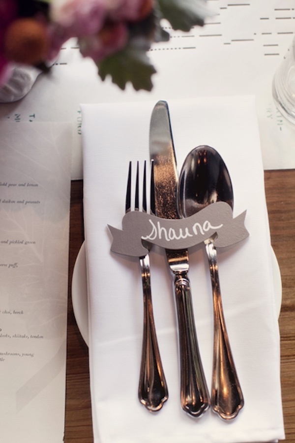
Once guests reach their tables, individual place cards should sit where a napkin or charger makes them obvious—usually above the plate or tucked into a simple fold. Keep them low so they do not compete with florals or candlelight. If meals are pre-assigned, a discreet icon or colored corner can cue servers without announcing dietary notes to the whole table; confirm that code with catering in writing before doors open. Outdoor dinners need weights or clips. Indoor air-conditioning can flip lightweight tents; heavier stock or a ribbon tie solves it. Skip glitter that sheds onto food. At children’s seats, avoid fragile glass holders and put cards at reachable height.
Timeline matters as much as typography. Build the escort display early enough to alphabetize calmly, then walk the guest path yourself: entrance, card pickup, route to tables, first seat. Check that elderly guests do not have to crouch, and that the display will not be struck for dancing before late arrivals finish finding seats. When every name is legible from a step away and the line does not block the bar, the stationery has done its quiet work—and nobody has to interrupt the photographer to ask where Aunt Maria sits.

Comments
Continue reading
Seating Cards for Wedding Tables: A Practical Planning Guide
How to choose escort cards, place cards, or a seating chart; lock the table map; design for readability; and set up day-of without vendor spam.
Window Seats That People Actually Sit In
Depth, cushions, storage, and light—how to build or dress a window seat so it becomes a reading spot instead of a dumping ground for laundry.
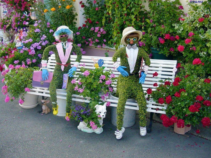
Garden Decoration Beyond Beds: Lace, Mosaiculture, and Upcycled Yard Art
From dressed topiary and floral cyclists to license-plate dragonflies and lace between trees—garden decorations that give a yard a voice.