
From Royal to Tiffany Blue: A Palette of Lifestyle Ideas
How deep ceremonial royal blue and pale aqua Tiffany tones work in fashion and interiors—criteria for undertone, contrast, and dose across a blue gallery.
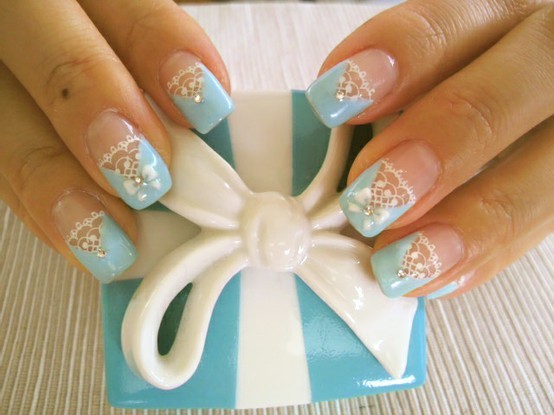
Blue is less a single color than a corridor of moods. At one end sits royal blue—deep, ceremonial, close to navy’s authority but brighter in daylight. At the other sits Tiffany blue—the pale, green-tinged aqua long associated with gift boxes and light spring air. Between them live sky, periwinkle, cobalt, powder, and countless unnamed mixes that appear in interiors, fashion, tableware, and small decorative objects. A gallery that moves from royal to Tiffany is really a study in temperature and saturation: how much pigment, how much air, how much green.
Use these images as a palette exercise rather than a shopping list. Ask what job each blue is doing—anchoring a room, softening a corner, sharpening an outfit, or flashing as an accent. The strongest blue stories usually pick a lane: one dominant blue, one supporting neutral, and optional metallic punctuation. Too many blues of equal strength cancel each other into visual noise.
Royal blue: depth, ceremony, and contrast
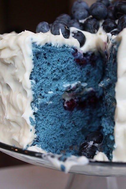
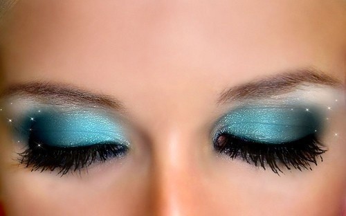
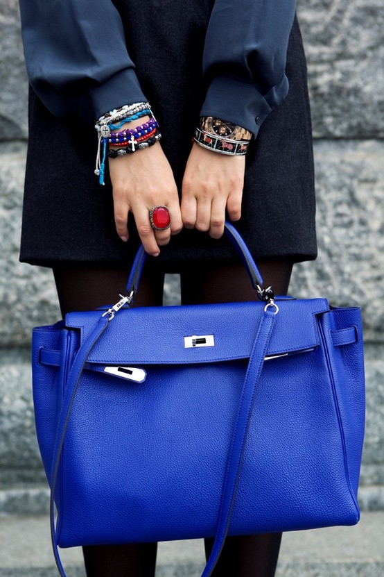
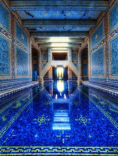
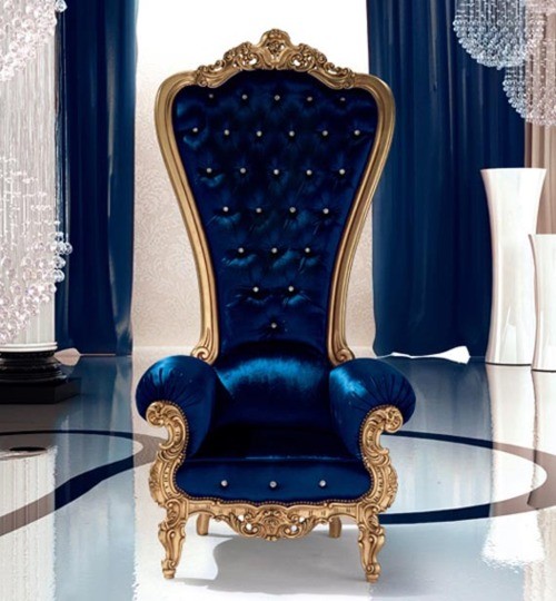
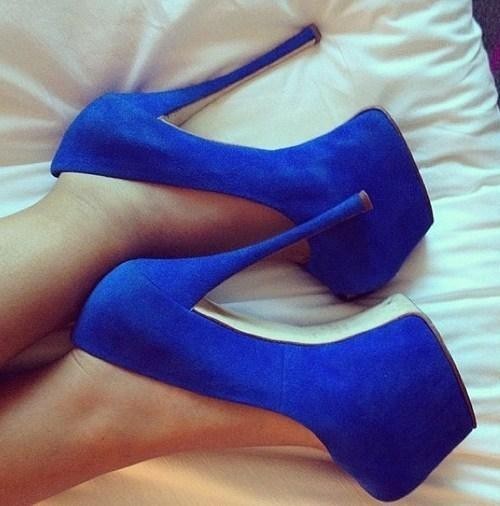
Royal blue carries historical associations with formality—uniforms, ceremonial dress, ink, and evening fabric. In a room, it behaves like a jewel tone: rich enough to act as a feature wall or a velvet chair, strong enough to need calm neighbors. Cream, soft gray, white, and natural wood keep royal blue from feeling heavy. Brass and gold warm it; chrome cools it. Black sharpens it for evening fashion; camel softens it for day.
In clothing, royal blue flatters a wide range of skin tones because it offers contrast without the severity of pure black. A royal dress or blazer can move from office to dinner with shoe and jewelry changes. Pairing royal with orange or coral is high-contrast and energetic; pairing it with blush or pale gray is quieter. Denim sits nearby on the spectrum but reads more casual—use royal when you want polish, indigo when you want ease.
Lighting changes royal dramatically. Cool LEDs can push it toward ink; warm lamps can reveal violet undertones. Test paint samples and fabric swatches at morning and night before committing a whole wall or sofa. What looks majestic at noon can feel cave-like after dark if the room lacks reflective surfaces or secondary light sources.

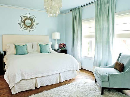
Mid blues: cobalt, sky, and everyday wear
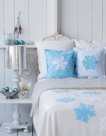
Between royal and Tiffany sit the workhorse blues—cobalt ceramics, sky walls, medium blue textiles—that people live with daily. Cobalt leans bright and graphic; it loves white space and black line. Sky and powder blues recede, making small rooms feel more open when used on walls or large sofas. They show dirt less dramatically than pure white but more than navy, so choose washable fabrics for high-touch pieces.
Pattern mixes well in this middle band. Stripes, toile, and geometric prints in blue-and-white traditions remain readable because the value contrast stays clear. When mixing patterns, keep the blue family related—cool with cool—or intentionally bridge with a neutral. A royal pillow on a sky sofa can work if sizes differ and one pattern stays quiet.
Fashion mid-blues include chambray shirts, medium dresses, and accessories that bridge jeans and tailored pieces. They photograph softly and travel easily through seasons. If royal feels too formal and Tiffany too sweet, mid blue is often the practical compromise for real wardrobes and rented apartments where paint drama is limited.
Tiffany blue: air, green undertone, and light touch
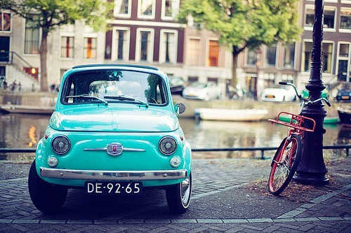
Tiffany blue—robin’s-egg, aqua-leaning, famously boxed—reads as gift, spring, and sweetness when used heavily. Its power is uplift. A pale aqua wall, a cake stand, a ribbon, or a clutch can refresh a neutral scheme without the weight of royal. Because the shade contains green, it pairs naturally with cream, soft gold, white orchid tones, and light wood. It can clash with strong orange or with cool grays that pull purple.
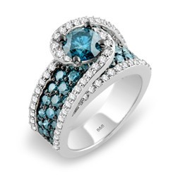
In fashion, Tiffany-like blues work as dresses for daytime celebrations, as lining flashes, or as accessory notes. Full head-to-toe pale aqua can flatten under fluorescent light; texture—lace, knit, linen—helps. Jewelry in silver or platinum cools the look; yellow gold warms it toward vintage bakery charm. Makeup near this shade often favors soft peach or rose rather than heavy burgundy, which can fight the airiness.
Interiors should dose Tiffany carefully. A whole room in pale aqua can feel themed. Better: one lacquered tray, a lamp base, guest towels, or a painted door interior. Let daylight do part of the work—this family of blues thrives near windows and pales under dim bulbs. If your north-facing room already runs cold, add warm wood or brass so aqua does not chill the space further.
Building a blue story across objects
Galleries like this often mix fashion, tabletop, and decor in one scroll. That mix is useful if you extract rules instead of copying every object. Rule one: decide whether blue is the hero or the accent. Hero blue needs quiet surroundings. Accent blue can sit on a patterned field if it repeats at least twice so the eye catches a rhythm.
Rule two: watch undertones. Royal next to Tiffany can look intentional—deep and pale as bookends—or accidental if a third blue of a different family intrudes. Swatch in natural light. Photograph your own objects together before buying more. Digital screens exaggerate saturation; real rooms forgive less.
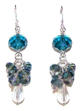
Rule three: finish materials change blue’s personality. Glossy ceramic Tiffany feels festive. Matte royal wool feels serious. Transparent blue glass mediates between them. Mixing finishes within one blue family often looks richer than mixing many hues of the same finish.
Table settings offer a low-risk laboratory. Royal napkins with white plates, or pale aqua dessert china with gold flatware, teach contrast without painting a wall. Fashion accessories—scarves, bags, shoes—teach the same lesson for the body. Move successful combinations upward in scale only after small tests succeed.



When to choose which blue
Choose royal when you want gravity: evening events, a statement chair, a winter coat, a library wall. Choose mid blue when you want daily calm: bedding, shirts, kitchen ceramics. Choose Tiffany-leaning aqua when you want lift: spring entertaining, a powder room surprise, a wedding accent, a single optimistic object on a gray desk.
Season and climate matter. Deep blues absorb light and suit bright rooms or evening drama. Pale aquas expand dim corners but can look icy in cold climates without warm textures—wool throws, oak, candlelight. Coastal homes often default to light blues; urban loft light can handle cobalt and royal without feeling maritime.
Ignore brand mythology when it gets in the way of your eyes. A blue does not need a famous box to earn a place in your house. It needs to sit well beside what you already own, clean reasonably, and still please you after the novelty of a gallery scroll fades. Walk the spectrum from royal to Tiffany once with that standard, and the collection becomes a tool instead of a wishlist.
One clear test: place your deepest blue object beside your palest aqua object on a white cloth. If the pairing feels like a deliberate chord, your spectrum is working. If it feels like two different songs, edit one out of the room—or introduce a mid blue bridge so the eye can travel.

Comments
Continue reading

Photo vs Illustrated Save-the-Dates: How to Choose a Format
A practical comparison of photographic and illustrated save-the-dates—when a portrait earns the stamp, when a drawing carries the date, and how to match format to venue, guests, and printing.
Escort-Card Displays That Aren’t a Table of Tiny Cards
Walls, branches, envelopes, mirrors, and numbered installations—how to stage escort cards so guests find their tables without a crowded lobby table.
Berry, Brick, and Brown Lipsticks That Still Read as Color
A guide to berry, brick, and brown lipsticks—undertones, finishes, and light—when classic fire-engine red is not the shade you want to wear.