
Jessica Alba for Glamour France, August 2013
Jessica Alba’s August 2013 Glamour France cover story by Jason Kim—rock-chic summer styling from Sébastien Cambos, framed as a historical magazine editorial.
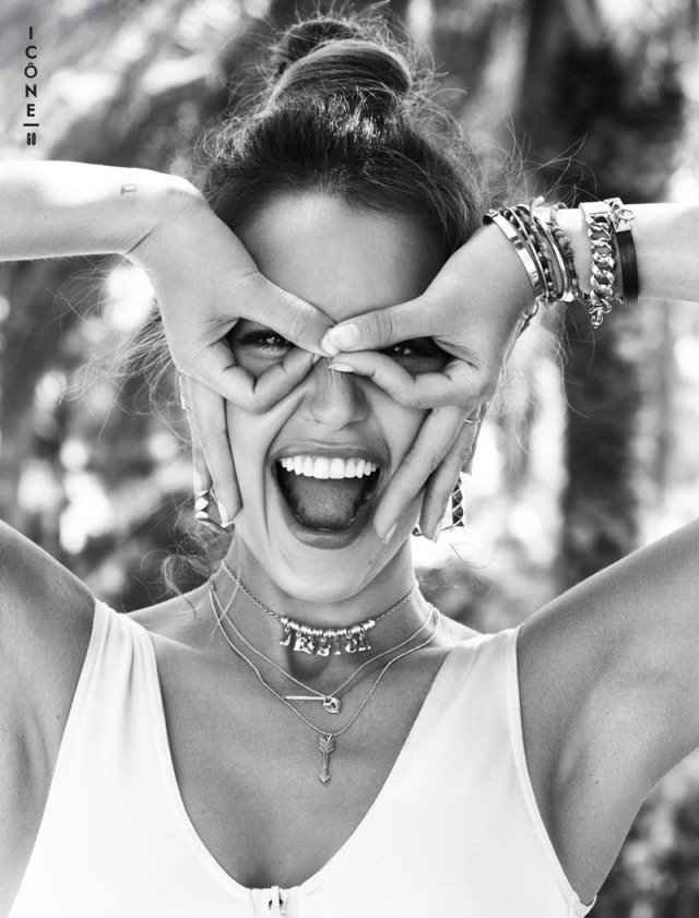
In summer 2013, Glamour France put Jessica Alba on its August cover in a look that traded red-carpet formality for rock-chic ease: a black bra top, high-waisted psychedelic-print pants, layered necklaces, geometric earrings, and the kind of casual confidence that French glossies often prefer when they want Hollywood without the Oscar-night armor. Photographer Jason Kim shot the story; stylist Sébastien Cambos built the wardrobe mix. Makeup came from Lauren Anderson, hair from Robert Ramos, manicure from Nettie Davis. The feature belongs to that season’s magazine calendar—newsstand summer reading, not a breaking announcement.
Alba was thirty-two, already long past breakout-teen-star framing and deep into a career that balanced film, branding, and a public image built on approachable glamour. Glamour France’s August issue used her the way international editions often use American actresses: as a familiar face who can still be restyled for a local fashion conversation. The cover that circulated online—Alba herself teased it on Instagram for French readers—emphasized color, curve, and cool rather than couture stiffness.
Jason Kim’s summer register
Jason Kim’s frames for the story lean toward sun, street, and poolside atmosphere rather than velvet studio drama. Coverage of the editorial described skater-casual denim, simple tees, sunglasses, studded belts, and a general no-fuss attitude: Alba soaking up light, moving through looks that feel closer to a stylish weekend than to a gala. That register matters historically. Early-2010s “cool girl” fashion often lived in the gap between luxury labels and high-street pieces, and Cambos’s styling reportedly mixed names such as Louis Vuitton, Hermès, Topshop, Marc by Marc Jacobs, Paule Ka, Vivienne Westwood, and Cartier. The point was contrast—heritage leather next to playful print, delicate jewelry next to spiked bracelets—without losing Alba’s recognizable warmth.
Magazine photography of this type sells a lifestyle hypothesis: that the cover star could walk out of the frame into a café or a convertible and still look edited. Kim’s light does a lot of that selling. Bright outdoor exposure flattens some of the usual Hollywood shadow play and replaces it with clarity—skin, fabric texture, and accessory detail all competing politely for attention. For a summer issue, that clarity is strategic. Readers are meant to imagine heat, not candlelight.
What the cover look was doing
The hero cover ensemble—black bra top and psychedelic trousers—works because it is graphic. Solid black against busy print creates an immediate silhouette: torso as a calm block, legs as a pattern field. Layered necklaces and geometric earrings add vertical and angular counterpoints so the print does not swallow the face. Spiked bracelets and arrow-or-key necklace motifs, noted in contemporary write-ups, push the styling toward rock and talismanic accessory culture rather than pure romantic femininity.
That choice also distinguished the French Glamour cover from more conservative American weekly celebrity packaging of the same years. International Glamour editions frequently chased a slightly sharper edge—more fashion-forward, more willing to show skin as style rather than scandal. Alba’s girl-next-door reputation made the edge feel playful instead of severe. The magazine could print a bra top as fashion, not as a tabloid dare, because the surrounding editorial language was “cool,” “chic,” and “summer.”
Compare that cover energy with Alba’s other 2013 Glamour-family appearances—such as her presence in Glam Belleza Latina’s summer orbit—and you see a consistent brand: Latina Hollywood figures held up as style references alongside names she herself admired. In related comments from that period she cited influences ranging across different notable Latinas in film and public life. The Glamour France cover sits inside that broader identity conversation without needing to lecture about it. The clothes carry the tone.
Alba’s 2013 public fashion context
Off-duty and event style reports from the same summer described Alba in maxis, loose shirts, and torn jeans one day, then polished minis and bright pumps the next. That split is useful when reading the Kim editorial. The magazine did not invent a new Jessica Alba; it selected the “easy but edited” channel of an image she already occupied. High-waisted pants, statement accessories, and sunglasses are the connective tissue between street candids and studio covers.
At thirty-two, Alba also represented a particular Hollywood career stage: no longer the ingénue of early 2000s genre films alone, not yet framed primarily through later entrepreneurial narratives in the way later press would emphasize. In 2013 magazine terms she was still chiefly an actress-model cover subject—someone whose face sold issues and whose body language sold clothes. Understanding that framing keeps the article historically honest. This is a fashion cover story from the summer of 2013, preserved as such.
Credits, craft, and why they matter
Fashion editorials are team sports. Jason Kim’s camera sets the mood, but Sébastien Cambos’s wardrobe choices determine whether the mood looks expensive, rebellious, or both. Lauren Anderson’s makeup and Robert Ramos’s hair decide whether the face reads as soft California or sharper European gloss. Nettie Davis’s manicure is the small detail phone zooms still catch. Listing credits is not trivia for its own sake; it is how you reverse-engineer why a cover feels coherent.
When contemporary blogs wrote up the story in July 2013, they tended to praise the accessories and the carefree attitude as much as the clothes. That reception is a clue. The editorial succeeded when viewers felt Alba was inhabiting the looks rather than modeling them at arm’s length. Kim’s direction—poses that suggest movement interrupted, light that suggests afternoon rather than midnight—supports that reading.
A checklist for reading the Glamour France set
- Season first: August cover energy means sun, print, and skin as style, not winter velvet.
- Graphic contrast: Black top vs. busy pants is the cover’s main design sentence.
- Accessory punctuation: Necklaces, earrings, and spikes keep the eye moving upward to the face.
- Luxury–street mix: High fashion labels beside high-street pieces define early-2010s “cool” styling.
- Historical distance: Treat the feature as a 2013 magazine artifact, not as today’s trend report.
If you are archiving Jessica Alba magazine appearances, file this one under summer rock-chic rather than ballgown glamour. Jason Kim and Sébastien Cambos gave Glamour France a version of Alba that feels breezy, graphic, and deliberately underdressed for the red carpet—exactly the kind of cover a French August issue could live on.

Comments
Continue reading
Photo vs Illustrated Save-the-Dates: How to Choose a Format
A practical comparison of photographic and illustrated save-the-dates—when a portrait earns the stamp, when a drawing carries the date, and how to match format to venue, guests, and printing.
Escort-Card Displays That Aren’t a Table of Tiny Cards
Walls, branches, envelopes, mirrors, and numbered installations—how to stage escort cards so guests find their tables without a crowded lobby table.
Berry, Brick, and Brown Lipsticks That Still Read as Color
A guide to berry, brick, and brown lipsticks—undertones, finishes, and light—when classic fire-engine red is not the shade you want to wear.