
Montblanc Fountain Pens: Design, Meisterstück, and Writing Culture
A product-and-culture look at Montblanc fountain pens—from the Meisterstück silhouette and gold nib craft to why the brand still shapes handwriting luxury.
A Montblanc fountain pen is one of those objects people recognize even when they cannot name the model. The black cigar silhouette, the white star on the cap, the gold clip that catches light like jewelry—together they have become a shorthand for seriousness about writing. In a century crowded with disposable ballpoints and glowing keyboards, the brand’s flagship pens keep asking a quieter question: what happens when the tool you use to put words on paper is treated as craft rather than as an afterthought?
Montblanc began in Germany in the early twentieth century and took its name from Europe’s highest peak. The mountain metaphor is not decoration alone. The white six-pointed emblem on the cap evokes the snowy summit of Mont Blanc, and the number 4810 engraved on many gold nibs recalls the mountain’s height in meters. Those details turn a writing instrument into a portable landscape: something you hold that still points upward toward an idea of excellence.
Meisterstück: the name that stuck
The line most closely tied to that reputation is the Meisterstück—“masterpiece” in German—introduced in 1924. Company lore holds that the best pens were once made by craftsmen for themselves, the way an apprentice’s final piece proves a skill. Customers asked for a “Sunday best” pen, and Montblanc answered with a public Meisterstück. Over decades the design settled into codes collectors can spot at a glance: precious black resin, three cap rings, a gold-toned clip, and a handcrafted gold nib that is polished and tested before it leaves Hamburg.
The Meisterstück 149, arriving in the early 1950s, became the mental image many people carry. It is large without being cartoonish, balanced for long writing sessions, and conservative enough to look at home beside a leather notebook or a signed contract. Presidents, actors, and executives have used versions of it; photographs of historic signatures sometimes show that familiar star flashing above a page. Status is part of the story, but it is not the whole story. People keep buying and filling these pens because the line still writes with a springy, wet character that cheap plastic tips rarely imitate.
Design that refuses to shout
Excellent pen design, in Montblanc’s case, is often a matter of restraint. The brand does release elaborate limited editions—metals, precious stones, literary tributes, and sculptural overlays that push prices into collector territory. Those pieces get gallery attention because they are rare and theatrical. Yet the everyday icon remains the black resin workhorse: a shape refined rather than reinvented. Curves are continuous. Branding is concentrated in a few marks. The pen looks intentional even when it sits closed on a desk.
That calm is why Montblanc photographs so well in design features. Against white paper or dark wood, the white star becomes a punctuation mark. Uncapped, the nib reveals engraving and a carefully cut tipping that determines how ink spreads. Writers talk about “feedback,” the tiny texture of nib against fiber, and about ink flow that stays generous without flooding. Those sensations are design outcomes as much as marketing claims. A fountain pen is a small hydraulic system; Montblanc’s reputation rests on making that system feel reliable in the hand.
Writing culture in a digital age
Fountain pens never disappeared, but they changed meaning. Where once they were office defaults, they are now often chosen on purpose—by journal keepers, calligraphers, architects who still sketch, students who like the ritual of filling a converter, and gift-givers who want an object that outlasts a gadget cycle. Montblanc occupies the upper shelf of that culture. Boutiques display pens beside leather goods and watches, framing handwriting as part of a broader luxury vocabulary.
Critics sometimes dismiss that framing as pure status. Fair enough: a famous logo can signal wealth faster than it signals taste. Still, the better reading is mixed. A well-made fountain pen slows you down. You choose ink color. You wipe the nib. You notice paper quality because cheap stock feathers and bleeds. Those micro-rituals are cultural habits, not only retail theater. Montblanc’s designs thrive in that slower lane even when the brand also sells spectacle editions for collectors who chase rarity.
Limited and special editions are where Montblanc’s design ambition shows most clearly. Some editions honor writers and musicians; others experiment with translucent resins, skeleton overlays, or unusual fills. Price tags for the rarest pieces can climb into five figures and beyond, which is why auction listings and boutique windows feel like jewelry cases. Looking at those pens as design objects—materials, proportion, storytelling—is more interesting than treating them as lottery tickets. The question worth asking is whether the decoration still serves the act of writing, or whether the pen has become sculpture that merely remembers ink.
What to notice when you look at one
If you are studying Montblanc fountain pens as design rather than shopping for a deal, start with silhouette. Does the barrel taper cleanly into the section? Does the cap post securely without looking top-heavy? Examine the star: is it centered and set flush? Check the rings for even spacing. On the nib, look for crisp engraving and an even tipping—tiny irregularities there matter more than shine on the clip.
Then imagine the pen in use. Fountain pens reward paper with some tooth and inks that dry cleanly. They dislike being left uncapped on a dry afternoon. They benefit from occasional flushing. None of that is exclusive to Montblanc, but luxury branding can obscure it. A beautiful pen that sits empty in a drawer is only half designed. The other half is the relationship between hand, ink, and page.
Collectors often distinguish daily writers from cabinet pieces. A classic black Meisterstück can live in a bag and still look composed after years of pocket wear; high jewelry editions ask for softer handling. That split mirrors other design fields: the chair you sit in every day versus the chair behind the velvet rope. Montblanc’s catalog spans both moods. The cultural weight of the brand comes from keeping them under one snowcap emblem.
Why the form endures
Trends in stationery come and go—pastel pastes, ultra-fine gel tips, smart pens that digitize strokes. Montblanc’s signature fountain pens endure partly because they refuse to chase every fad. They update quietly: better resins, refined feeds, anniversary collections that glance backward at archive drawings. The brand understands that its strongest asset is recognition. Change too much and the object stops being a Montblanc in the public mind; change too little and it risks becoming a costume of itself. The successful editions walk that line.
There is also a simple sensory truth. Ink from a gold nib can look richer on the page than ink from a steel ball. Lines swell and thin with pressure. Signatures gain character. For people who still write thank-you notes, dedicate books, or draft ideas by hand, those qualities justify caring about the instrument. Montblanc did not invent handwriting, but it branded a particular vision of it: dark, glossy, Alpine-clean, slightly ceremonial.
So when you see a Montblanc fountain pen in a photograph or under glass, try reading it twice. First as a status symbol—the easy reading. Then as industrial design with a century of iteration behind it: a sealed ink reservoir, a flexible writing tip, and a handful of graphic marks that turned a German pen into a global icon. The best examples still do the ordinary job. They put a wet line where a thought needs to land.
If you already own one, the next useful move is not another purchase; it is a page. Fill the converter, choose a paper that behaves, and write until the novelty of the logo fades and only the stroke remains. That is where Montblanc’s design either earns its reputation or reveals itself as theater. Most lasting tools survive that test.

Comments
Continue reading
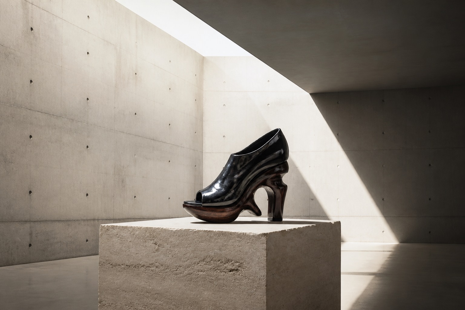
Sculptural Shoes That Were Never Meant to Walk Far
When footwear leaves the sidewalk: gallery heels, unwearable lasts, and object-shoes that belong on a plinth more than on a commute.
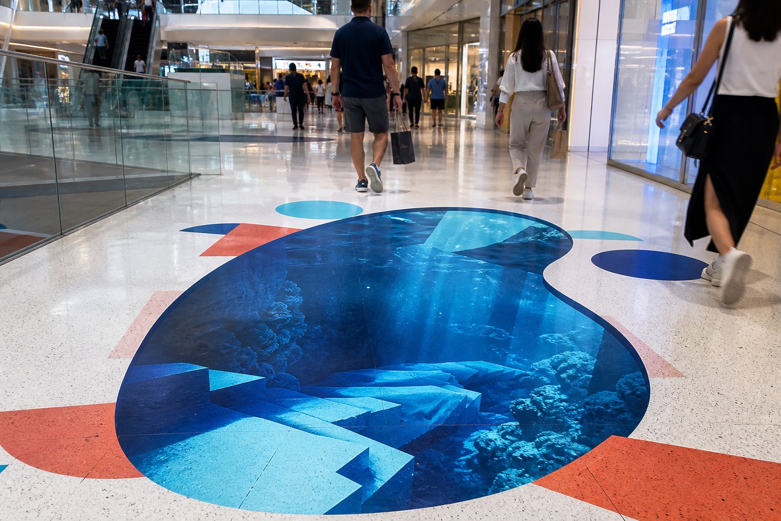
Ads That Live on the Floor, the Street, and the Mall
Ambient and out-of-home advertising that uses pavement, escalators, parking lots, and mall floors as the media—not a magazine page.

Attic Bathroom Design Ideas: Light, Layout, and Roof-Friendly Fixtures
Design ideas for converting an attic into an extra bathroom—working with slopes, skylights, wet-zone materials, eaves storage, and fixture placement.